
Tag: COVID19
A coronavirus prediction you can bank on
How many cases will there be on June 1? Beats me. But there’s one thing I’m sure of.
My confidence bounds on future behavior of the epidemic are still pretty wide. While there’s good reason to be optimistic about a lot of locations, there are also big uncertainties looming. No matter how things shake out, I’m confident in this:
The antiscience crowd will be out in force. They’ll cherry-pick the early model projections of an uncontrolled epidemic, and use that to claim that modelers predicted a catastrophe that didn’t happen, and conclude that there was never a problem. This is the Cassandra’s curse of all successful modeling interventions. (See Nobody Ever Gets Credit for Fixing Problems that Never Happened for a similar situation.)
But it won’t stop there. A lot of people don’t really care what the modelers actually said. They’ll just make stuff up. Just today I saw a comment at the Bozeman Chronicle to the effect of, “if this was as bad as they said, we’d all be dead.” Of course that was never in the cards, or the models, but that doesn’t matter in Dunning Krugerland.
Modelers, be prepared for a lot more of this. I think we need to be thinking more about defensive measures, like forecast archiving and presentation of results only with confidence bounds attached. However, it’s hard to do that and to produce model results at a pace that keeps up with the evolution of the epidemic. That’s something we need more infrastructure for.
Coronavirus – Really Simple Math
Why border control has limits, and mild cases don’t matter.
At the top, the US coronavirus response seems to be operating with (at least) two misperceptions. First, that border control works. Second, that a lower fatality rate means fewer deaths. Here’s how it really works.
Consider an extremely simplified SEIRD model. This is a generalization of the simple SIR framework to include asymptomatic, non-infective Exposed people and the Deceased:
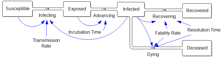
The parameters are such that the disease takes about a week to incubate, and about a week to resolve. The transmission rate is such that cases double about once a week, if left uncontrolled.
Those fortuitous time constants make it really simple to model the spread in discrete time. First, abstract away the susceptible (who are abundant early in the epidemic) and the resolved cases (which are few and don’t participate further):
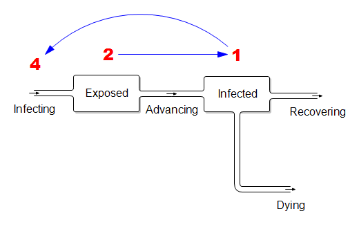
In this dirt-simple model,
- This week’s infected will all resolve
- This week’s exposed will advance to become next week’s infected
- Next week’s exposed are the ones the current infected are infecting now.
If the disease is doubling weekly, then for every 1 infected person there must be 2 exposed people in the pipeline. And each of those infected people must expose 4 others. (Note that this is seemingly an R0 of 4, which is higher than what’s usually quoted, but the difference is partly due to discrete vs. continuous compounding. The R0 of 2.2 that’s currently common seems too low to fit the data though – more on that another time.)
What does this imply for control strategy? It means that, on the day you close the border, the infected arrivals you’ve captured and isolated understate the true problem. For every infected person, there are two exposed people on the loose, initiating domestic community spread. Because it’s doubling weekly, community infections very quickly replace the imports, even if a travel ban is 100% effective.
Mild Cases
Now consider the claim that the fatality rate is much lower than reported, because there are many unobserved mild cases:
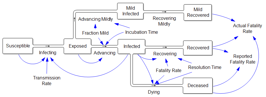
In other words, the reported fatality rate is Deceased/(Recovered+Deceased), but the “real” fatality rate is Deceased/(Recovered+Deceased+Mild Recovered). That’s great, but where did all those mild cases come from? If they are sufficiently numerous to dilute the fatality rate by, say, a factor of 10, then there must also be 9 people with mild infections going undetected for every known infected case. That doesn’t help the prognosis for deaths a bit, because (one tenth the fatality rate) x (ten times the cases) yields the same outcome. Actually, this makes the border control and community containment problem much harder, because there are now 10x as many contacts to trace and isolate. Fortunately this appears to be pure speculation.
Stock markets and coronavirus – an endogenous perspective
Markets collapse when they’re in a vulnerable state. Coronavirus might be the straw that broke the camel’s back – this time – but there’s no clear pandemic to stock price causality.
The predominant explanation for this week’s steep decline in the stock market is coronavirus. I take this as evidence that the pandemic of open-loop, event-based thinking is as strong as ever.

First, let’s look at some data. Here’s interest in coronavirus:
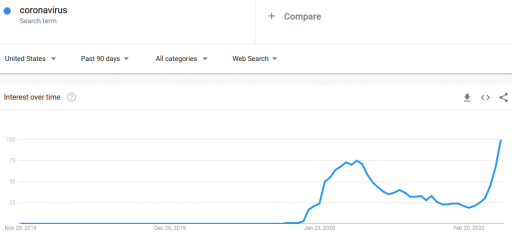
It was already pretty high at the end of January. Why didn’t the market collapse then? (In fact, it rose a little over February). Is there a magic threshold of disease, beyond which markets collapse?
How about other pandemics? Interest in pandemics was apparently higher in 2009, with the H1N1 outbreak:
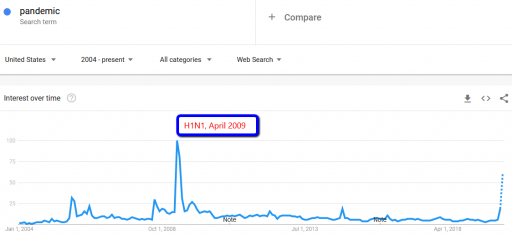
Did the market collapse then? No. In fact, that was the start of the long climb out of the 2007 financial crisis. The same was true for SARS, in spring 2003, in the aftermath of the dotcom bust.
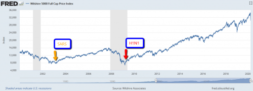
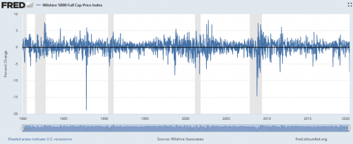
There are also lots of examples of market crashes, like 1987, that aren’t associated with pandemic fears at all. Corrections of this magnitude are actually fairly common (especially if you consider the percentage drop, not the inflated absolute drop):
I submit that the current attribution of the decline to coronavirus is primarily superstitious, and that the market is doing what it always does.
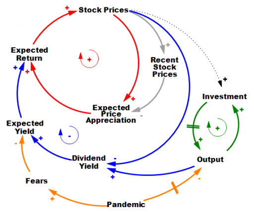
It’s hard to do it justice briefly, but the stock market is basically an overlay of a complicated allocation mechanism on top of the real economy. In the real economy (green positive loop) capital and technology accumulation increase output (thinking strictly of on-market effects). Growth in that loop proceeds steadily in the long run, but with bumps from business cycles. The stock market is sending signals to the real economy about how to invest, but that’s complicated, hence the dashed line.
In the stock market, prices reflect expectations about the future flow of dividends from the economy (blue negative loop). If that were the whole story, coronavirus (orange) would have to have induced fears of a drop in the NPV of future profits of about 10%. Hopefully that’s way outside any plausible scenario. So why the big drop? It’s due to the other half of the story. Expectations are formed partly on fundamentals, and partly on the expectation that the market will go up, because it’s been going up (red positive loop).
There are actually a number of mechanisms behind this: naive extrapolation, sophisticated exploitation of the greater fool, redirection of media attention to prognosticators of growth when they’re right, and so on. The specifics aren’t important; what matters is that they create a destabilizing reinforcing feedback loop that inflates bubbles. Then, when some shock sufficient to overcome the expectations of appreciation arrives, the red loop runs the other way, as a vicious cycle. Diminished expected returns spark selling, lowering prices, and further diminishing expectations of appreciation. If things get bad enough, liquidity problems and feedback to the real economy accentuate the problem, as in 1929.
Importantly, this structure makes the response of the market to bad news nonlinear and state-dependent. When SARS and H1N1 arrived, the market was already bottomed out. At such a point, the red loop is weak, because there’s not much speculative activity or enthusiasm. The fact that this pandemic is having a large impact, even while it’s still hypothetical, suggests that market expectations were already in a fragile state. If SARS-Cov-2 hadn’t come along to pop the bubble, some other sharp object would have done it soon: a bank bust, a crop failure, or maybe just a bad hot dog for an influential trader.
Coronavirus may indeed be the proximate cause of this week’s decline, in the same sense as the straw that broke the camel’s back. However, the magnitude of the decline is indicative of the fragility of the market state when the shock came along, and not necessarily of the magnitude of the shock itself. The root cause of the decline is that the structure of markets is prone to abrupt losses.
For a nice exploration of these dynamics, from the complexity/nonlinear dynamics thread of systems science, see Didier Sornette’s Why Stock Markets Crash: Critical Events in Complex Financial Systems.