My take: It’s a noble effort, but flawed. The best thing about it is the broad, upstream coverage of >85% of emissions. However, there are too many extraneous pieces operating alongside the cap. Those create possible inefficiencies, where the price of carbon is nonuniform across the economy, and create a huge design task and administrative burden for EPA. It would be better to get a carbon price in place, then fiddle with RPS, LCFS, and other standards and programs as needed later. The deep cuts in emissions reflect what it takes to change the climate trajectory, but I’m concerned that the trajectory is too rigid to cope with uncertainty, even with the compliance period, banking, borrowing, and strategic reserve provisions. So-called environmental certainty isn’t helpful if it causes price volatility that leads to the undoing of the program. As always, I’d rather see a carbon tax, but I think we could work with this framework if we have to. Allowance allocation is, of course, the big wrestling match to come.
The WSJ has a quick look
Joe Romm gives it a B+
GreenPeace says it’s a good first step
USCAP likes it (they should, a lot of it is their ideas):
USCAP hails the discussion draft released by Chairmen Waxman and Markey as a strong starting point for enacting legislation to reduce greenhouse gas emissions. The discussion draft provides a solid foundation to create a climate strategy that both protects our economy and achieves the nation’s environmental goals. It recognizes that many of these issues are tightly linked and must be dealt with simultaneously. We appreciate the thoughtful approach reflected in the draft and the priority the Chairmen are placing on this important issue.
The draft addresses most of the core issues identified by USCAP in our Blueprint for Legislative Action and reflects many of our policy recommendations. Any climate program must promote private sector investment in vital low-carbon technologies that will create new jobs and provide a foundation for economic recovery. Legislation must also protect consumers, vulnerable communities and businesses while ensuring economic sustainability and environmental effectiveness.
The API hasn’t reacted, but the IPAA has coverage on its blog
CEI hates it.
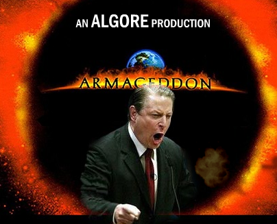
Rush Limbaugh says it’ll finish us off,
RUSH: Henry Waxman’s just about finished his global warming energy bill, 648 pages, as the Democrats prepare to finish off what’s left of the United States. Folks, we have got to drive these people out of office. We have to start now. The Republicans in Congress need to start throwing every possible tactic in front of everything the Democrats are trying to do. This is getting absurd. Listen to this. Henry Waxman and Edward Markey are putting the finishing touches on a 648-page global warming and energy bill that will certainly finish this country off. They’re circulating the bill today. The text of the bill ought to be up soon at a website called globalwarming.org. The bill contains everything you’d expect from an Algore wish list. Reading this, I don’t know how this will not raise energy prices to crippling levels and finish off the auto industry as we know it. (More here)
Time points out that the Senate could be a dealbreaker:
The effects of the already-intense lobbying around the issue were being felt across the Capitol, where the Senate the same afternoon passed by an overwhelming margin an amendment resolving that any energy legislation should not increase electricity or gas prices.
That’ll make it tough to get 60 votes.