Ethanol Odd Couple & the California LCFS

I started sharing items from my feed reader, here. Top of the list is currently a pair of articles from Science Daily:

Corn-for-ethanol’s Carbon Footprint Critiqued

To avoid creating greenhouse gases, it makes more sense using today’s technology to leave land unfarmed in conservation reserves than to plow it up for corn to make biofuel, according to a comprehensive Duke University-led study.

“Converting set-asides to corn-ethanol production is an inefficient and expensive greenhouse gas mitigation policy that should not be encouraged until ethanol-production technologies improve,” the study’s authors reported in the March edition of the research journal Ecological Applications.

Corn Rises After Government Boosts Estimate for Ethanol Demand

Corn rose for a fourth straight session, the longest rally this year, after the U.S. government unexpectedly increased its estimate of the amount of grain that will be used to make ethanol.

House Speaker Nancy Pelosi, a California Democrat, and Senator Amy Klobuchar, a Minnesota Democrat, both said March 9 they support higher amounts of ethanol blended into gasoline. On March 6, Growth Energy, an ethanol-industry trade group, asked the Environmental Protection Agency to raise the U.S. ratio of ethanol in gasoline to 15 percent from 10 percent.

This left me wondering where California’s assessments of low carbon fuels now stand. Last March, I attended a collaborative workshop on life cycle analysis of low carbon fuels, part of a series (mostly facilitated by Ventana, but not this one) on GHG policy. The elephant in the room was indirect land use emissions from biofuels. At the time, some of the academics present argued that, while there’s a lot of uncertainty, zero is the one value that we know to be wrong. That left me wondering what plan B is for biofuels, if current variants turn out to have high land use emissions (rendering them worse than fossil alternatives) and advanced variants remain elusive.

It turns out to be an opportune moment to wonder about this again, because California ARB has just released its LCFS staff report and a bunch of related documents on fuel GHG intensities and land use emissions. The staff report burdens corn ethanol with an indirect land use emission factor of 30 gCO2eq/MJ, on top of direct emissions of 47 to 75 gCO2eq/MJ. That renders 4 of the 11 options tested worse than gasoline (CA RFG at 96 gCO2eq/MJ). Brazilian sugarcane ethanol goes from 27 gCO2eq/MJ direct to 73 gCO2eq/MJ total, due to a higher burden of 46 gCO2eq/MJ for land use (presumably due to tropical forest proximity).

These numbers are a lot bigger than the zero, but also a lot smaller than Michael O’Hare’s 2008 back-of-the-envelope exercise. For example, for corn ethanol grown on converted CRP land, he put total emissions at 228 gCO2eq/MJ (more than twice as high as gasoline), of which 140 gCO2eq/MJ is land use. Maybe the new results (from the GTAP model) are a lot better, but I’m a little wary of the fact that the Staff Report sensitivity ranges on land use (32-57 gCO2eq/MJ for sugarcane, for example) have such a low variance, when uncertainty was previously regarded as rather profound.

But hey, 7 of 11 corn ethanol variants are still better than gasoline, right? Not so fast. A low carbon fuel standard sets the constraint:

(1-x)*G = (1-s)*G + s*A

where x is the standard (emissions intensity cut vs. gasoline), s is the market share of the low-carbon alternative, G is the intensity of gasoline, and A is the intensity of the alternative. Rearranging,

s = x / (1-A/G)

In words, the market share of the alternative fuel needed is proportional to the size of the cut, x, and inversely proportional to the alternative’s improvement over gasoline, (1-A/G), which I’ll call i. As a result, the required share of an alternative fuel increases steeply as it’s performance approaches the limit required by the standard, as shown schematically below:
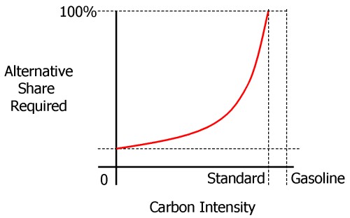
Intensity-share schematic

Clearly, if a fuel’s i is less than x, s=x/i would have to exceed 1, which is impossible, so you couldn’t meet the constraint with that fuel alone (though you could still use it, supplemented by something better).

Thus land use emissions are quite debilitating for conventional ethanol fuels’ role in the LCFS. For example, ignoring land use emissions, California dry process ethanol has intensity ~=59, or i=0.39. To make a 10% cut, x=0.1, you’d need s=0.26 – 26% market share is hard, but doable. But add 30 gCO2eq/MJ for land use, and i=0.07, which means you can’t meet the standard with that fuel alone. Even the best ethanol option, Brazilian sugarcane at i=0.24, would have 42% market share to meet the standard. This means that the alternative to gasoline in the LCFS would have to be either an advanced ethanol (cellulosic, not yet evaluated), electricity (i=0.6) or hydrogen. As it turns out, that’s exactly what the new Staff Report shows. In the new gasoline compliance scenarios in table ES-10, conventional ethanol contributes at most 5% of the 2020 intensity reduction.

Chapter VI of the Staff Report describes compliance scenarios in more detail. Of the four scenarios in the gasoline stovepipe, each blends 15 to 20% ethanol into gasoline. That ethanol is in turn about 10% conventional (Midwest corn or an improved CA variant with lower intensity) and up to 10% sugarcane. The other 80 to 90% of ethanol is either cellulosic or “advanced renewable” (from forest waste).

That makes the current scenarios a rather different beast from those explored in the original UC Davis LCFS technical study that provides the analytical foundation for the LCFS. I dusted off my copy of VISION-CA (the model used, and a topic for another post some day) and ran the 10% cut scenarios. Some look rather like the vision in the current staff report, with high penetration of low-intensity fuels. But the most technically diverse (and, I think, the most plausible) scenario is H10, with multiple fuels and vehicles. The H10 scenario’s ethanol is still 70% conventional Midwest corn in 2020. It also includes substantial “dieselization” of the fleet (which helps due to diesel’s higher tank-to-wheel efficiency). I suspect that H10-like scenarios are now unavailable, due to land use emissions (which greatly diminish the value of corn ethanol) and the choice of separate compliance pathways for gasoline and diesel.

The new beast isn’t necessarily worse than the old, but it strikes me as higher risk, because it relies on the substantial penetration of fuels that aren’t on the market today. If that’s going to happen by 2020, it’s going to be a busy decade.
MIT Updates Greenhouse Gamble

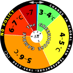
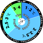
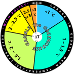
For some time, the MIT Joint Program has been using roulette wheels to communicate climate uncertainty. They’ve recently updated the wheels, based on new model projections:

No Policy Policy
New No policy Policy
Old Old no policy Old policy

The changes are rather dramatic, as you can see. The no-policy wheel looks like the old joke about playing Russian Roulette with an automatic. A tiny part of the difference is a baseline change, but most is not, as the report on the underlying modeling explains:

The new projections are considerably warmer than the 2003 projections, e.g., the median surface warming in 2091 to 2100 is 5.1°C compared to 2.4°C in the earlier study. Many changes contribute to the stronger warming; among the more important ones are taking into account the cooling in the second half of the 20th century due to volcanic eruptions for input parameter estimation and a more sophisticated method for projecting GDP growth which eliminated many low emission scenarios. However, if recently published data, suggesting stronger 20th century ocean warming, are used to determine the input climate parameters, the median projected warning at the end of the 21st century is only 4.1°C. Nevertheless all our simulations have a very small probability of warming less than 2.4°C, the lower bound of the IPCC AR4 projected likely range for the A1FI scenario, which has forcing very similar to our median projection.

I think the wheels are a cool idea, but I’d be curious to know how users respond to it. Do they cheat, and spin to get the outcome they hope for? Perhaps MIT should spice things up a bit, by programming an online version that gives users’ computers the BSOD if they roll a >7C world.

Hat tip to Travis Franck for pointing this out.

Bathtub Still Filling, Despite Slower Inflow

Found this bit, under the headline Carbon Dioxide Levels Rising Despite Economic Downturn:

A leading scientist said on Thursday that atmospheric levels of carbon dioxide are hitting new highs, providing no indication that the world economic downturn is curbing industrial emissions, Reuters reported.

Joe Romm does a good job explaining why conflating emissions with concentrations is a mistake. I’ll just add the visual:

CO2 stock flow structure

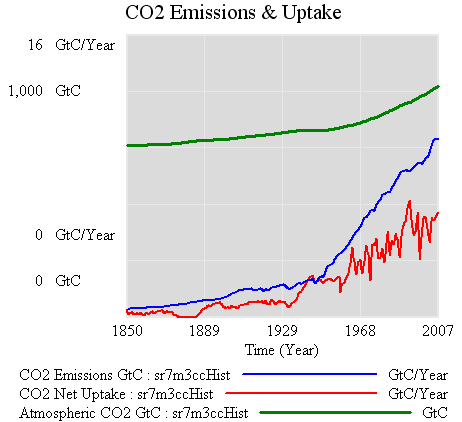
And the data to go with it:

CO2 data

It would indeed take quite a downturn to bring the blue (emissions) below the red (uptake), which is what would have to happen to see a dip in the CO2 atmospheric content (green). In fact, the problem is tougher than it looks, because a fall in emissions would be accompanied by a fall in net uptake, due to the behavior of short-term sinks. Notice that atmospheric CO2 kept going up after the 1929 crash. (Interestingly, it levels off from about 1940-1945, but it’s hard to attribute that because it appears to be within natural variability).

At the moment, it’s kind of odd to look for the downturn in the atmosphere when you can observe fossil fuel consumption directly. The official stats do involve some lag, but less than waiting for natural variability to shake out of sparse atmospheric measurements. Things might change soon, though, with the advent of satellite measurements.

OMG Did I say that out loud?

Steve Chu says the t word in an NYT interview:

He said that while President Obama and Congressional Democratic leaders had endorsed a so-called cap-and-trade system to control global warming pollutants, there were alternatives that could emerge, including a tax on carbon emissions or a modified version of cap-and-trade.

Glad the option isn’t totally dead.

Sea Level Rise – VI – The Bottom Line (Almost)

The pretty pictures look rather compelling, but we’re not quite done. A little QC is needed on the results. It turns out that there’s trouble in paradise:

  1. the residuals (modeled vs. measured sea level) are noticeably autocorrelated. That means that the model’s assumed error structure (a white disturbance integrated into sea level, plus white measurement error) doesn’t capture what’s really going on. Either disturbances to sea level are correlated, or sea level measurements are subject to correlated errors, or both.
  2. attempts to estimate the driving noise on sea level (as opposed to specifying it a priori) yield near-zero values.

#1 is not really a surprise; G discusses the sea level error structure at length and explicitly address it through a correlation matrix. (It’s not clear to me how they handle the flip side of the problem, state estimation with correlated driving noise – I think they ignore that.)

#2 might be a consequence of #1, but I haven’t wrapped my head around the result yet. A little experimentation shows the following:

driving noise SD equilibrium sensitivity (a, mm/C) time constant (tau, years) sensitivity (a/tau, mm/yr/C)
~ 0 (1e-12) 94,000 30,000 3.2
1 14,000 4400 3.2
10 1600 420 3.8

Intermediate values yield values consistent with the above. Shorter time constants are consistent with expectations given higher driving noise (in effect, the model is getting estimated over shorter intervals), but the real point is that they’re all long, and all yield about the same sensitivity.

The obvious solution is to augment the model structure to include states representing persistent errors. At the moment, I’m out of time, so I’ll have to just speculate what that might show. Generally, autocorrelation of the errors is going to reduce the power of these results. That is, because there’s less information in the data than meets the eye (because the measurements aren’t fully independent), one will be less able to discriminate among parameters. In this model, I seriously doubt that the fundamental banana-ridge of the payoff surface is going to change. Its sides will be less steep, reflecting the diminished power, but that’s about it.

Assuming I’m right, where does that leave us? Basically, my hypotheses in Part IV were right. The likelihood surface for this model and data doesn’t permit much discrimination among time constants, other than ruling out short ones. R’s very-long-term paleo constraint for a (about 19,500 mm/C) and corresponding long tau is perfectly plausible. If anything, it’s more plausible than the short time constant for G’s Moberg experiment (in spite of a priori reasons to like G’s argument for dominance of short time constants in the transient response). The large variance among G’s experiment (estimated time constants of 208 to 1193 years) is not really surprising, given that large movements along the a/tau axis are possible without degrading fit to data. The one thing I really can’t replicate is G’s high sensitivities (6.3 and 8.2 mm/yr/C for the Moberg and Jones/Mann experiments, respectively). These seem to me to lie well off the a/tau ridgeline.

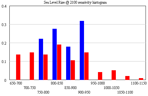
The conclusion that IPCC WG1 sea level rise is an underestimate is robust. I converted Part V’s random search experiment (using the optimizer) into sensitivity files, permitting Monte Carlo simulations forward to 2100, using the joint a-tau-T0 distribution as input. (See the setup in k-grid-sensi.vsc and k-grid-sensi-4x.vsc for details). I tried it two ways: the 21 points with a deviation of less than 2 in the payoff (corresponding with a 95% confidence interval), and the 94 points corresponding with a deviation of less than 8 (i.e., assuming that fixing the error structure would make things 4x less selective). Sea level in 2100 is distributed as follows:

Sea level distribution in 2100

The sample would have to be bigger to reveal the true distribution (particularly for the “overconfident” version in blue), but the qualitative result is unlikely to change. All runs lie above the IPCC range (.26-.59), which excludes ice dynamics.

Continue reading “Sea Level Rise – VI – The Bottom Line (Almost)”

Sea Level Rise Models – V

To take a look at the payoff surface, we need to do more than the naive calibrations I’ve used so far. Those were adequate for choosing constant terms that aligned the model trajectory with the data, given a priori values of a and tau. But that approach could give flawed estimates and confidence bounds when used to estimate the full system.

Elaborating on my comment on estimation at the end of Part II, consider a simplified description of our model, in discrete time:

(1) sea_level(t) = f(sea_level(t-1), temperature, parameters) + driving_noise(t)

(2) measured_sea_level(t) = sea_level(t) + measurement_noise(t)

The driving noise reflects disturbances to the system state: in this case, random perturbations to sea level. Measurement noise is simply errors in assessing the true state of global sea level, which could arise from insufficient coverage or accuracy of instruments. In the simple case, where driving and measurement noise are both zero, measured and actual sea level are the same, so we have the following system:

(3) sea_level(t) = f(sea_level(t-1), temperature, parameters)

In this case, which is essentially what we’ve assumed so far, we can simply initialize the model, feed it temperature, and simulate forward in time. We can estimate the parameters by adjusting them to get a good fit. However, if there’s driving noise, as in (1), we could be making a big mistake, because the noise may move the real-world state of sea level far from the model trajectory, in which case we’d be using the wrong value of sea_level(t-1) on the right hand side of (1). In effect, the model would blunder ahead, ignoring most of the data.

In this situation, it’s better to use ordinary least squares (OLS), which we can implement by replacing modeled sea level in (1) with measured sea level:

(4) sea_level(t) = f(measured_sea_level(t-1), temperature, parameters)

In (4), we’re ignoring the model rather than the data. But that could be a bad move too, because if measurement noise is nonzero, the sea level data could be quite different from true sea level at any point in time.

The point of the Kalman Filter is to combine the model and data estimates of the true state of the system. To do that, we simulate the model forward in time. Each time we encounter a data point, we update the model state, taking account of the relative magnitude of the noise streams. If we think that measurement error is small and driving noise is large, the best bet is to move the model dramatically towards the data. On the other hand, if measurements are very noisy and driving noise is small, better to stick with the model trajectory, and move only a little bit towards the data. You can test this in the model by varying the driving noise and measurement error parameters in SyntheSim, and watching how the model trajectory varies.

The discussion above is adapted from David Peterson’s thesis, which has a more complete mathematical treatment. The approach is laid out in Fred Schweppe’s book, Uncertain Dynamic Systems, which is unfortunately out of print and pricey. As a substitute, I like Stengel’s Optimal Control and Estimation.

An example of Kalman Filtering in everyday devices is GPS. A GPS unit is designed to estimate the state of a system (its location in space) using noisy measurements (satellite signals). As I understand it, GPS units maintain a simple model of the dynamics of motion: my expected position in the future equals my current perceived position, plus perceived velocity times time elapsed. It then corrects its predictions as measurements allow. With a good view of four satellites, it can move quickly toward the data. In a heavily-treed valley, it’s better to update the predicted state slowly, rather than giving jumpy predictions. I don’t know whether handheld GPS units implement it, but it’s possible to estimate the noise variances from the data and model, and adapt the filter corrections on the fly as conditions change.

Continue reading “Sea Level Rise Models – V”

Sea Level Rise Models – IV

So far, I’ve established that the qualitative results of Rahmstorf (R) and Grinsted (G) can be reproduced. Exact replication has been elusive, but the list of loose ends (unresolved differences in data and so forth) is long enough that I’m not concerned that R and G made fatal errors. However, I haven’t made much progress against the other items on my original list of questions:

  • Is the Grinsted et al. argument from first principles, that the current sea level response is dominated by short time constants, reasonable?
  • Is Rahmstorf right to assert that Grinsted et al.’s determination of the sea level rise time constant is shaky?
  • What happens if you impose the long-horizon paleo constraint to equilibrium sea level rise in Rahmstorf’s RC figure on the Grinsted et al. model?

At this point I’ll reveal my working hypotheses (untested so far):

  • I agree with G that there are good reasons to think that the sea level response occurs over multiple time scales, and therefore that one could make a good argument for a substantial short-time-constant component in the current transient.
  • I agree with R that the estimation of long time constants from comparatively short data series is almost certainly shaky.
  • I suspect that R’s paleo constraint could be imposed without a significant degradation of the model fit (an apparent contradiction of G’s results).
  • In the end, I doubt the data will resolve the argument, and we’ll be left with the conclusion that R and G agree on: that the IPCC WGI sea level rise projection is an underestimate.

Continue reading “Sea Level Rise Models – IV”

Sea Level Rise Models – III

Starting from the Rahmstorf (R) parameterization (tested, but not exhaustively), let’s turn to Grinsted et al (G).

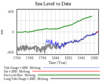
First, I’ve made a few changes to the model and supporting spreadsheet. The previous version ran with a small time step, because some of the tide data was monthly (or less). That wasted clock cycles and complicated computation of residual autocorrelations and the like. In this version, I binned the data into an annual window and shifted the time axes so that the model will use the appropriate end-of-year points (when Vensim has data with a finer time step than the model, it grabs the data point nearest each time step for comparison with model variables). I also retuned the mean adjustments to the sea level series. I didn’t change the temperature series, but made it easier to use pure-Moberg (as G did). Those changes necessitate a slight change to the R calibration, so I changed the default parameters to reflect that.

Now it should be possible to plug in G parameters, from Table 1 in the paper. First, using Moberg: a = 1290 (note that G uses meters while I’m using mm), tau = 208, b = 770 (corresponding with T0=-0.59), initial sea level = -2. The final time for the simulation is set to 1979, and only Moberg temperature data are used. The setup for this is in change files, GrinstedMoberg.cin and MobergOnly.cin.

Moberg, Grinsted parameters

Continue reading “Sea Level Rise Models – III”

Sea Level Rise Models – II

Picking up where I left off, with model and data assembled, the next step is to calibrate, to see whether the Rahmstorf (R) and Grinsted (G) results can be replicated. I’ll do that the easy way, and the right way.

An easy first step is to try the R approach, assuming that the time constant tau is long and that the rate of sea level rise is proportional to temperature (or the delta against some preindustrial equilibrium).

Rahmstorf estimated the temperature-sea level rise relationship by regressing a smoothed rate of sea level rise against temperature, and found a slope of 3.4 mm/yr/C.

Rahmstorf figure 2

Continue reading “Sea Level Rise Models – II”