More commentary on Corporate Average Fuel Economy standards:
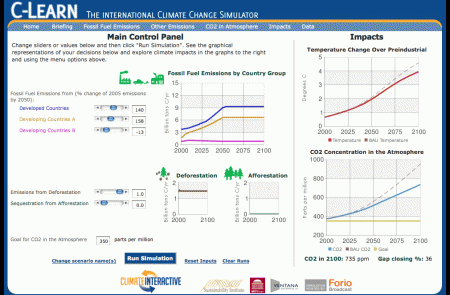
C-LEARN is live
Climate Interactive has the story.
Try it yourself, or see it in action in an interactive webinar on June 3rd.
Another Look at Limits to Growth
I was just trying to decide whether I believed what I said recently, that the current economic crisis is difficult to attribute to environmental unsustainability. While I was pondering, I ran across this article by Graham Turner on the LtG wiki entry, which formally compares the original Limits runs to history over the last 30+ years. A sample:
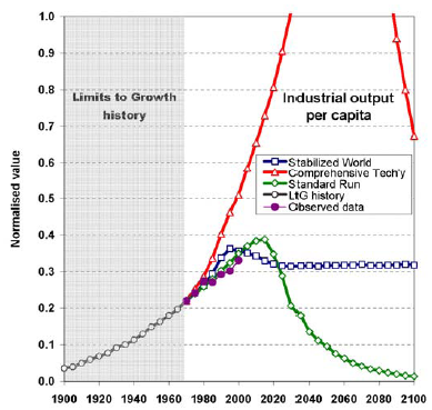
The report basically finds what I’ve argued before: that history does not discredit Limits.
Cash for Clunkers Illusion
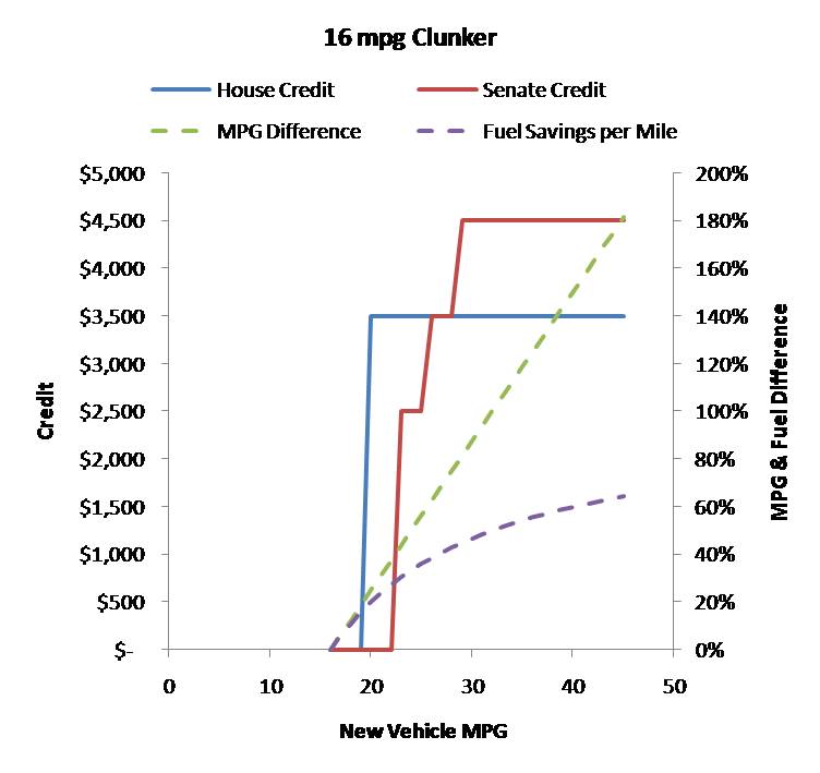
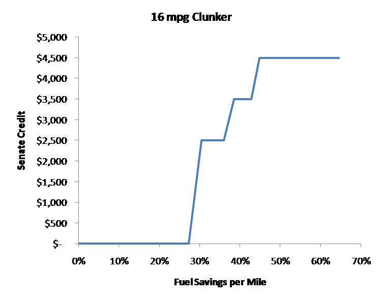
The proposed cash-for-clunkers program strikes me as yet another marginally effective policy that coulda been a contenda. In the aggregate, getting rid of clunkers doesn’t do much good, because fleet fuel economy has not improved in the last decade (at least current proposals don’t target age). Only transaction costs prevent wholesale shuffling of vehicles to yield advantageous trades that don’t improve total fleet efficiency. Clunkers that are cheap enough to scrap for a tax credit likely have low utilization; if they’re replaced by a new vehicle with high utilization, that doesn’t help. It might be a good stimulus for automakers, but you can’t get to a low-carbon future by subsidizing new carbon-consuming capital. The credits proposed in House and Senate versions appear to suffer from MPG illusion:
How many climate and energy policies that don’t work do we really need?
Drinking too much CAFE?
The NHTSA and EPA have announced upgraded vehicle efficiency and emissions standards. The CAFE standard will go up to 35.5 mpg by 2016, and a 250 gCO2/mile emissions limit will be phased in by the same time. My bottom line: I strongly favor efficient, low-emissions vehicles, but I think command and control legislation is a lousy way to get them. The approach works, but there’s a lot of collateral damage and inefficiency, and opponents of climate and energy policy are given lots to complain about. I’m happy about the new standard, but I look forward to the day when it’s not needed, because other signals are working properly.
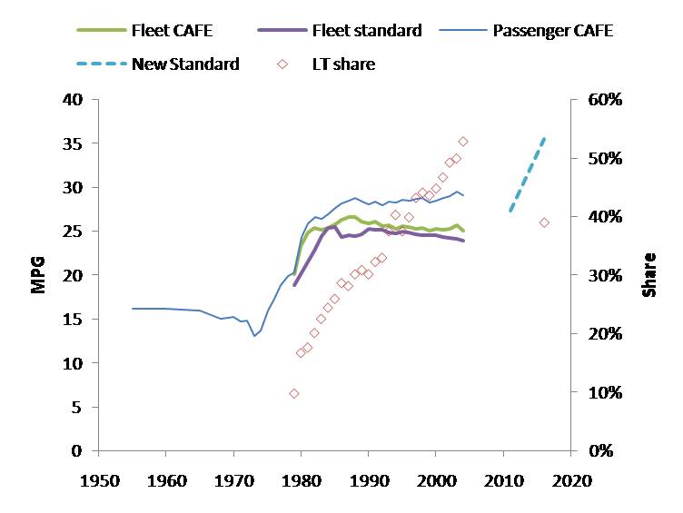
First, as background, here’s the new CAFE standard in perspective:
Source: NHTSA Update: I’ve corrected the data, which inadvertently showed light trucks rather than the total fleet. Notice two things: first, the total fleet corporate average fuel economy (CAFE) and standard has been declining, due to the penetration of light trucks (including SUVs). Second, if the 2016 standard of 35.5 mpg is to be met, given car and truck standards of 39 and 30 mpg, the share of light trucks will have to fall below 40%, though extrapolation of the historic trend would carry it nearer to 70%. It’s not clear how the allocation of footprint, credit trading and other features of CAFE will cause this to occur.
Like other portfolio standards, CAFE creates an internal tax and subsidy system within regulated entities. To meet its portfolio requirement, a manufacturer has to (internally) subsidize high-mpg vehicles and tax low-mpg vehicles. This hidden tax structure is problematic in several ways. There’s no guarantee that it yields an implicit price of carbon or energy that’s consistent across manufacturers, or consistent with fuel taxes and the price of emissions under a cap & trade system. Subsidizing the high-mpg vehicles is a bad idea: they’re more efficient, but they aren’t zero-emissions, and they still contribute to congestion and other side effects of driving – why would we want more of that? It’s even possible, if high-mpg drivers are price elastic (think kids) and low-mpg drivers are less so (think luxury SUV buyers, that the standard increases the total fleet and thus offsets some of its intended fuel savings.
The basic incentive problem with portfolio standards is compounded by the division of CAFE into domestic and imported, car and light truck stovepipes. Separate, non-fungible standards for cars and trucks create a bizarre allocation of property rights – in effect, light truck buyers are endowed with more property rights to consume or emit, irrespective of the fact that GHGs and other externalities do the same harm regardless of who’s responsible. Recently, a new footprint methodology effectively generalized the car/truck distinction to an allocation based on vehicle footprint. This makes about as much sense as subsidizing bullets for felons. It sounds like the stovepipe issue will be relaxed a bit with the new regulations, because credits will become tradable, but just wait until GM truck buyers figure out that they’re paying a tax that goes to subsidize Honda Fits. Still, there’s no clear reason why the ratio of car:truck standards should be 39:30, or why the car standard should go up 30% while the truck standard goes up 15%.
Applying the standard to vehicles at the point of purchase, rather than as they are used (through fuel taxes or VMT tolls) fails to recognize that most of the negative side effects of a vehicle arise from its use, not from its existence. With fuel, emissions, and congestion charges, people could be free to make their own tradeoffs among efficiency, vehicle utilization, and capabilities like cargo capacity. Standards basically ignore diversity in usage patterns, and shoehorn everyone into the same mold. Remember that, while a driver-only Chevy Suburban is ridiculous, a full one moves people almost as efficiently as a full Prius, and 3x more efficiently than a driver-only Prius.
Once efficient vehicles are on the road, the rebound effect crops up. CAFE lowers the cost of driving, so in the absence of a fuel or emissions price signal, people will drive, consume, and emit more. Over the past three decades, miles traveled per vehicle and the total fleet size have dramatically increased. As a result, fuel consumption per vehicle has been essentially constant, in spite of efficiency improvements, and total fuel consumption is up. The increase in driving is likely due mostly to cheap fuel, sprawl, and increasing population and wealth, but efficiency mandates have probably contributed as well.
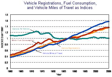
Source: DOT FHWA
In addition to incentive problems, there are lots of implementation issues in CAFE. Over the years, there’s been a lot of tinkering with the standard (like the footprint methodology) designed to restore flexibility you’d have automatically with a market-based mechanism or to achieve other policy goals. As a result, the rules have become rather opaque. CAFE measurements use EPA’s old fuel economy measurement methods, which were abandoned for window stickers a few years ago because they didn’t match reality. There are various loopholes, including one that permits vehicles to claim 4x mpg if they can consume alternate fuels, even if those fuels are not widely distributed (E85).
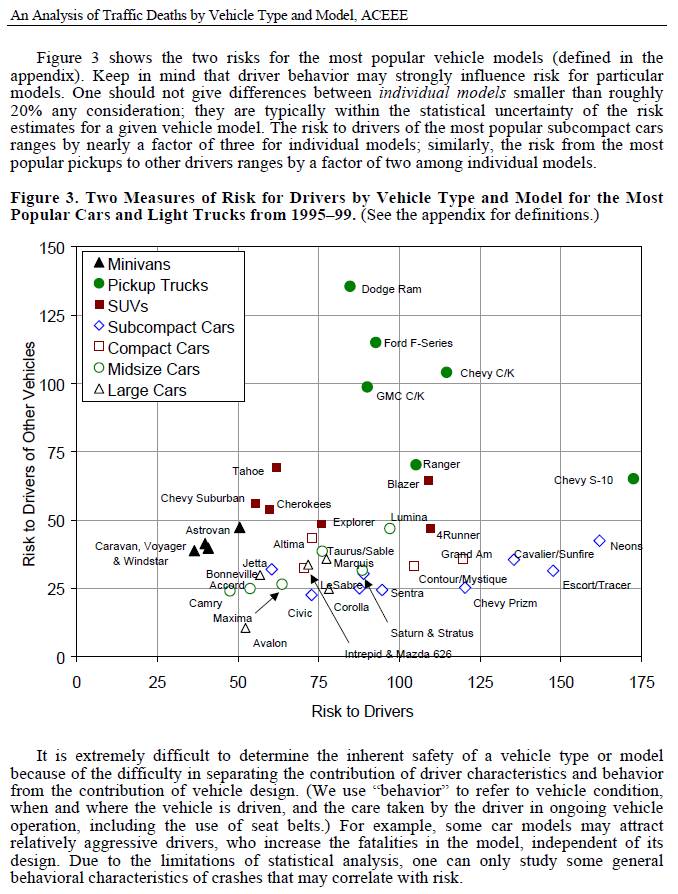
The critics of CAFE mostly don’t focus on the incentive and transparency problems above. Instead, they hammer on two ideas: that CAFE costs jobs, and forces us all to die in tiny boxes. Those make good sound bites, but neither argument is particularly strong. Seeking Alpha has a nice look at the economics. The safety issue is harder to wrap your arms around. Basically, the critics argue that, in a collision, weight is good. From the perspective of a single driver, that’s largely true, because the distribution of changes in momentum in a collision is strongly proportional to the relative mass of the objects involved. However, that’s an arms race, with no aggregate benefit: when everyone else drives a 4952 lb Dodge Ram 1500, you need a 6342 lb Ram 3500 to stay ahead. With safety as the only consideration, soon we’d all be driving locomotives and M1 tanks. The real social benefit of weight is that it’s correlated with size, which (all else equal) lowers the acceleration passengers face in a collision, but the size-weight correlation is intermediated by technology, which governs the strength of a passenger compartment and the aggressiveness of a vehicle chassis against other vehicles.
In that respect, CAFE’s car-light truck distinction and footprint methodology probably has been damaging, because it has encouraged the spread of heavy SUVs on ladder frames, as can be seen in the first figure. Those vehicles impose disproportionate risk on others:
Source: Marc Ross UMich, Tom Wenzel LBNL, An Analysis of Traffic Deaths by Vehicle Type and Model, ACEE Report #T012, March 2002.
There are many ways to achieve safety without simply adding mass: good design, better materials, restraints, lower speeds, and less beer on Saturday night all help. If we had a vehicle energy and emissions policy that permitted broader tradeoffs, I’m sure we could arrive at a more efficient system with better aggregate safety than we have now.
In spite of its many problems, I’ll take CAFE – it’s better than nothing, and there’s certainly no technical obstacle to meeting the new standards (be prepared for lots of whining though). Alternatives will take a while to construct, so by wingwalker’s rule we should hang onto what we have for the moment. But rather than pushing the standards approach to its inevitable breakdown point, I think we should be pursuing other options: get a price on carbon, and any other externalities we care about (congestion tolls and pay-at-the-pump insurance are good examples). Then work on zoning, infrastructure, and other barriers to efficiency, mode shifting, and VMT reduction. With the fundamental price signals aligned with the goals, it should be easier to push things in the right direction.
Dancing Sandhills
Too busy to write much lately, but here’s a nice show put on by a pair of cranes in our pasture yesterday:

These are very big birds. Last year my wife & kids found one that had been injured by a collision with a power line. We took it to MT Fish & Wildlife’s rehab center. Catching an unhappy bird with a beak as long as your hand and wings longer than your arms is no picnic! Unfortunately he didn’t make it, and we spent the rest of the season hearing the mournful calls of his mate. Still, it was a privilege to see such a magnificent bird up close.
Setting Up Vensim
I’m trying to adapt to the new tabbed interface in Office 2007. So far, all those pretty buttons seem like a hindrance. Vensim, on the other hand, is a bit too austere. I’ve just installed version 5.9 (check it out, and while you’re at it see the new Ventana site); my setup follows. Note that this only applies to advanced versions of Vensim.
First, I allow the equation editor to “accept enter” – I like to be able to add line breaks to equations (and hate accidentally dismissing the editor with an <enter>). You can do this anyway with <ctl><enter>, but I prefer it this way.

Low-Carbon Climate Policy
Drew Jones of SI just ran a climate policy exercise in Croatia from his desk in NC. Sure, it takes some carbon to keep the servers humming, but a lot less than for a transatlantic flight. Aviation is often regarded as essential to a connected world … but what if it’s not?
Reality-free Cap and Trade?
Over at Prometheus, Roger Pielke picks on Nancy Pelosi:
Speaker Nancy Pelosi (D-CA) adds to a long series of comments by Democrats that emphasize cost as a crucial criterion for evaluating cap and trade legislation, and specifically, that there should be no costs:
‘There should be no cost to the consumer,’ House Speaker Nancy Pelosi (D., Calif.) said Wednesday. She vowed the legislation would ‘make good on that’ pledge.
Of course, cost-free cap and trade defeats the purpose of cap and trade which is to raise the costs of energy, …
Pelosi’s comment sounds like fantasy, but it’s out of context. If you read the preceding paragraph in the linked article, it prefaces the quote with:
Top House Democrats are also considering a proposal to create a second consumer rebate to help lower- and middle-income families offset the higher energy costs of the cap-and-trade program.
It sounds to me like Pelosi could be talking specifically about net cost to low- and middle-income consumers. It’s hard to get a handle on what people are really talking about because the language used is so imprecise. “Cost” gets used to mean net cost of climate policy, outlays for mitigation capital, net consumer budget effects, energy or energy service expenditures, and energy or GHG prices. So, “no cost” cap and trade could mean a variety of things:
Continue reading “Reality-free Cap and Trade?”
