
The formula behind the recent tariffs has spawned a lot of analysis, presumably because there’s plenty of foolishness to go around. Stand Up Maths has a good one:
I want to offer a slightly different take.
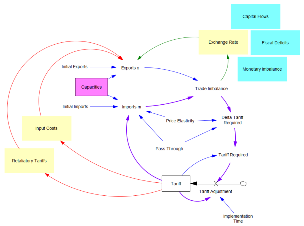
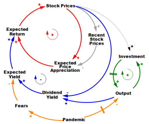
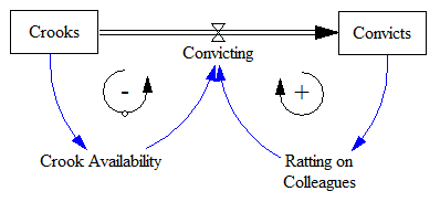
What the tariff formula is proposing is really a feedback control system. The goal of the control loop is to extinguish trade deficits (which the administration mischaracterized as “tariffs other countries charge us”). The key loop is the purple one, which establishes the tariff required to achieve balance:
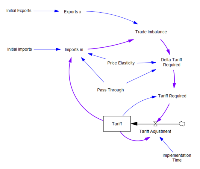 The Tariff here is a stock, because it’s part of the state of the system – a posted price that changes in response to an adjustment process. That process isn’t instantaneous, though it seems that the implementation time is extremely short recently.
In this simple model, delta tariff required is the now-famous formula. There’s an old saw, that economics is the search for an objective function that makes revealed behavior optimal. There’s something similar here, which is discovering the demand function for imports m that makes the delta tariff required correct. There is one:
Imports m = Initial Imports*(1-Tariff*Pass Through*Price Elasticity)
With that, the loop works exactly as intended: the tariff rises to the level predicted by the initial delta, and the trade imbalance is extinguished:

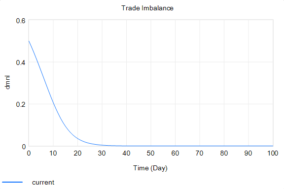 So in this case, the model produces the desired behavior, given the assumptions. It just so happens that the assumptions are really dumb.
You could quibble with the functional form and choice of parameters (which the calculation note sources from papers that don’t say what they’re purported to say). But I think the primary problem is omitted structure.
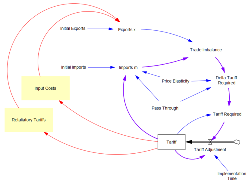
First, in the original model, exports are invariant. That’s obviously not the case, because (a) the tariff increases domestic costs, and therefore export prices, and (b) it’s naive to expect that other countries won’t retaliate. The escalation with China is a good example of the latter.
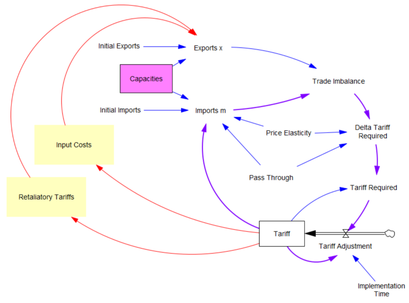
Second, the prevailing mindset seems to be that trade imbalances can adjust quickly. That’s bonkers. The roots of imbalances are structural, and baked in to the capacity of industries to produce and transport particular mixes of goods (pink below). Turning over the capital stocks behind those capacities takes years. Changing the technology and human capital involved might take even longer. A whole industrial ecosystem can’t just spring up overnight.
Third, in theory exchange rates are already supposed to be equilibrating trade imbalances, but they’re not. I think this is because they’re tied up with monetary and physical capital flows that aren’t in the kind of simple Ricardian barter model the administration is assuming. Those are potentially big issues, for which there isn’t good agreement about the structure.
I think the problem definition, boundary and goal of the system also need to be questioned. If we succeed in balancing trade, other countries won’t be accumulating dollars and plowing them back into treasuries to finance our debt. What will the bond vigilantes do then? Perhaps we should be looking to get our own fiscal house in order first.
Lately I’ve been arguing for a degree of predictability in some systems. However, I’ve also been arguing that one should attempt to measure the potential predictability of the system. In this case, I think the uncertainties are pretty profound, the proposed model has zero credibility, and better models are elusive, so the tariff formula is not predictive in any useful way. We should be treading carefully, not swinging wildly at a pinata where the candy is primarily trading opportunities for insiders.


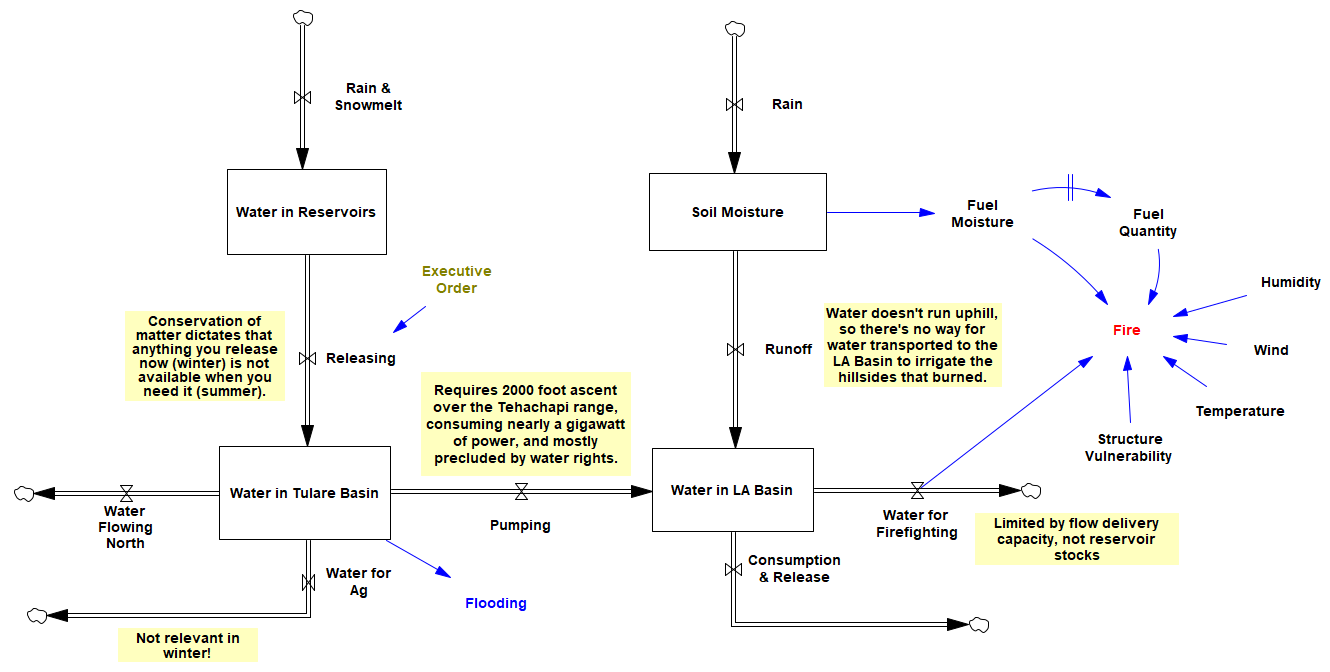


 It seems plausible to compare investment and consumption, until you look at the system structure: