The other bathtubs – population

I’ve written quite a bit about bathtub dynamics here. I got the term from “Cloudy Skies” and other work by John Sterman and Linda Booth Sweeney.

We report experiments assessing people’s intuitive understanding of climate change. We presented highly educated graduate students with descriptions of greenhouse warming drawn from the IPCC’s nontechnical reports. Subjects were then asked to identify the likely response to various scenarios for CO2 emissions or concentrations. The tasks require no mathematics, only an understanding of stocks and flows and basic facts about climate change. Overall performance was poor. Subjects often select trajectories that violate conservation of matter. Many believe temperature responds immediately to changes in CO2 emissions or concentrations. Still more believe that stabilizing emissions near current rates would stabilize the climate, when in fact emissions would continue to exceed removal, increasing GHG concentrations and radiative forcing. Such beliefs support wait and see policies, but violate basic laws of physics.

The climate bathtubs are really a chain of stock processes: accumulation of CO2 in the atmosphere, accumulation of heat in the global system, and accumulation of meltwater in the oceans. How we respond to those, i.e. our emissions trajectory, is conditioned by some additional bathtubs: population, capital, and technology. This post is a quick look at the first.

I’ve grabbed the population sector from the World3 model. Regardless of what you think of World3’s economics, there’s not much to complain about in the population sector. It looks like this:
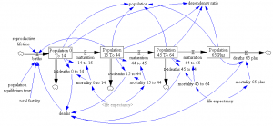
World3 population sector

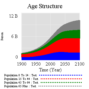
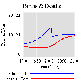
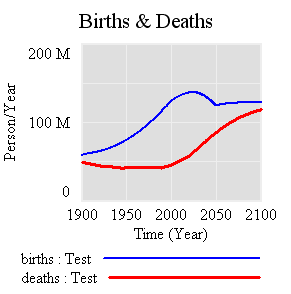
People are categorized into young, reproductive age, working age, and older groups. This 4th order structure doesn’t really capture the low dispersion of the true calendar aging process, but it’s more than enough for understanding the momentum of a population. If you think of the population in aggregate (the sum of the four boxes), it’s a bathtub that fills as long as births exceed deaths. Roughly tuned to history and projections, the bathtub fills until the end of the century, but at a diminishing rate as the gap between births and deaths closes:

Births & Deaths

Age Structure

Notice that the young (blue) peak in 2030 or so, long before the older groups come into near-equilibrium. An aging chain like this has a lot of momentum. A simple experiment makes that momentum visible. Suppose that, as of 2010, fertility suddenly falls to slightly below replacement levels, about 2.1 children per couple. (This is implemented by changing the total fertility lookup). That requires a dramatic shift in birth rates:

Births & deaths in replacement experiment

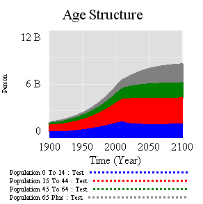
However, that doesn’t translate to an immediate equilibrium in population. Instead,population still grows to the end of the century, but reaching a lower level. Growth continues because the aging chain is internally out of equilibrium (there’s also a small contribution from ongoing extension of life expectancy, but it’s not important here). Because growth has been ongoing, the demographic pyramid is skewed toward the young. So, while fertility is constant per person of child-bearing age, the population of prospective parents grows for a while as the young grow up, and thus births continue to increase. Also, at the time of the experiment, the elderly population has not reached equilibrium given rising life expectancy and growth down the chain.

Age Structure - replacement experiment

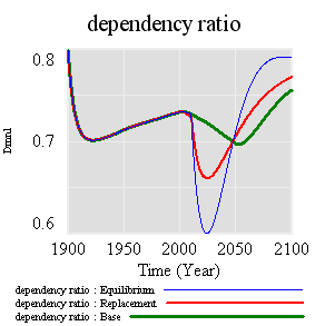
Achieving immediate equilibrium in population would require a much more radical fall in fertility, in order to bring births immediately in line with deaths. Implementing such a change would require shifting yet another bathtub – culture – in a way that seems unlikely to happen quickly. It would also have economic side effects. Often, you hear calls for more population growth, so that there will be more kids to pay social security and care for the elderly. However, that’s not the first effect of accelerated declines in fertility. If you look at the dependency ratio (the ratio of the very young and old to everyone else), the first effect of declining fertility is actually a net benefit (except to the extent that young children are intrinsically valued, or working in sweatshops making fake Gucci wallets):

Dependency ratio

The bottom line of all this is that, like other bathtubs, it’s hard to change population quickly, partly because of the physics of accumulation of people, and partly because it’s hard to even talk about the culture of fertility (and the economic factors that influence it). Population isn’t likely to contribute much to meeting 2020 emissions targets, but it’s part of the long game. If you want to win the long game, you have to anticipate long delays, which means getting started now.

The model (Vensim binary, text, and published formats): World3 Population.vmf World3-Population.mdl World3 Population.vpm
Data variables or lookups?

System dynamics models handle data in various ways. Traditionally, time series inputs were embedded in so-called lookups or table functions (DYNAMO users will remember TABHL for example). Lookups are really best suited for graphically describing a functional relationship. They’re really cool in Vensim’s Synthesim mode, where you can change the shape of a relationship and watch the behavioral consequence in real time.

Time series data can be thought of as f(time), so lookups are often used as data containers. This works decently when you have a limited amount of data, but isn’t really suitable for industrial strength modeling. Those familiar with advanced versions of Vensim may be aware of data variables – a special class of equation designed for working with time series data rather than endogenous structure.

There are many advantages to working with data variables:

  • You can tell where there are data points, visually on graphs or in equations by testing for a special :NA: value indicating missing data.
  • You can easily determine the endpoints of a series and vary the interpolation method.
  • Data variables execute outside the main sequence of the model, so they don’t bog down optimization or Synthesim.
  • It’s easier to use diverse sources for data (Excel, text files, ODBC, and other model runs) with data variables.
  • You can see the data directly, without creating extra variables to manipulate it.
  • In calibration optimization, data variables contribute to the payoff only when it makes sense (i.e., when there’s real data).

I think there are just two reasons to use lookups as containers for data:

  • You want compatibility with Vensim PLE (e.g., for students)
  • You want to expose the data stream to quick manipulation in a user interface

Otherwise, go for data variables. Occasionally, there are technical limitations that make it impossible to accomplish something with a data equation, but in those cases the solution is generally a separate data model rather than use of lookups. More on that soon.

Tableau + Vensim = ?

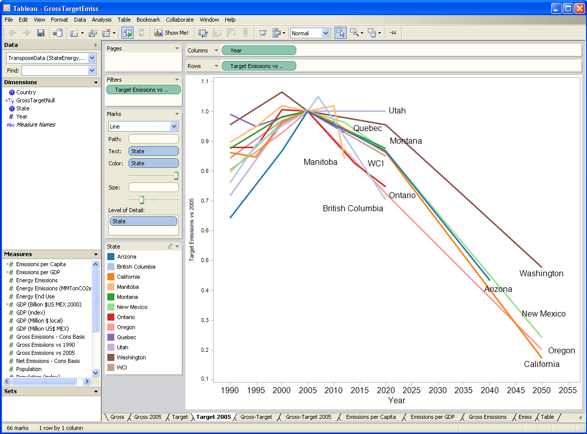
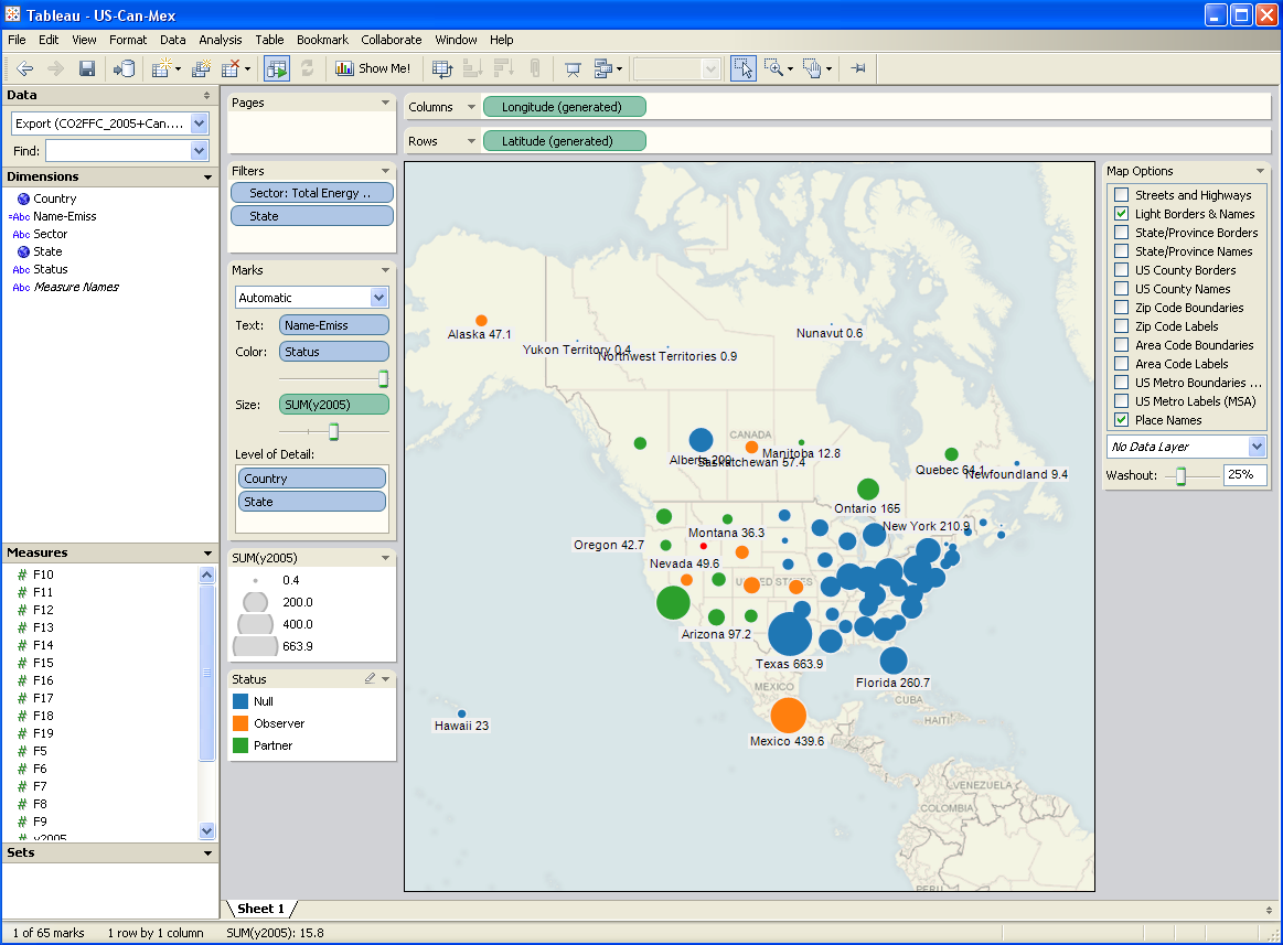
I’ve been testing a data mining and visualization tool called Tableau. It seems to be a hot topic in that world, and I can see why. It’s a very elegant way to access large database servers, slicing and dicing many different ways via a clean interface. It works equally well on small datasets in Excel. It’s very user-friendly, though it helps a lot to understand the relational or multidimensional data model you’re using. Plus it just looks good. I tried it out on some graphics I wanted to generate for a collaborative workshop on the Western Climate Initiative. Two examples:

Tableau state province emissions

Tableau map

A year or two back, I created a tool, based on VisAD, that uses the Vensim .dll to do multidimensional visualization of model output. It’s much cruder, but cooler in one way: it does interactive 3D. Anyway, I hoped that Tableau, used with Vensim, would be a good replacement for my unfinished tool.

After some experimentation, I think there’s a lot of potential, but it’s not going to be the match made in heaven that I hoped for. Cycle time is one obstacle: data can be exported from Vensim in .tab, .xls, or a relational table format (known as “data list” in the export dialog). If you go the text route (.tab), you have to pass through Excel to convert it to .csv, which Tableau reads. If you go the .xls route, you don’t need to pass through Excel, but may need to close/open the Tableau workspace to avoid file lock collisions. The relational format works, but yields a fundamentally different description of the data, which may be harder to work with.

I think where the pairing might really shine is with model output exported to a database server via Vensim’s ODBC features. I’m lukewarm on doing that with relational databases, because they just don’t get time series. A multidimensional database would be much better, but unfortunately I don’t have time to try at the moment.

Whether it works with models or not, Tableau is a nice tool, and I’d recommend a test drive.

http://www.ssec.wisc.edu/~billh/visad.html

Good modeling practices

Some thoughts I’ve been collecting, primarily oriented toward system dynamics modeling in Vensim, but relevant to any modeling endeavor:

  • Know why you’re building the model.
    • If you’re targeting a presentation or paper, write the skeleton first, so you know how the model will fill in the answers as you go.
  • Organize your data first.
    • No data? No problem. But surely you have some reference mode in mind, and some constraints on behavior, at least in extreme conditions.
    • In Vensim, dump it all into a spreadsheet, database, or text file and import it into a data model, using the Model>Import data… feature, GET XLS DATA functions, or ODBC.
    • Don’t put data in lookups (table functions) unless you must for some technical reason; they’re a hassle to edit and update, and lousy at distinguishing real data points from interpolation.
  • Keep a lab notebook. An open word processor while you work is useful. Write down hypotheses before you run, so that you won’t rationalize surprises. Continue reading “Good modeling practices”

Setting Up Vensim

I’m trying to adapt to the new tabbed interface in Office 2007. So far, all those pretty buttons seem like a hindrance. Vensim, on the other hand, is a bit too austere. I’ve just installed version 5.9 (check it out, and while you’re at it see the new Ventana site); my setup follows. Note that this only applies to advanced versions of Vensim.

First, I allow the equation editor to “accept enter” – I like to be able to add line breaks to equations (and hate accidentally dismissing the editor with an <enter>). You can do this anyway with <ctl><enter>, but I prefer it this way.

vensim1.png

Continue reading “Setting Up Vensim”

Sea Level Rise – VI – The Bottom Line (Almost)

The pretty pictures look rather compelling, but we’re not quite done. A little QC is needed on the results. It turns out that there’s trouble in paradise:

  1. the residuals (modeled vs. measured sea level) are noticeably autocorrelated. That means that the model’s assumed error structure (a white disturbance integrated into sea level, plus white measurement error) doesn’t capture what’s really going on. Either disturbances to sea level are correlated, or sea level measurements are subject to correlated errors, or both.
  2. attempts to estimate the driving noise on sea level (as opposed to specifying it a priori) yield near-zero values.

#1 is not really a surprise; G discusses the sea level error structure at length and explicitly address it through a correlation matrix. (It’s not clear to me how they handle the flip side of the problem, state estimation with correlated driving noise – I think they ignore that.)

#2 might be a consequence of #1, but I haven’t wrapped my head around the result yet. A little experimentation shows the following:

driving noise SD equilibrium sensitivity (a, mm/C) time constant (tau, years) sensitivity (a/tau, mm/yr/C)
~ 0 (1e-12) 94,000 30,000 3.2
1 14,000 4400 3.2
10 1600 420 3.8

Intermediate values yield values consistent with the above. Shorter time constants are consistent with expectations given higher driving noise (in effect, the model is getting estimated over shorter intervals), but the real point is that they’re all long, and all yield about the same sensitivity.

The obvious solution is to augment the model structure to include states representing persistent errors. At the moment, I’m out of time, so I’ll have to just speculate what that might show. Generally, autocorrelation of the errors is going to reduce the power of these results. That is, because there’s less information in the data than meets the eye (because the measurements aren’t fully independent), one will be less able to discriminate among parameters. In this model, I seriously doubt that the fundamental banana-ridge of the payoff surface is going to change. Its sides will be less steep, reflecting the diminished power, but that’s about it.

Assuming I’m right, where does that leave us? Basically, my hypotheses in Part IV were right. The likelihood surface for this model and data doesn’t permit much discrimination among time constants, other than ruling out short ones. R’s very-long-term paleo constraint for a (about 19,500 mm/C) and corresponding long tau is perfectly plausible. If anything, it’s more plausible than the short time constant for G’s Moberg experiment (in spite of a priori reasons to like G’s argument for dominance of short time constants in the transient response). The large variance among G’s experiment (estimated time constants of 208 to 1193 years) is not really surprising, given that large movements along the a/tau axis are possible without degrading fit to data. The one thing I really can’t replicate is G’s high sensitivities (6.3 and 8.2 mm/yr/C for the Moberg and Jones/Mann experiments, respectively). These seem to me to lie well off the a/tau ridgeline.

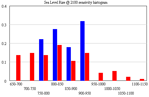
The conclusion that IPCC WG1 sea level rise is an underestimate is robust. I converted Part V’s random search experiment (using the optimizer) into sensitivity files, permitting Monte Carlo simulations forward to 2100, using the joint a-tau-T0 distribution as input. (See the setup in k-grid-sensi.vsc and k-grid-sensi-4x.vsc for details). I tried it two ways: the 21 points with a deviation of less than 2 in the payoff (corresponding with a 95% confidence interval), and the 94 points corresponding with a deviation of less than 8 (i.e., assuming that fixing the error structure would make things 4x less selective). Sea level in 2100 is distributed as follows:

Sea level distribution in 2100

The sample would have to be bigger to reveal the true distribution (particularly for the “overconfident” version in blue), but the qualitative result is unlikely to change. All runs lie above the IPCC range (.26-.59), which excludes ice dynamics.

Continue reading “Sea Level Rise – VI – The Bottom Line (Almost)”

Sea Level Rise Models – V

To take a look at the payoff surface, we need to do more than the naive calibrations I’ve used so far. Those were adequate for choosing constant terms that aligned the model trajectory with the data, given a priori values of a and tau. But that approach could give flawed estimates and confidence bounds when used to estimate the full system.

Elaborating on my comment on estimation at the end of Part II, consider a simplified description of our model, in discrete time:

(1) sea_level(t) = f(sea_level(t-1), temperature, parameters) + driving_noise(t)

(2) measured_sea_level(t) = sea_level(t) + measurement_noise(t)

The driving noise reflects disturbances to the system state: in this case, random perturbations to sea level. Measurement noise is simply errors in assessing the true state of global sea level, which could arise from insufficient coverage or accuracy of instruments. In the simple case, where driving and measurement noise are both zero, measured and actual sea level are the same, so we have the following system:

(3) sea_level(t) = f(sea_level(t-1), temperature, parameters)

In this case, which is essentially what we’ve assumed so far, we can simply initialize the model, feed it temperature, and simulate forward in time. We can estimate the parameters by adjusting them to get a good fit. However, if there’s driving noise, as in (1), we could be making a big mistake, because the noise may move the real-world state of sea level far from the model trajectory, in which case we’d be using the wrong value of sea_level(t-1) on the right hand side of (1). In effect, the model would blunder ahead, ignoring most of the data.

In this situation, it’s better to use ordinary least squares (OLS), which we can implement by replacing modeled sea level in (1) with measured sea level:

(4) sea_level(t) = f(measured_sea_level(t-1), temperature, parameters)

In (4), we’re ignoring the model rather than the data. But that could be a bad move too, because if measurement noise is nonzero, the sea level data could be quite different from true sea level at any point in time.

The point of the Kalman Filter is to combine the model and data estimates of the true state of the system. To do that, we simulate the model forward in time. Each time we encounter a data point, we update the model state, taking account of the relative magnitude of the noise streams. If we think that measurement error is small and driving noise is large, the best bet is to move the model dramatically towards the data. On the other hand, if measurements are very noisy and driving noise is small, better to stick with the model trajectory, and move only a little bit towards the data. You can test this in the model by varying the driving noise and measurement error parameters in SyntheSim, and watching how the model trajectory varies.

The discussion above is adapted from David Peterson’s thesis, which has a more complete mathematical treatment. The approach is laid out in Fred Schweppe’s book, Uncertain Dynamic Systems, which is unfortunately out of print and pricey. As a substitute, I like Stengel’s Optimal Control and Estimation.

An example of Kalman Filtering in everyday devices is GPS. A GPS unit is designed to estimate the state of a system (its location in space) using noisy measurements (satellite signals). As I understand it, GPS units maintain a simple model of the dynamics of motion: my expected position in the future equals my current perceived position, plus perceived velocity times time elapsed. It then corrects its predictions as measurements allow. With a good view of four satellites, it can move quickly toward the data. In a heavily-treed valley, it’s better to update the predicted state slowly, rather than giving jumpy predictions. I don’t know whether handheld GPS units implement it, but it’s possible to estimate the noise variances from the data and model, and adapt the filter corrections on the fly as conditions change.

Continue reading “Sea Level Rise Models – V”

Sea Level Rise Models – IV

So far, I’ve established that the qualitative results of Rahmstorf (R) and Grinsted (G) can be reproduced. Exact replication has been elusive, but the list of loose ends (unresolved differences in data and so forth) is long enough that I’m not concerned that R and G made fatal errors. However, I haven’t made much progress against the other items on my original list of questions:

  • Is the Grinsted et al. argument from first principles, that the current sea level response is dominated by short time constants, reasonable?
  • Is Rahmstorf right to assert that Grinsted et al.’s determination of the sea level rise time constant is shaky?
  • What happens if you impose the long-horizon paleo constraint to equilibrium sea level rise in Rahmstorf’s RC figure on the Grinsted et al. model?

At this point I’ll reveal my working hypotheses (untested so far):

  • I agree with G that there are good reasons to think that the sea level response occurs over multiple time scales, and therefore that one could make a good argument for a substantial short-time-constant component in the current transient.
  • I agree with R that the estimation of long time constants from comparatively short data series is almost certainly shaky.
  • I suspect that R’s paleo constraint could be imposed without a significant degradation of the model fit (an apparent contradiction of G’s results).
  • In the end, I doubt the data will resolve the argument, and we’ll be left with the conclusion that R and G agree on: that the IPCC WGI sea level rise projection is an underestimate.

Continue reading “Sea Level Rise Models – IV”

Sea Level Rise Models – III

Starting from the Rahmstorf (R) parameterization (tested, but not exhaustively), let’s turn to Grinsted et al (G).

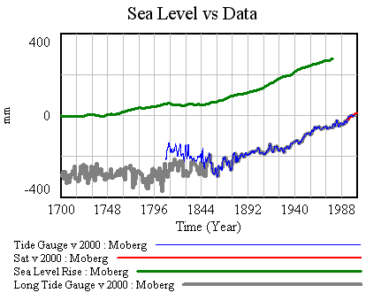
First, I’ve made a few changes to the model and supporting spreadsheet. The previous version ran with a small time step, because some of the tide data was monthly (or less). That wasted clock cycles and complicated computation of residual autocorrelations and the like. In this version, I binned the data into an annual window and shifted the time axes so that the model will use the appropriate end-of-year points (when Vensim has data with a finer time step than the model, it grabs the data point nearest each time step for comparison with model variables). I also retuned the mean adjustments to the sea level series. I didn’t change the temperature series, but made it easier to use pure-Moberg (as G did). Those changes necessitate a slight change to the R calibration, so I changed the default parameters to reflect that.

Now it should be possible to plug in G parameters, from Table 1 in the paper. First, using Moberg: a = 1290 (note that G uses meters while I’m using mm), tau = 208, b = 770 (corresponding with T0=-0.59), initial sea level = -2. The final time for the simulation is set to 1979, and only Moberg temperature data are used. The setup for this is in change files, GrinstedMoberg.cin and MobergOnly.cin.

Moberg, Grinsted parameters

Continue reading “Sea Level Rise Models – III”

Sea Level Rise Models – II

Picking up where I left off, with model and data assembled, the next step is to calibrate, to see whether the Rahmstorf (R) and Grinsted (G) results can be replicated. I’ll do that the easy way, and the right way.

An easy first step is to try the R approach, assuming that the time constant tau is long and that the rate of sea level rise is proportional to temperature (or the delta against some preindustrial equilibrium).

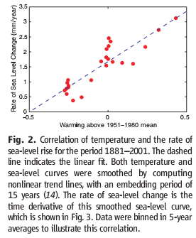
Rahmstorf estimated the temperature-sea level rise relationship by regressing a smoothed rate of sea level rise against temperature, and found a slope of 3.4 mm/yr/C.

Rahmstorf figure 2

Continue reading “Sea Level Rise Models – II”