Modeling to detect data problems

Sometimes the best model is the data, but all data are wrong! A big part of validation is detecting and correcting errors in data.

I’ve recently run across an interesting example. I’m working on Chronic Wasting Disease in deer, which essentially combines an epidemiology model with a deer population model, surrounded by some social and environmental features.

We use data heavily. The model is driven by hunter harvest and targeted removals of deer, which are fairly reliable measurement streams with long histories. We calibrate primarily against surveillance (positive CWD tests) and population data. The surveillance is very noisy because sample sizes are small, but as far as we know it’s fairly free of big systematic problems. The population data is more aggregate and less noisy. It typically looks like this:

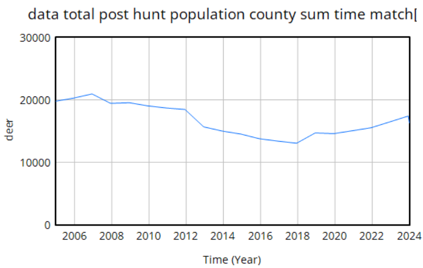
The U-shaped pattern here is intuitively attractive, because it’s doing bathtub dynamics. Population integrates the difference between births and deaths (shaded area, left plot – or really its negative). In reality mortality is declining (due to declining hunting pressure), so a population that declines early, levels off, and later grows is a plausible outcome.

However … it proves difficult to replicate this trajectory with realistic parameters. Part of the problem is that there are two discontinuities:

The first one is real – it’s an EHD outbreak that caused widespread mortality. That can easily be captured in the model with an exogenous event. The second one though turns out to be a change in methods, and that’s the real problem here. This deer “data” isn’t really data, it’s an accounting model with its own assumptions. Really there’s no such thing as pure data – it’s always captured through some kind of process that is effectively a model. But in this case, the model is problematic, because it changed in 2018, and we don’t know how.

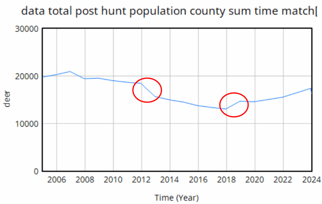
We do know it’s wrong though. Difficulty tuning a model to the data led us look into the details of the age structure, and it’s problematic. Here’s an adjacent county:

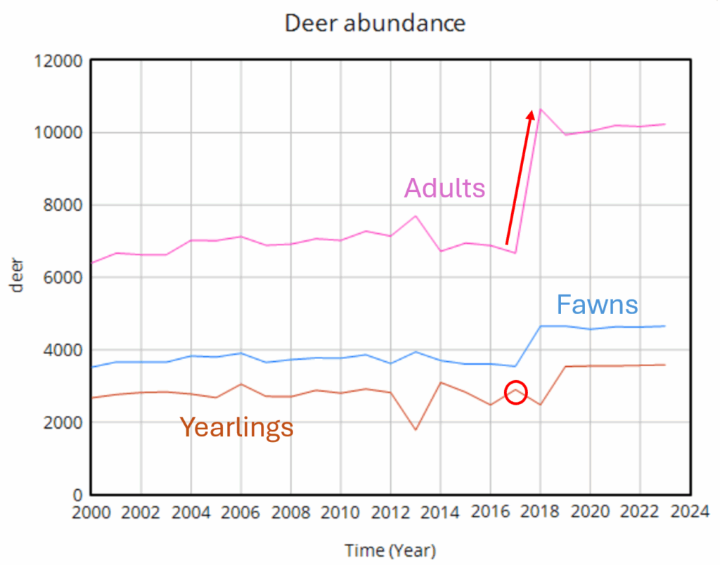
Deer populations have age structures. Fawns are born, in a year they mature into (surprise!) yearlings, and in another year they mature to adults. So this year’s yearlings are next year’s adults. But in the plot above, the increase in the adult data is about 4000 deer (red arrow), while the total yearling population aging into the adult category is about 3000. So the adult trajectory is simply impossible without negative mortality or an alien airdrop of 1000 extra deer into the county. Obviously this is an artifact of the methods change.

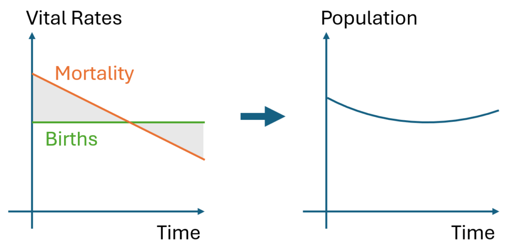
Once you’re aware of the age structure issue, other questionable features of the population data surface. For example, if you impose a one-year birth bonanza on a reduced form model, you see that births can’t produce a simple monotonic jump in population.

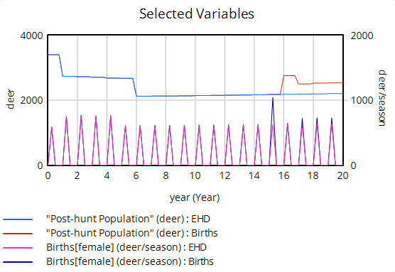
Instead, population spikes up, but falls back almost halfway to its initial level. This is because the spike of new fawns doesn’t immediately produce more births; fawns have a very low birth rate, so they have to mature through yearlings to adults before they make a substantial contribution to future population. Again if you look into the age structure, you can see these effects:

The bottom line is that abrupt increases in population are not very plausible – the dynamics just impose too many constraints.

In this modeling project, that means we’re in a bit of a pickle. Population dynamics have important interactions with CWD, but we don’t have reliable population measurements. The only option left to us is to do a lot of scenario analysis to try to capture the uncertain effects of various plausible trajectories.

Hitching our wagon to the ‘Sick Man of Europe’

Tsar Nicholas I reportedly coined the term “Sick Man of Europe” to refer to the declining Ottoman Empire. Ironically, now it’s Russia that seems sick.

Above shows GDP per capita (constant PPP, World Bank). Here’s how this works. GDP growth is basically from two things: capital accumulation, and technology. There are diminishing returns to capital, so in the long run technology is essentially the whole game. Countries that innovate grow, and those that don’t stagnate.

However, when you’re the technology leader, innovation is hard. There’s a tension between making big technical leaps and falling off a cliff because you picked the wrong one. Since the industrial revolution, this has created a glass ceiling of growth at 1.5-2%/year for the leading countries. That rate has prevailed despite huge waves of technology from railroads to microchips, and at low and high tax rates. If you’re below the ceiling, you can grow faster, because you can imitate rather than innovate, and that entails much less risk of failure.

If you’re below the glass ceiling, you can also fail to grow, because growth is essentially a function of MIN( rule of law, functioning markets, etc. ) that enable innovation or imitation. If you don’t have some basic functioning human and institutional capital, you can’t grow. Unfortunately, human rights don’t seem to be a necessary part of the equation, as long as there’s some basic economic infrastructure. On the other hand, there’s some evidence that equity matters, probably because innovation is a bottom-up evolutionary process.

In the chart above, the US is doing pretty well lately at 1.7%/yr. China has also done very well, at 5.8%, which is actually off their highest growth rates, but it’s substantially due to catch-up effects. South Korea, at about 60% of US GDP/cap, grows a little faster at 2.2% (a couple decades back, they were growing much faster, but have now caught up.

So why is Russia, poorer than S. Korea, doing poorly at only 0.96%/year? The answer clearly isn’t resource endowment, because Russia is massively rich in that sense. I think the answer is rampant corruption and endless war, where the powerful steal the resources that could otherwise be used for innovation, and the state squanders the rest on conflict.

At current rates, China could surpass Russia in just 12 years (though it’s likely that growth will slow). At that point, it would be a vastly larger economy. So why are we throwing our lot in with a decrepit, underperforming nation that finds it easier to steal crypto from Americans than to borrow ideas? I think the US was already at risk from overconcentration of firms and equity effects that destroy education and community, but we’re now turning down a road that leads to a moribund oligarchy.

Modeling Chronic Wasting Disease

I’ve been too busy to post much lately, because I’ve been busy with projects in city energy planning, web interfaces, and chronic wasting disease (CWD) in deer, plus a lot of Vensim and Ventity testing.

I’m hoping to write a little more about CWD, because it’s very interesting (and very nasty). We’ve been very successful at blending Structured Decision Making (SDM) with SD modeling in Wisconsin’s 10-yr plan review. We’ve been able to use models live in a rather diverse stakeholder group, including non-modelers. The model has worked well as a shared thinking tool, triggering some really good discussions, without getting mired in black-box problems.

The video below is from an “under the hood” session that looked into the details of the model for an interested subset of participants, so it’s probably nerdier than other more policy-oriented discussions, but also of greater interest to modelers I hope.

I’ll have more to say about SD in CWD policy and the marriage of SD and SDM soon, I hope.

Crusonia on COVID19

On Saturday I gave a quick introduction to modeling the coronavirus epidemic in a Crusonia livestream, followed by Q&A. We had some really smart people on the call, with lots of interesting ideas to follow up on. I talk a bit about economic tradeoffs, using a speculative extension of my earlier model. One thing that was clearer to me after the discussion than before is just how hamstrung we’ve been by the lack of testing. I think it would not be much of stretch to say that this failure is costing us a billion dollars a day, due to inability to isolate the infected and lack of information for decision making.

The second panelist – Eugene Scarberry – was really interesting, both for his extensive experience in the trenches getting things approved at the FDA, and some good background on ventilators and alternatives, and how to get more of them.

Is coronavirus different in the UK and Italy?

BBC UK writes, Coronavirus: Three reasons why the UK might not look like Italy. They point to three observations about the epidemic so far:

  1. Different early transmission – the UK lags the epidemic in Italy
  2. Italy’s epidemic is more concentrated
  3. More of Italy’s confirmed cases are fatal

I think these speculations are misguided, and give a potentially-disastrous impression that the UK might somehow dodge a bullet without really trying. That’s only slightly mitigated by the warning at the end,

Don’t relax quite yet

Even though our epidemic may not follow Italy’s exactly, that doesn’t mean the UK will escape serious changes to its way of life.

Epidemiologist Adam Kucharski warns against simple comparisons of case numbers and that “without efforts to control the virus we could still see a situation evolve like that in Italy”, even if not necessarily in the next four weeks.

… which should be in red 72-point text right at the top.

Will the epidemic play out differently in the UK? Surely. But it really look qualitatively different? I doubt it, unless the reaction is different.

The fundamental problem is that the structure of a system determines its behavior. A slinky will bounce if you jiggle it, but more fundamentally it bounces because it’s a spring. You can jiggle a brick all you want, but you won’t get much bouncing.

The system of a virus spreading through a population is the same. The structure of the system says that, as long as the virus can infect people faster than they recover, it grows exponentially. It’s inevitable; it’s what a virus does. The only way to change that is to change the structure of the system by slowing the reproduction. That happens when there’s no one left to infect, or when we artificially reduce the infection rate though social distancing, sterilization and quarantine.

A change to the initial timing or distribution of the epidemic doesn’t change the structure at all. The slinky is still a slinky, and the epidemic will still unfold exponentially. Our job, therefore, is to make ourselves into bricks.

The third point, that fatality rates are lower, may also be a consequence of the UK starting from a different state today. In Italy, infections have grown high enough to overwhelm the health care system, which increases the fatality rate. The UK may not be there yet. However, a few doublings of the number of infected will quickly close the gap. This may also be an artifact of incomplete testing and lags in reporting.

Here’s a more detailed explanation:

Coronavirus Containment Reference Mode

I ran across this twitter thread this morning, describing how a focus on border security and containment of existing cases has failed to prevent the takeoff of coronavirus.

Here’s the data on US confirmed cases that goes with it:

US confirmed coronavirus cases, as of 3/2/2019. Source: Johns Hopkins CSSE dashboard, https://gisanddata.maps.arcgis.com/apps/opsdashboard/index.html#/bda7594740fd40299423467b48e9ecf6

It’s easy to see how this behavior could lure managers into a self-confirming attributions trap. After a surge of imports, they close the borders. Cases flatten. Problem solved. Why go looking for trouble?

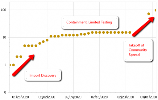
The problem is that containment alone doesn’t work, because the structure of the system defeats it. You can’t intercept every infected person, because some are exposed but not yet symptomatic, or have mild cases. As soon as a few of these people slip into the wild, the positive loops that drive infection operate as they always have. Once the virus is in the wild, it’s essential to change behavior enough to lower its reproduction below replacement.