Thyroid Dynamics: Noise

A couple weeks ago I wrote about the perceptual challenges of managing thyroid stimulating hormone (TSH), which has an exponential response to the circulating thyroid hormones (T3 & T4) you’d actually like to control.

Another facet of the thyroid control problem is noise. Generally, uncertainty in measurements is not made available to users. For example, the lab results reported by MyChart have no confidence bounds: If you start looking for information on these tests, you’ll usually find precision estimates that sound pretty good – typically 5 to 7% error. (Example.) However, this understates the severity of the problem.

It’s well known that individual variation in the TSH<->T3,T4 setpoint is large, and the ATA guidelines mention this, if you read the detailed discussion. However, this is presented as a reason for the superiority of TSH measurements, “The logarithmic relationship between TSH and thyroid hormone bestows sensitivity: even if circulating T3 and T4 are in the normal range, it cannot be assumed that the subject is euthyroid. The interindividual ranges for T3 and T4 are much broader than the individual variance (), such that measuring T3 and T4 is a suboptimal way to assess thyroid status.” The control implications of variation over time within an individual are not mentioned.

The issue we face in our N=1 sample is unexplained longitudinal variation around the setpoint. In our data, this is HUGE. At a given dose, even during a long period of stability, variation in TSH is not 10%; it’s a factor of 10.

Now consider the problem facing a doc trying to titrate your dose in a 30-minute visit. They tested your TSH, and it’s 4, or .4, right at the high or low end o the recommended range. Should they adjust the dose? (The doc’s problem is actually harder than the data presented above suggests, because they never see this much data – changes in providers, labs and systems truncate the available information to just a few points.) In our experience, 3 out of 5 doctors do change the dose, even though the confidence bounds on these measurements are probably big enough to sail the Exxon Valdez through.

There is at last a paper that tackles this issue:

Individuals exhibit fluctuations in the concentration of serum thyroid-stimulating hormone (TSH) over time. The scale of these variations ranges from minutes to hours, and from months to years. The main factors contributing to the observed within-person fluctuations in serum TSH comprise pulsatile secretion, circadian rhythm, seasonality, and ageing.

I think the right response is actually the byline of this blog: don’t just do something, stand there! If one measurement potentially has enormous variation, the first thing you should probably do is leave the dose alone and retest after a modest time. On several occasions, we have literally begged for such a retest, and been denied.

The consequence of test aversion is that we have only 20 data points over 8 years, and almost none in close proximity to one another. That makes it impossible to determine whether the variation we’re seeing is measurement error (blood draw or lab methods), fast driving noise (circadian effects), or slow trends (e.g., seasonal). I’ve been fitting models to the data for several years, but this sparsity and uncertainty gives the model fits. Here’s an example:

At the highlighted point (and half a dozen others), the model finds the data completely inexplicable. The Kalman filter moves the model dramatically towards the data (the downward spike in the red curve), but only about halfway, because the estimate yields both high measurement error and high driving noise in TSH. Because the next measurement doesn’t occur for 4 months, there’s no way to sort out which is which.

This extreme noise, plus nonlinearity previously mentioned, is really a perfect setup for errors in dose management. I’ll describe one or two in a future post.

Climate Causality Confusion

A newish set of papers (1. Theory (preprint); 2. Applications (preprint); 3. Extension) is making the rounds on the climate skeptic sites, with – ironically – little skepticism applied.

The claim is bold:

… According to the commonly assumed causality link, increased [CO2] causes a rise in T. However, recent developments cast doubts on this assumption by showing that this relationship is of the hen-or-egg type, or even unidirectional but opposite in direction to the commonly assumed one. These developments include an advanced theoretical framework for testing causality based on the stochastic evaluation of a potentially causal link between two processes via the notion of the impulse response function. …. All evidence resulting from the analyses suggests a unidirectional, potentially causal link with T as the cause and [CO2] as the effect.

Galileo complex seeps in when the authors claim that absence of correlation or impulse response from CO2 -> temperature proves absence of causality:

Clearly, the results […] suggest a (mono-directional) potentially causal system with T as the cause and [CO2] as the effect. Hence the common perception that increasing [CO2] causes increased T can be excluded as it violates the necessary condition for this causality direction.

Unfortunately, these claims are bogus. Here’s why.

The authors estimate impulse response functions between CO2 and temperature (and back), using the following formalism:


where g(h) is the response at lag h. As the authors point out, if

the IRF is zero for every lag except for the specific lag 0, then Equation (1) becomes y(t)=bx(t-h0) +v(t). This special case is equivalent to simply correlating  y(t) with x(t-h0) at any time instance . It is easy to find (cf. linear regression) that in this case the multiplicative constant is the correlation coefficient of y(t) and  x(t-h0) multiplied by the ratio of the standard deviations of the two processes.

Now … anyone who claims to have an “advanced theoretical framework for testing causality” should be aware of the limitations of linear regression. There are several possible issues that might lead to misleading conclusions about causality.

Problem #1 here is bathtub statistics. Temperature integrates the radiative forcing from CO2 (and other things). This is not debatable – it’s physics. It’s old physics, and it’s experimental, not observational. If you question the existence of the effect, you’re basically questioning everything back to the Enlightenment. The implication is that no correlation is expected between CO2 and temperature, because integration breaks pattern matching. The authors purport to avoid integration by using first differences of temperature and CO2. But differencing both sides of the equation doesn’t solve the integration problem; it just kicks the can down the road. If y integrates x, then patterns of the integrals or derivatives of y and x won’t match either. Even worse differencing filters out the signals of interest.

Problem #2 is that the model above assumes only equation error (the term v(t) on the right hand side). In most situations, especially dynamic systems, both the “independent” (a misnomer) and dependent variables are subject to measurement error, and this dilutes the correlation or slope of the regression line (aka attenuation bias), and therefore also the IRF in the authors’ framework. In the case of temperature, the problem is particularly acute, because temperature also integrates internal variability of the climate system (weather) and some of this variability is autocorrelated on long time scales (because for example oceans have long time constants). That means the effective number of data points is a lot less than the 60 years or 720 months you’d expect from simple counting.

Dynamic variables are subject to other pathologies, generally under the heading of endogeneity bias, and related features with similar effects like omitted variable bias. Generalizing the approach to distributed lags in no way mitigates these. The bottom line is that absence of correlation doesn’t prove absence of causation.

Admittedly, even Nobel Prize winners can screw up claims about causality and correlation and estimate dynamic models with inappropriate methods. But causality confusion isn’t really a good way to get into that rarefied company.

I think methods purporting to assess causality exclusively from data are treacherous in general. The authors’ proposed method is provably wrong in some cases, including this one, as is Granger Causality. Even if you have pretty good assumptions, you’ll always find a system that violates them. That’s why it’s so important to take data-driven results with a grain of salt, and look for experimental control (where you can get it) and mechanistic explanations.

One way to tell if you’ve gotten causality wrong is when you “discover” mechanisms that are physically absurd. That happens on a spectacular scale in the third paper:

… we find Δ=23.5 and 8.1 Gt C/year, respectively, i.e., a total global increase in the respiration rate of Δ=31.6 Gt C/year. This rate, which is a result of natural processes, is 3.4 times greater than the CO2 emission by fossil fuel combustion (9.4 Gt C /year including cement production).

To put that in perspective, the authors propose a respiration flow that would put the biosphere about 30% out of balance. This implies a mass flow of trees harvested, soils destroyed, etc. 3.4 times as large as the planetary flow of fossil fuels. That would be about 4 cubic kilometers of wood, for example. In the face of the massive outflow from the biosphere, the 9.4 GtC/yr from fossil fuels went where, exactly? Extraordinary claims require extraordinary evidence, but the authors apparently haven’t pondered how these massive novel flows could be squared with other lines of evidence, like C isotopes, ocean Ph, satellite CO2, and direct estimates of land use emissions.

This “insight” is used to construct a model of the temperature->CO2 process:

In this model, the trend in CO2 is explained almost exclusively by the mean temperature effect mu_v = alpha*(T-T0). That effect is entirely ad hoc, with no basis in the impulse response framework.

How do we get into this pickle? I think the simple answer is that the authors’ specification of the system is incomplete. As above, they define a causal system,

y(t) = ∫g1(h)x(t-h)dh

x(t) = ∫g2(h)y(t-h)dh

where g(.) is an impulse response function weighting lags h and the integral is over h from 0 to infinity (because only nonnegative lags are causal). In their implementation, x and y are first differences, so in their climate example, Δlog(CO2) and ΔTemp. In the estimation of the impulse lag structures g(.), the authors impose nonnegativity and (optionally) smoothness constraints.

A more complete specification is roughly:

Y = A*X + U

dX/dt = B*X + E

where

  • X is a vector of system states (e.g., CO2 and temperature)
  • Y is a vector of measurements (observed CO2 and temperature)
  • A and B are matrices of coefficients (this is a linear view of the system, but could easily be generalized to nonlinear functions)
  • E is driving noise perturbing the state, and therefore integrated into it
  • U is measurement error

My notation could be improved to consider covariance and state-dependent noise, though it’s not really necessary here. Fred Schweppe wrote all this out decades ago in Uncertain Dynamic Systems, and you can now find it in many texts like Stengel’s Optimal Control and Estimation. Dixit and Pindyck transplanted it to economics and David Peterson brought it to SD where it found its way into Vensim as the combination of Kalman filtering and optimization.

How does this avoid the pitfalls of the Koutsoyiannis et al. approach?

  • An element of X can integrate any other element of X, including itself.
  • There are no arbitrary restrictions (like nonnegativity) on the impulse response function.
  • The system model (A, B, and any nonlinear elements augmenting the framework) can incorporate a priori structural knowledge (e.g., physics).
  • Driving noise and measurement error are recognized and can be estimated along with everything else.

Does the difference matter? I’ll leave that for a second post with some examples.


Thyroid Dynamics: Misperceptions of Nonlinearity

I’ve been working on thyroid dynamics, tracking a friend’s data and seeking some understanding with models. With only one patient to go on, it’s impossible to generalize about thyroid behavior from one time series (though there are some interesting features I’ll report on later). On the other hand, our sample size of doctors is now around 10, and I’m starting to see some persistent misperceptions leading to potentially dangerous errors. One of the big issues is simple.

The principal indicator used for thyroid diagnosis is TSH (thyroid stimulating hormone). TSH regulates production of T4 and T3, T3 being the metabolically active hormone. T4 and T3 in turn downregulate TSH (via TRH), producing a negative feedback loop. The basis for the target range for TSH in thyroid treatment is basically the distribution of TSH in the general population without a thyroid diagnosis.

The challenge with TSH is that its response is logarithmic, so its distribution is lognormal. The usual target range is 0.4 to 4 mIU/L (or .45 to 4.5, or something else, depending on which source you prefer). Anyway, suppose you test at 2.2 – bingo! right in the middle! Well, not so fast. The geometric mean of .4 and 4.4 is actually 1.6, so you’re a little high.

How high? Well, no one will tell you without a fight. For some reason, most sources insist on throwing out much of the relevant information about the distribution of “normal”. In fact, when you look at the large survey papers reporting on population health, like NHANES, it’s hard to find the distribution. For example, Thyroid Profile of the Reference United States Population: Data from NHANES 2007-2012 (Jain 2015) doesn’t have a single visualization of the data – just a bunch of tables. When you do find the distribution, you’ll often get a subset (smokers) or a linear-scaled version that makes it hard to see the left tail. (For the record, TSH=2.2 is just above the 75th percentile in the NHANES THYROD_G dataset – so already quite far from the middle.)

There are also more subtle issues. In the first NHANES thyroid survey article, I found Fig. 1:

Here we have a log scale, but bins of convenience. The breakpoints 1, 2, 3, 5, 10… happen to be roughly equally spaced on a log scale. But when you space histogram bins at these intervals, the bin width is very rough indeed – varying by almost a factor of 2. That means the shape of the distribution is distorted. One of the bins expected to be small is the 2.1-3 range, and you can actually see here that those columns look anomalously low, compared to what you’d expect of a nice bell curve.

That was 20 years ago, but things are no better with modern analytics. If you get a blood test now, your results are likely to be reported to you, and your doc, though a system like MyChart. For TSH, this means you’ll get a range plot with a linear scale:

backed up by a time series with a linear scale:

Notice that the “normal” range doesn’t match the ATA recommendation or any other source I’ve seen. Presumably it’s the lab’s +/- 2 standard deviation range or something like that. That’s bad, because the upper limit – 4.82 – is above every clinical association recommendation I’ve seen. The linear scale squashes all the variation around low values, and exaggerates the high ones.

Given that the information systems for the entire thyroid management enterprise offer biased, low-information displays of TSH stats, I think it’s not surprising that physicians have trouble overcoming the nonlinearity bias. They have hundreds of variables to think about, and can’t possibly be expected to maintain a table of log or Z transformations in their heads. Patients are probably even more baffled by the asymmetry.

It would be simple to remedy this by presenting the information in a way that minimizes the cognitive burden on the viewer. Reporting TSH on a log scale is trivial. Reporting percentiles as a complementary statistic would also be trivial, and percentiles are widely used, so you don’t have to explain them. Setting a target value rather than a target range would encourage driving without bouncing off the guardrails. I hope authors and providers can figure this out.

1975 – the CIA Evaluates SD

I just had a great time at the MIT SD Group for a Friday seminar. Lots to think about! Hopefully I can report on a few topics later.

In the meantime, Hesam Mahmoudi showed me a fun tidbit (via Navid Ghaffarzadegan). It’s a declassified CIA evaluation of MIT SD developments circa 1975, which one contributor refers to as the “Forrester cult.” I can’t believe I haven’t seen this before.

The first report is an interesting read, but mainly for its naïvely arrogant clever snark. The author appears to have completely missed the point.

I’d be interested to know what models specifically are “the same kinds” as industrial dynamics. AFAIK, economics was pretty solidly entrenched in econometrics at the time, and that had little to do with dynamics. Dynamic models were not unknown, including the Ramsey model (solved analytically), the Samuelson multiplier-accelerator (oops), and the hydraulic Phillips machine, but they were hardly mainstream.

Well, actually, we mostly use differential equations, because discrete time stinks. But that’s a minor point.

“Snake diagram” … oil … get it? Snake oil?

The author implements this as:

This doesn’t actually have much to do with SD. No one would formulate a market clearing mechanism this way, because the discrete time implementation has obvious flaws, including conflating the time step with the time scale of the price adjustment process. The initial condition for price is also omitted.

The “striking similarity between this model and good old supply-and-demand analysis” is clearly referencing the familiar plot of the intersection of supply and demand curves, which is generally about consumer surplus, taxation, technical shifts, etc. – nothing to do with dynamics. Instead, this is the cobweb model:

Obviously the dynamics lie on the supply and demand curves, but except for a trivial equilibrium point, it’s an oscillator, damped over half its parameter space, but explosive in the other half. This is basically a big exercise in DT error. The degree of damping depends on the relative slopes of the supply and demand curves, which is problematic because we don’t necessarily expect oscillatory behavior from models with stiff elasticities in the real world. The discrete time specification neglects the time constant of the adjustment process; slow adjustment is not the same as low elasticity, but the two are conflated here. This is actually a common problem in econometric models and might partly explain why short term and long term elasticity estimates overlap.

Finally, we get the old red herring, that SD models are over-parameterized:

This is just silly, and also deeply ironic because omitted structure in the author’s proposed model (presumably to avoid having an explicit time constant) would seriously bias parameter estimates. It also embodies the common but wrong view that estimates from the particular data in an analysis are the only information in the universe that can inform a model.

It’s too bad the first author was too busy being dismissive to develop a proper critique, because we all might have learned something from that. Interestingly, though, a second author in the file came away with a different conclusion:

Correlation & causation – it’s complicated

It’s common to hear that correlation does not imply causation. It’s certainly true in the strong sense that observing a correlation between X and Y does not prove causation X->Y, because the true causality might be Y->X or Z->(X,Y).

Some wag (Feynman?) pointed out that “correlation does not imply causation, but it’s a good start.” This is also true. If you’re trying to understand the causes of Y, data mining for things that are correlated is a useful exploratory step, even if it proves nothing. If you find something, then you can look for plausible mechanisms, try experiments, etc.

Some go a little further than this, and combine Popper’s falsification with causality criteria to argue that lack of correlation does imply lack of causation. Unfortunately, this is untrue, for a number of reasons:

  1. Measurement error – in OLS regression, the slope is just the correlation coefficient normalized by standard deviations. However, if there’s measurement error in the RHS variables, not just equation error affecting the LHS, the slope is affected by attenuation bias. In other words, a poor signal to noise ratio destroys apparent correlation, even when causality is present.
  2. Integration – bathtub dynamics renders pattern matching incorrect, and destroys correlations, even in synthetic data experiments where causation is known to exist.
  3. Nonlinearity – there are many possible bivariate patterns that result in a linear correlation coefficient of 0 despite an obvious (possibly causal) relationship.

Most systems have all three of these features to some extent, and they gain strength in combination. Noise integrates into the system stocks, and the slope or correlation of a relationship may reverse, depending on system state. Sugihara et al. show that Granger Causality fails, because “in deterministic dynamic systems (even noisy ones), if X is a cause for Y, information about X will be redundantly present in Y itself and cannot formally be removed….”

The common thread here is that no method can say much about causality if the assumptions neglect features of the system dynamics (integration or nonlinearity) or stochastic processes (measurement error and driving noise). Sometimes you get lucky, because you have a natural experiment, or high precision measurements, or simply loads of data about benign dynamics, but luck rarely coincides with big novel problems. Presence or absence of correlation is suggestive but far from definitive.

The Way Out

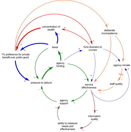
I’ve previously advised that a hyper-vigilant emphasis on model quality is the only viable path to a good model approaching the scope you hope for. That’s the green path.

However, it’s likely you will be captured by the red path at times. Client appetite for scope, desire for rapid perceived progress, the apparent ease of adding features, and existing models that aren’t as good as they box they came in advertised are all seductive.

Once you’ve overextended on scope, the standard vicious cycles in project models kick in:

  • errors beget errors
  • large models are slow and hard to test
  • errors mask other errors, making rework discovery more difficult
  • time pressure -> fatigue -> morale -> errors

So how do you get back on the righteous path? I think there are three options, but only 1.5 work.

The red path is tempting, because you can preserve the illusion of progress on scope. It will seldom work though. You’re unlikely to be able to inspect quality into an enlarged model later. You might progress to the right, but you won’t progress up. The orange path, a compromise of mild simplification and aggressive improvement, might work, but it’s going to hurt.

You’re better off to pursue the blue path, which essentially means reconstructing a better, simpler model, even at the expense of perceived functionality. Step 1: you’re in a hole, so stop digging. Productive things you might do include:

  • Suspend feature enhancements
  • Do extreme conditions tests – LOTS of them
  • Calibrate to data or run policy optimizations, as another kind of test (the algorithm will exploit weakenesses)
  • Dismantle sectors into standalone submodels that are easier to test and redesign
  • Aggressively clean up diagrams
  • Have a zero-tolerance policy for unit errors and runtime warnings
  • Document equations
  • Conduct team design reviews
  • Keep a trail of your model versions and components, so you can backtrack and later restore things you have to rip out

Once you’re back in shape, continue these disciplines. They’ll keep you on a path that stays far from the vortex.

Held v Montana

The Montana climate case, Held vs. State of Montana, has just turned in a win for youth.

The decision looks pretty strong. I think the bottom line is that the legislature’s MEPA exclusions preventing consideration of climate in state regulation are a limitation of the MT constitutional environmental rights, and therefore require strict scrutiny. The state failed to show that the MEPA Limitation serves a compelling government interest.

Not to diminish the accomplishments of the plaintiffs, but the state put forth a very weak case. The Montana Supreme Court tossed out AG Knudsen’s untimely efforts to send the case back to the drawing board. The state’s own attorney, Thane Johnson, couldn’t get acronyms right for the IPCC and RCPs. That’s perhaps not surprising, given that the Director of Montana’s alleged environmental agency admitted unfamiliarity with the largest scientific body related to climate,

Montana’s top witnesses — state employees who are responsible for permitting fossil fuel projects — however, acknowledged they are not well-versed in climate science and at times struggled with the many acronyms used in the case.

Chris Dorrington, director of the Montana Department of Environmental Quality, told an attorney for the youth that he had been unaware of the U.N. Intergovernmental Panel on Climate Change (IPCC) — which has issued increasingly dire assessments since it was established more than 30 years ago to synthesize global climate data.

“I attended this trial last week, when there was testimony relevant to IPCC,” Dorrington said. “Prior to that, I wasn’t familiar, and certainly not deeply familiar with its role or its work.”

As noted by Judge Seeley, the state left much of the plaintiffs’ evidence uncontested. They also declined to call their start witness on climate science, Judith Curry, who reflects:

MT’s lawyers were totally unprepared for direct and cross examination of climate science witnesses. This was not surprising, since this is a very complex issue that they apparently had not previously encountered. One lawyer who was cross-examining the Plaintiffs’ witnesses kept getting confused by ICP (IPCC) and RPC (RCP). The Plaintiffs were very enthusiastic about keeping witnesses in reserve to rebut my testimony, with several of the Plaintiffs’ witnesses who were leaving on travel presenting pre-buttals to my anticipated testimony during their direct questioning – all of this totally misrepresented what was in my written testimony, and can now be deleted from the court record since I didn’t testify. I can see that all of this would have turned the Hearing into a 3-ring climate circus, and at the end of all that I might not have managed to get my important points across, since I am only allowed to respond to questions.

On Thurs eve, I received a call from the lead Montana lawyer telling me that they were “letting me off the hook.” I was relieved to be able to stay home and recapture those 4 days I had scheduled for travel to and from MT.

The state’s team sounds pretty dysfunctional:

Montana’s approach to the case has evolved since 2020, has evolved rapidly in the last 6 months since a new legal team was brought in, and even evolved rapidly during the course of the trial.  The lawyers I spoke to in Sept 2022 were gone by the end of Oct, with an interim team brought in from the private sector, and then a new team that was hired for the Montana’s State Attorney’s Office in Dec.

MT’s original expert witnesses were apparently tossed, and I and several other expert witnesses were brought on board in the 11th hour, around Sept 2022. Note:  instructions for preparing our written reports were received from lawyers two generations removed from the actual trial lawyers.  As per questioning during my Deposition, I gleaned that the state originally had a collection of witnesses that were pretty subpar (I don’t know who they were).  The new set of witnesses was apparently much better.

If the state has such a compelling case, why can’t they get their act together?

In any case, I find one argument in all of this really disturbing. Suppose we accept Curry’s math:

With regards to Montana’s CO2 emissions, based on 2019 estimates Montana produces 0.63% of U.S. emissions and 0.09% of global emissions.  For an anticipated warming of 2oC, Montana’s 0.09% of emissions would account for 0.0018oC of warming.  There are other ways to frame this calculation (and more recent numbers), but any way you slice it, you can’t come up with a significant amount of global warming that is caused by Montana’s emissions.

Never mind that MT is also only .0135% of global population. If you get granular enough, every region is a tiny fraction of the world in all things. So if we are to imagine that “my contribution is small” equates to “I don’t have to do anything about the problem,” then no one has to do anything about climate, or any other global problem for that matter. There’s no role for leadership, cooperation or enlightened self-interest. This is a circular firing squad for global civilization.

What is accumulation?

The SD Society posted a definition of accumulation on Facebook, and it caught my eye.

This is from the SD Glossary, by David Ford.

accumulation (integration) : a gradual, non-instantaneous increase or decrease of a quantity over time. An accumulator is also referred to as a stock or level and represents the state of a system. To accumulate is the act of increasing and decreasing the size of a state variable (a stock) over time.

I wrote,

I’m not a fan of this definition. Accumulation is not necessarily gradual or non-instantaneous. In fact, it’s quite common to accumulate a flow pulse to produce an abrupt step in a stock. The key feature of accumulation is that it’s, well, cumulative. I’m at a loss for a way to express that without mentioning integration, which won’t help most people. Maybe someone can do better?

I think it’s telling that we don’t have ready words to describe accumulation. That might be a symptom, or a cause, of our problematic mental models about bathtub dynamics and bathtub statistics.

Resorting to “integration” isn’t really helpful, except to the mathematically inclined, which is not the audience for this kind of description I think.

The dictionary definition of “cumulative” turns out to be helpful:

increasing by successive additions

With that in mind, I’d propose something like:

  • accumulation : increasing by successive additions, or decreasing by successive subtractions.
  • stock (level) : A variable representing a persistent state in a system, which can be considered the memory of the system. Stocks change by accumulation of flows.
  • flow (rate): A variable that contributes to cumulative change in a stock over time. Flows represent activity or change in a system. A flow may represent the movement of physical quantities between stocks within a system boundary or across the model boundary and thereby into or out of the system (sinks and sources), or the rate of change of a nonphysical or intangible state.

Note that it’s hard to discuss accumulation without also discussing stocks and flows, so I’ve modified all three glossary entries.

What is SD?

Asmeret Naugle, Saeed Langarudi, Timothy Clancy propose to define System Dynamics in a new paper.

The defining characteristics are: (1) models are based on causal feedback structure, (2) accumulations and delays are foundational, (3) models are equation-based, (4) concept of time is continuous, and (5) analysis focuses on feedback dynamics.

I like the paper, but … not so fast. I think more, and more flexible, criteria are needed. I would use the term “characterize” rather than “define.” The purpose should be to aid recognition of SD, and hopefully good SD, without drawing too tight a box around the field.

I particularly disagree with the inclusion of continuous time. Even though discrete time stinks, I think continuous time is a common but inessential feature, like continuous flows. Many models include occasional discrete events, and sometimes they’re important. Ventity’s actions are explicit discrete events between time steps, and they may modify model structure in ways that are key to an operational representation of reality.

My top-of-mind alternative framework looks like:

I think it’s also helpful to describe things that are not SD:

  • Intertemporal optimization or rational expectations representing behavior
  • Computable general equilibrium
  • Linear regression
  • Linear programming
  • Mixed integer programming
  • Social Network Analysis (static)
  • Discrete ABM
  • Discrete event simulation
  • Equilibrium
  • Simultaneity

Sometimes it’s easier to see the negative space, but there are exceptions to these rules.

I think it’s notable that both frameworks exclude a variety of qualitative systems thinking approaches, like group model building or elicitation methods that create CLDs rather than simulatable models. I’m a big tent fan, and certainly some of the exceptions are common at the SD conference, but does that make them SD?

I think behavior is another challenging feature to describe. In my mind, System Dynamics is almost synonymous with behavioral dynamics. If you’re building an economic model in which agents explicitly know the future (e.g., via intertemporal optimization), it’s not an SD model (though you might be using it as a comparison case for some SD purpose). Yet there’s a strong tradition of prize-winning biomedical models that lack behavior because they lack human agency. These are not easily distinguishable from what other fields might call ODEs or nonlinear dynamics. I would not want to eject those from the field, but neither would I want this to become our focus.

I’ll be interested to see how the conversation evolves on this.

Mental Models vs. Models in the Loop

Timothy Clancy, Saeed P. Langarudi and Raafat Zaini have an interesting new commentary in the SDR.

Never the strongest: reconciling the four schools of thought in system dynamics in the debate on quality

With the passing of Jay Forrester, the field of system dynamics exists at a similar crossroads. Debates of implicit, if not explicit, inheritance and future direction are already breaking out among competing generals. Who owns Forrester’s legacy? Will we proceed down the reference mode of the Macedonian and Mughal Empires—or will we instead seek an alternative reference mode of Alexandria: integration, reconciliation, and mutually recognized coexistence of different schools within the broader field of system dynamics?

We suggest the latter path—and that begins by recognizing at least four, if not more, distinct schools of thought on how to approach system dynamics and the study of complex systems. We believe these schools arise from differing mental models in the field and the consequences that arise in practice from these differences.

I haven’t really absorbed it yet, so I’ll refrain from direct comment, but it did spur me to finish off a draft of some similar thoughts on these questions.

I personally lean very much toward the hard science, data-driven side of the field: what the authors call the Empirical school of thought. But as a policy, I lean toward a big tent view of the field that includes work with low model content (which I don’t equate with low quality).

I think the central tension in the debate has already been posed by JWF and others long ago – all the way back to Industrial Dynamics really. In Some Basic Concepts in System Dynamics (2009), Forrester summarized,

The basic feedback loop in Figure 4 is too simple to represent real-world situations. But simple loops have more serious shortcomings—they are misleading and teach the wrong lessons. Most of our intuitive learning comes from very simple systems. The truths learned from simple systems are often completely opposite from the behavior of more complex systems. A person understands filling a water glass, as in Figure 3. But, if we go to a system that is only five times as complicated, as in Figure 5, intuition fails. A person cannot look at Figure 5 and anticipate the behavior of the pictured system.

Figure 5 from World Dynamics is five times more complicated than Figure 4 in the sense that it has five stocks—the rectangles in the figure. The figure shows how rapidly apparent complexity increases as more system stocks are added.

Mathematicians would describe Figure 5 as a fifth-order, nonlinear, dynamic system. No one can predict the behavior by studying the diagram or its underlying equations. Only by using computer simulation can the implied behavior be revealed.

I think the message is pretty clear here. To solve complex problems, you must formally simulate the system because mental simulations are treacherous. I’d go even one step further, and argue that it’s not sufficient to simulate the system once, figure out where the leverage point is, implement the solution, and toss out the model when you’re done. The simulation needs to become an ongoing part of the loop for model predictive control.

If that’s the ideal, why settle for anything less? I think there are a number of possible answers.

  1. Even in a perfect world where it’s easy to construct the model-in-the-loop, you need buy-in from the participants in the system to implement the model, and that requires a skillset that’s quite distinct.
  2. While it’s true that no one can intuit the behavior of a 10th order system, there might be a lot of value in managing low-order components of the system that are amenable to mental simulation or simple decision rules. There might be two reasons for this:
    • The complex system is dominated by a few key parameters (as in sloppy systems).
    • Risking global suboptimization by improving locally is better than optimizing nothing (though this might be a matter of luck).
  3. Often no single stakeholder in the system has the resources or authority to implement needed changes. But exposing the connectivity of the system, even if you can’t predict exactly how it works, is sometimes enough to catalyze creation of higher-level structures that enable change in the future.
  4. Not everyone is, or wants to be, a modeler. Moreover some participants in the system may reject models, data, and pretty much everything else since the Enlightenment, but you still have to include them.
  5. The non-modelers, as participants in the system, hold key knowledge that the modelers need.
  6. A qualitative map of a system is a good start towards an eventual quantitative model.
  7. Not every problem is big enough to model.

I’m sure you can probably think of more. I think these are good reasons to embrace non-model-based work on systems, as long as one refrains from making strong predictions about behavior from incomplete descriptions of behavior. Fortunately that leaves a lot of interesting things to think about.

I think the opposite perspective, that nothing is worth doing without a model and data, requires some counterexamples. Are there instances in which a group mapping exercise, playing a dynamic game, or engaging in cross-functional dialog led to reduced performance? I’m not aware of good examples of this, and certainly not of good diagnoses of the outcome. Attribution in complex systems is notoriously difficult. I think what this suggests is that we need stronger links to the evaluation research community, because we don’t really know what works and what doesn’t. We already have some strength in this area from the dynamic decision making experiment thread of SD, but … physician heal thyself.

There is one thing that troubles me though, just beyond the boundaries of our field. It’s climate policy (and related global issues). Most climate policy advocates are in some sense systems thinkers. Many build nice diagrams or use other systemic tools. If you don’t care about systems, it’s hard to see why you’d care about climate to begin with.

Yet … it seems that a substantial fraction of people who are pro-climate policy favor policies that are counterproductive or insufficient. They like low-carbon fuel standards that are unstable, inefficient, and can even increase emissions. They like standards that allocate more property rights to bigger polluters, or simply make it harder to change. They like to impose constraints on new fossil supply that work exactly like OPEC to increase prices and profits for incumbent producers. They subsidize EVs and solar, increasing the incentive to consume energy and congest roads, with benefits accruing to the rich who can afford the capital outlay.

What this means is that my reason #2, “Risking global suboptimization by improving locally is better than optimizing nothing,” isn’t working out too well. I think this is exactly the kind of counterintuitive behavior of social systems that JWF was referring too. I don’t believe you can sort these things out with CLDs or other qualitative methods, except perhaps when they are used as explanatory tools for underlying formal models.

I think the bottom line is that, inside the big tent, the tall pole must remain construction and validation of robust behavioral dynamic models.