For all friends in the Bozone … this is letter I sent to a community list earlier today:
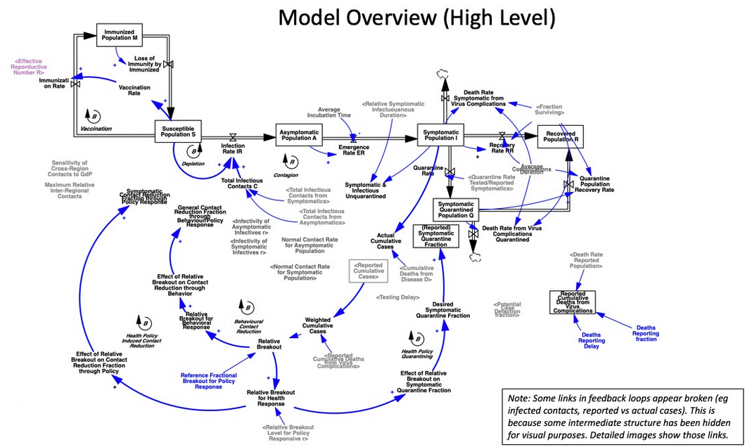
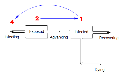
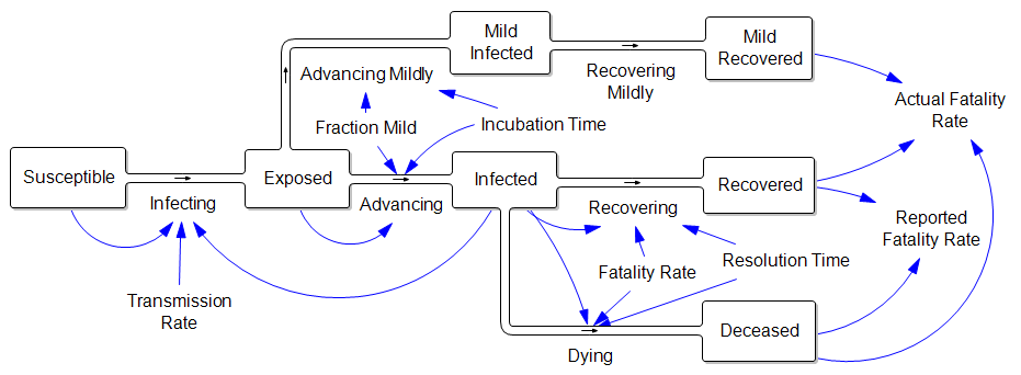
I appreciate the timely information from Chris Mehl. I’d like to emphasize a few points. I’m largely drawing on my thinking from an epidemic model that I posted here a few days ago, https://youtu.be/mxUsBI0Wr2M
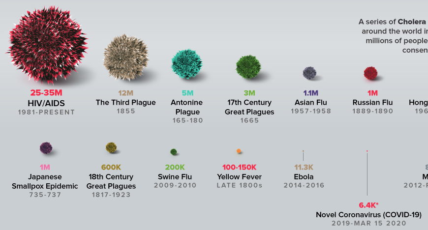
It’s unfortunate that we now have our first confirmed COVID19 case, but we knew it was coming. One case likely means several more exposed asymptomatic are already here. Things could develop quickly: Italy went from 3 cases to 3858 in two weeks, although some of that is illusory due to the expansion of testing. However, that is not necessarily our fate – we may be luckier, and we definitely can change some things.
Two key points about this disease:
– The Covid-19 virus is transmissible before people become symptomatic. We therefore cannot wait to take action until there are confirmed or presumptive cases, or even people who have potentially been exposed, in our social networks, faith groups, communities, workplace, towns, or cities.
– This is not just about us individually. The disease disproportionately attacks older people, and people with compromised immune systems. The life you save through personal behavior may be your grandmother’s.
The response has a lot of moving parts.
1. The end of the line is treatment for the severely ill. The flu peak is typically 5-6% of ER admissions in Montana, so something just as widespread and 10x more serious is an obvious threat. It’s critical to avoid overwhelming (and infecting) our precious and limited health care workers, because if we don’t, fatality rates go up, as happened in Italy and Wuhan.
2. We can reduce contacts with the infected through monitoring, quarantine and isolation. This is the public health bailiwick, but I would expect that a large caseload could overwhelm them as well. I hope they’ll reach out to the community for help if needed. Independent of that, perhaps we can make it easy on people who are self-isolating, by organizing delivery of essential services? For employers, I hope that generous sick leave is a matter of enlightened self-interest: do you want 1 employee out for a week, or all of them out two weeks later?
We have two options that scale up well:
3. We can reduce the risk of each social contact by avoiding proximity and touching (elbow bumps instead of handshakes) and cleaning everything – handwashing, hard surfaces, etc. Lots of good info out there on this. (Sadly, hoarding sanitizers doesn’t contribute.)
4. Finally, we can reduce the number of contacts per person, aka social distancing. Cancelling nonessential group events, or moving them online, is very influential. One Biogen company meeting spawned 100 infections in Boston. The Atlantic has a nice discussion of the nuances: https://www.theatlantic.com/…/coronavirus-what-does…/607927/
If half the infected are isolated, and we have half as many contacts, and those contacts are made 50% safer, then we’ve reduced the transmission of infection by 87.5%. That’s enough to slow the infection rate to less than the recovery rate, so the disease will die out.
If we do that, we’re not quite out of the woods. Social distancing is going to be hard to sustain. But if you stop to soon, the disease comes back. So we’ll need a plan for transitioning from more disruptive social distancing measures to things we can sustain.
When we have to close schools, which I think is likely, we will need to find ways to provide good nutrition and safe spaces for kids, without risk of infection. We can help.
Social distancing is also disruptive to the economy. Our tourism industry and performing arts, and surely other sectors I haven’t thought of, are going to have a rough time. We need to mitigate that.
It’s hard on our social fabric, so things like the Renewal Network’s recent links are important. We need to figure out how to support, comfort and play interact with each other … six feet apart, like the Italians singing from their balconies in the darkness of locked-down Siena.
Fortunately, some bad outcomes are very unlikely. There’s no reason for the food system to break down, for example. Inventories are large and the working-age population won’t have high mortality. So keeping a decent stock of food in case you’re sick is prudent, but panic buying of massive quantities is unproductive. This is not the zombie apocalypse.
There is a Cassandra’s curse here. If we succeed, the worst-case scenarios won’t come true, and some will accuse us of overreacting. That takes courage.
Finally, a personal note. David Brooks had a gloomy piece in the New York Times a day or two back, detailing social breakdown during historic plagues. I think that is not our fate. We have new tools at our disposal, i.e. the internet, that did not exist in previous pandemics. Incredibly, I know – by just one hop on social media – people involved in several of the defining events of this epidemic, including the Siena singers. W now have a powerful and non-infectious way for us to stay coordinated; we just have to be sure that we find ways to reach out to people who are not so digitally connected.
There’s a huge trove of digital resources here:
https://coronavirustechhandbook.com/
Tom Continue reading “Open Letter on Coronavirus”