Real Estate Roundup

Ira Artman takes a look at residential real estate price indices – S&P/Case-Shiller (CSI), OFHEO, and RPX. The RPX comes out on top, for (marginally) better correlation with foreclosures and, more importantly, a much shorter reporting lag than CSI. This is a cause for minor rejoicing, as we at Ventana helped create the RPX and are affiliated with Radar Logic. Perhaps more importantly, rumor has it that there’s more trading volume on RPX.

In spite of the lag it introduces, the CSI repeat sales regression is apparently sexy to economists. Calculated Risk has been using it to follow developments in prices and price/rent ratios. Econbrowser today looks at the market bottom, as predicted by CSI forward contracts on CME. You can find similar forward curves in Radar’s monthly analysis. As of today, both RPX and CSI futures put the bottom of the market in Nov/Dec 2010, another 15% below current prices. Interestingly, the RPX forward curve looks a little more pessimistic than CSI – an arbitrage opportunity, if you can find the liquidity.

Artman notes that somehow the Fed, in its flow of funds reporting, missed most of the housing decline until after the election.

MIT Updates Greenhouse Gamble

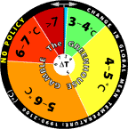
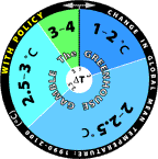
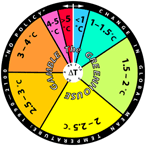
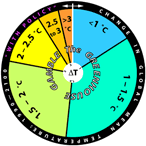
For some time, the MIT Joint Program has been using roulette wheels to communicate climate uncertainty. They’ve recently updated the wheels, based on new model projections:

No Policy Policy
New No policy Policy
Old Old no policy Old policy

The changes are rather dramatic, as you can see. The no-policy wheel looks like the old joke about playing Russian Roulette with an automatic. A tiny part of the difference is a baseline change, but most is not, as the report on the underlying modeling explains:

The new projections are considerably warmer than the 2003 projections, e.g., the median surface warming in 2091 to 2100 is 5.1°C compared to 2.4°C in the earlier study. Many changes contribute to the stronger warming; among the more important ones are taking into account the cooling in the second half of the 20th century due to volcanic eruptions for input parameter estimation and a more sophisticated method for projecting GDP growth which eliminated many low emission scenarios. However, if recently published data, suggesting stronger 20th century ocean warming, are used to determine the input climate parameters, the median projected warning at the end of the 21st century is only 4.1°C. Nevertheless all our simulations have a very small probability of warming less than 2.4°C, the lower bound of the IPCC AR4 projected likely range for the A1FI scenario, which has forcing very similar to our median projection.

I think the wheels are a cool idea, but I’d be curious to know how users respond to it. Do they cheat, and spin to get the outcome they hope for? Perhaps MIT should spice things up a bit, by programming an online version that gives users’ computers the BSOD if they roll a >7C world.

Hat tip to Travis Franck for pointing this out.

The Blood-Hungry Spleen

OK, I’ve stolen another title, this time from a favorite kids’ book. This post is really about the thyroid, which is a little less catchy than the spleen.

Your hormones are exciting!
They stir your body up.
They’re made by glands (called endocrine)
and give your body pluck.

Allan Wolf & Greg Clarke, The Blood-Hungry Spleen

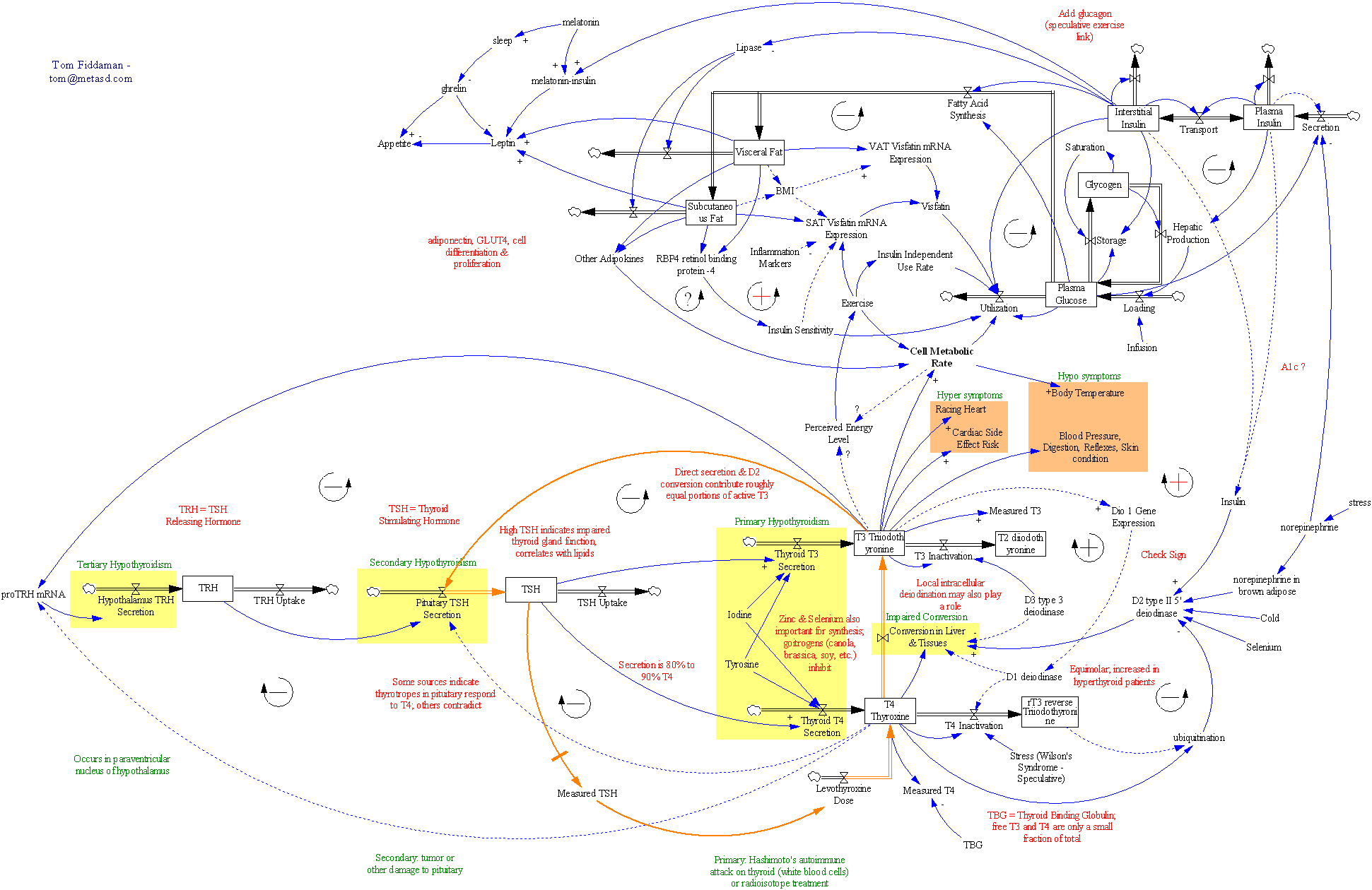
A friend has been diagnosed with hypothyroidism, so I did some digging on the workings of the thyroid. A few hours searching citations on PubMed, Medline and google gave me enough material to create this diagram:

Thyroid function and some associated feedbacks

(This is a LARGE image, so click through and zoom in to do it justice.)

The bottom half is the thyroid control system, as it is typically described. The top half strays into the insulin regulation system (borrowed from a classic SD model), body fat regulation, and other areas that seem related. A lot of the causal links above are speculative, and I have little hope of turning the diagram into a running model. Unfortunately, I can’t find anything in the literature that really digs into the dynamics of the system. In fact, I can’t even find the basics – how much stuff is in each stock, and how long does it stay there? There is a core of the system that I hope to get running at some point though:

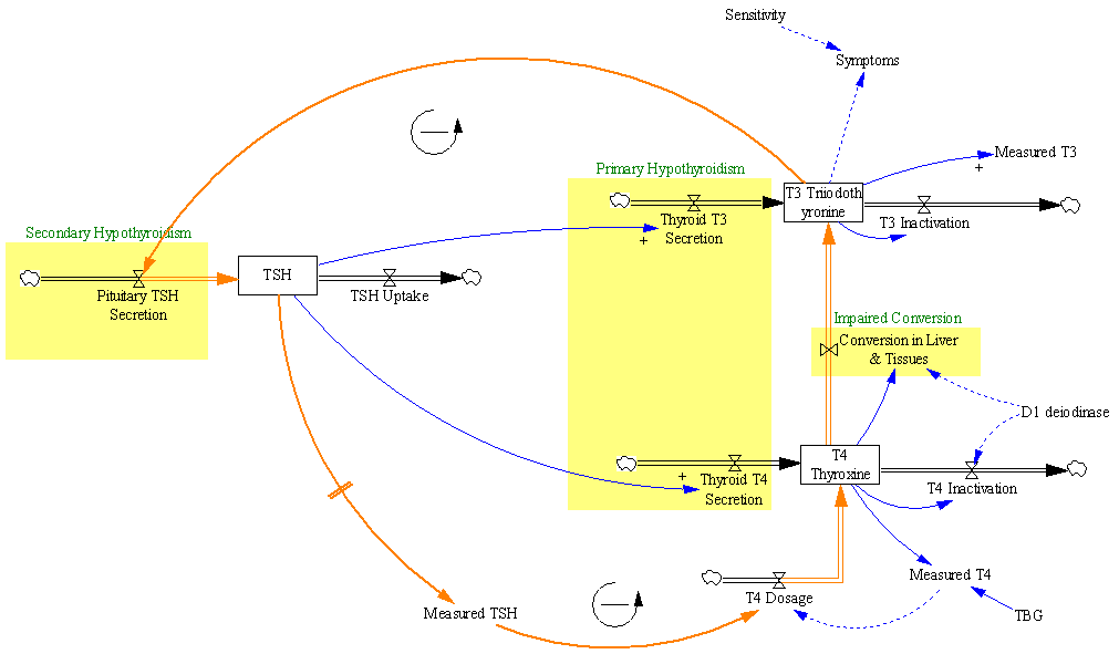
Thyroid - core regulation and dose titration

(another largish image)

This is the part of the system that’s typically involved in the treatment of hypothyroidism with synthetic hormone replacements. Normally, the body runs a negative feedback loop in which thyroid hormone levels (T3/T4) govern production of TSH, which in turn controls the production of T3 and T4. The problem begins when something (perhaps an autoimmune disease, i.e. Hashimoto’s) diminishes the thyroid’s ability to produce T3 and T4 (reducing the two inflows in the big yellow box at center). Then therapy seeks to replace the natural control loop, by adjusting a dose of synthetic T4 (levothyroxine) until the measured level of TSH (left stock structure) reaches a desired target.

This is a negative feedback loop with fairly long delays, so dosage adjustments are made only at infrequent intervals, in order to allow the system to settle between changes. Otherwise, you’d have the aggressive shower taker problem: water’s to cold, crank up the hot water … ouch, too hot, turn it way down … eek, too cold …. Measurements of T3 and T4 are made, but seldom paid much heed – the TSH level is regarded as the “gold standard.”

This black box approach to control is probably effective for many patients, but it leaves me feeling uneasy about several things. The “normal” range for TSH varies by an order of magnitude; what basis is there for choosing one or the other end of the range as a target? Wouldn’t we expect variation among patients in the appropriate target level? How do we know that TSH levels are a reliable indicator, if they don’t correlate well with T3/T4 levels or symptoms? Are extremely sparse measurements of TSH really robust to variability on various time scales, or is dose titration vulnerable to noise?

One could imagine alternative approaches to control, using direct measurements of T3 and T4, or indirect measurements (symptoms). Those might have the advantage of less delay (fewer confounding states between the goal state and the measured state). But T3/T4 measurements seem to be regarded as unreliable, which might have something to do with the fact that it’s hard to find any information on the scale or dynamics of their reservoirs. Symptoms also take a back seat; one paper even demonstrates fairly convincingly that dosage changes +/- 25% have no effect on symptoms (so why are we doing this again?).

I’d like to have a more systemic understanding of both the internal dynamics of the thyroid regulation system, and its interaction with symptoms, behaviors, and other regulatory systems. Here’s hoping that one of you lurkers (I know you’re out there) can comment with some thoughts or references.


So the spleen doesn’t feel shortchanged, I’ll leave you with another favorite:

Lovely
I think that I ain’t never seen
A poem ugly as a spleen.
A poem that could make you shiver
Like 3.5 … pounds of liver.
A poem to make you lose your lunch,
Tie your intestines in a bunch.
A poem all gray, wet, and swollen,
Like a stomach or a colon.
Something like your kidney, lung,
Pancreas, bladder, even tongue.
Why you turning green, good buddy?
It’s just human body study.

John Scieszka & Lane Smith, Science Verse

Random Excellence – Bailouts, Biases, Boxplots

(A good title, stolen from TOP, and repurposed a bit).

1. A nice graphical depiction of the stimulus package, at the Washington post

2. An interesting JDM article on the independence of cognitive ability and biases, via Marginal Revolution. Abstract:

In 7 different studies, the authors observed that a large number of thinking biases are uncorrelated with cognitive ability. These thinking biases include some of the most classic and well-studied biases in the heuristics and biases literature, including the conjunction effect, framing effects, anchoring effects, outcome bias, base-rate neglect, ‘less is more’ effects, affect biases, omission bias, myside bias, sunk-cost effect, and certainty effects that violate the axioms of expected utility theory. In a further experiment, the authors nonetheless showed that cognitive ability does correlate with the tendency to avoid some rational thinking biases, specifically the tendency to display denominator neglect, probability matching rather than maximizing, belief bias, and matching bias on the 4-card selection task. The authors present a framework for predicting when cognitive ability will and will not correlate with a rational thinking tendency.

The framework alluded to in that last sentence is worth a look. Basically, the explanation hinges on whether subjects have “mindware” available, time resources, and reflexes to trigger an (unbiased) analytical solution when a (biased) heuristic response is unwarranted. This seems to be applicable to dynamic decision making tasks as well: people use heuristics (like pattern matching), because they don’t have the requisite mindware (understanding of dynamics) or triggers (recognition that dynamics matter).

3. A nice monograph on the construction of statistical graphics, via Statisitical Modeling, Causal Inference, and Social Science Update: Bill Harris likes this one too.

Bathtub Still Filling, Despite Slower Inflow

Found this bit, under the headline Carbon Dioxide Levels Rising Despite Economic Downturn:

A leading scientist said on Thursday that atmospheric levels of carbon dioxide are hitting new highs, providing no indication that the world economic downturn is curbing industrial emissions, Reuters reported.

Joe Romm does a good job explaining why conflating emissions with concentrations is a mistake. I’ll just add the visual:

CO2 stock flow structure

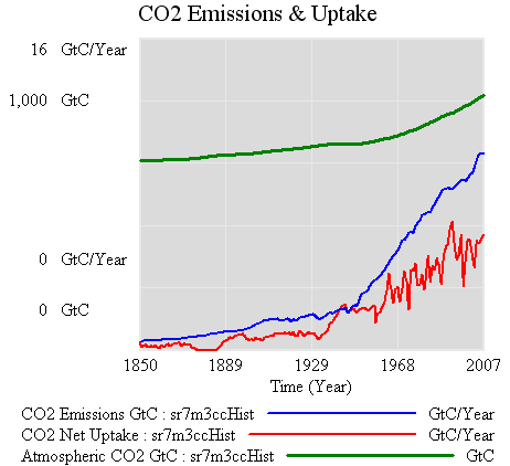
And the data to go with it:

CO2 data

It would indeed take quite a downturn to bring the blue (emissions) below the red (uptake), which is what would have to happen to see a dip in the CO2 atmospheric content (green). In fact, the problem is tougher than it looks, because a fall in emissions would be accompanied by a fall in net uptake, due to the behavior of short-term sinks. Notice that atmospheric CO2 kept going up after the 1929 crash. (Interestingly, it levels off from about 1940-1945, but it’s hard to attribute that because it appears to be within natural variability).

At the moment, it’s kind of odd to look for the downturn in the atmosphere when you can observe fossil fuel consumption directly. The official stats do involve some lag, but less than waiting for natural variability to shake out of sparse atmospheric measurements. Things might change soon, though, with the advent of satellite measurements.

OMG Did I say that out loud?

Steve Chu says the t word in an NYT interview:

He said that while President Obama and Congressional Democratic leaders had endorsed a so-called cap-and-trade system to control global warming pollutants, there were alternatives that could emerge, including a tax on carbon emissions or a modified version of cap-and-trade.

Glad the option isn’t totally dead.

Sea Level Rise – VI – The Bottom Line (Almost)

The pretty pictures look rather compelling, but we’re not quite done. A little QC is needed on the results. It turns out that there’s trouble in paradise:

  1. the residuals (modeled vs. measured sea level) are noticeably autocorrelated. That means that the model’s assumed error structure (a white disturbance integrated into sea level, plus white measurement error) doesn’t capture what’s really going on. Either disturbances to sea level are correlated, or sea level measurements are subject to correlated errors, or both.
  2. attempts to estimate the driving noise on sea level (as opposed to specifying it a priori) yield near-zero values.

#1 is not really a surprise; G discusses the sea level error structure at length and explicitly address it through a correlation matrix. (It’s not clear to me how they handle the flip side of the problem, state estimation with correlated driving noise – I think they ignore that.)

#2 might be a consequence of #1, but I haven’t wrapped my head around the result yet. A little experimentation shows the following:

driving noise SD equilibrium sensitivity (a, mm/C) time constant (tau, years) sensitivity (a/tau, mm/yr/C)
~ 0 (1e-12) 94,000 30,000 3.2
1 14,000 4400 3.2
10 1600 420 3.8

Intermediate values yield values consistent with the above. Shorter time constants are consistent with expectations given higher driving noise (in effect, the model is getting estimated over shorter intervals), but the real point is that they’re all long, and all yield about the same sensitivity.

The obvious solution is to augment the model structure to include states representing persistent errors. At the moment, I’m out of time, so I’ll have to just speculate what that might show. Generally, autocorrelation of the errors is going to reduce the power of these results. That is, because there’s less information in the data than meets the eye (because the measurements aren’t fully independent), one will be less able to discriminate among parameters. In this model, I seriously doubt that the fundamental banana-ridge of the payoff surface is going to change. Its sides will be less steep, reflecting the diminished power, but that’s about it.

Assuming I’m right, where does that leave us? Basically, my hypotheses in Part IV were right. The likelihood surface for this model and data doesn’t permit much discrimination among time constants, other than ruling out short ones. R’s very-long-term paleo constraint for a (about 19,500 mm/C) and corresponding long tau is perfectly plausible. If anything, it’s more plausible than the short time constant for G’s Moberg experiment (in spite of a priori reasons to like G’s argument for dominance of short time constants in the transient response). The large variance among G’s experiment (estimated time constants of 208 to 1193 years) is not really surprising, given that large movements along the a/tau axis are possible without degrading fit to data. The one thing I really can’t replicate is G’s high sensitivities (6.3 and 8.2 mm/yr/C for the Moberg and Jones/Mann experiments, respectively). These seem to me to lie well off the a/tau ridgeline.

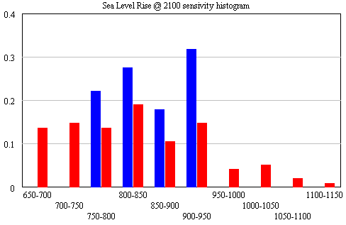
The conclusion that IPCC WG1 sea level rise is an underestimate is robust. I converted Part V’s random search experiment (using the optimizer) into sensitivity files, permitting Monte Carlo simulations forward to 2100, using the joint a-tau-T0 distribution as input. (See the setup in k-grid-sensi.vsc and k-grid-sensi-4x.vsc for details). I tried it two ways: the 21 points with a deviation of less than 2 in the payoff (corresponding with a 95% confidence interval), and the 94 points corresponding with a deviation of less than 8 (i.e., assuming that fixing the error structure would make things 4x less selective). Sea level in 2100 is distributed as follows:

Sea level distribution in 2100

The sample would have to be bigger to reveal the true distribution (particularly for the “overconfident” version in blue), but the qualitative result is unlikely to change. All runs lie above the IPCC range (.26-.59), which excludes ice dynamics.

Continue reading “Sea Level Rise – VI – The Bottom Line (Almost)”

Sea Level Rise Models – V

To take a look at the payoff surface, we need to do more than the naive calibrations I’ve used so far. Those were adequate for choosing constant terms that aligned the model trajectory with the data, given a priori values of a and tau. But that approach could give flawed estimates and confidence bounds when used to estimate the full system.

Elaborating on my comment on estimation at the end of Part II, consider a simplified description of our model, in discrete time:

(1) sea_level(t) = f(sea_level(t-1), temperature, parameters) + driving_noise(t)

(2) measured_sea_level(t) = sea_level(t) + measurement_noise(t)

The driving noise reflects disturbances to the system state: in this case, random perturbations to sea level. Measurement noise is simply errors in assessing the true state of global sea level, which could arise from insufficient coverage or accuracy of instruments. In the simple case, where driving and measurement noise are both zero, measured and actual sea level are the same, so we have the following system:

(3) sea_level(t) = f(sea_level(t-1), temperature, parameters)

In this case, which is essentially what we’ve assumed so far, we can simply initialize the model, feed it temperature, and simulate forward in time. We can estimate the parameters by adjusting them to get a good fit. However, if there’s driving noise, as in (1), we could be making a big mistake, because the noise may move the real-world state of sea level far from the model trajectory, in which case we’d be using the wrong value of sea_level(t-1) on the right hand side of (1). In effect, the model would blunder ahead, ignoring most of the data.

In this situation, it’s better to use ordinary least squares (OLS), which we can implement by replacing modeled sea level in (1) with measured sea level:

(4) sea_level(t) = f(measured_sea_level(t-1), temperature, parameters)

In (4), we’re ignoring the model rather than the data. But that could be a bad move too, because if measurement noise is nonzero, the sea level data could be quite different from true sea level at any point in time.

The point of the Kalman Filter is to combine the model and data estimates of the true state of the system. To do that, we simulate the model forward in time. Each time we encounter a data point, we update the model state, taking account of the relative magnitude of the noise streams. If we think that measurement error is small and driving noise is large, the best bet is to move the model dramatically towards the data. On the other hand, if measurements are very noisy and driving noise is small, better to stick with the model trajectory, and move only a little bit towards the data. You can test this in the model by varying the driving noise and measurement error parameters in SyntheSim, and watching how the model trajectory varies.

The discussion above is adapted from David Peterson’s thesis, which has a more complete mathematical treatment. The approach is laid out in Fred Schweppe’s book, Uncertain Dynamic Systems, which is unfortunately out of print and pricey. As a substitute, I like Stengel’s Optimal Control and Estimation.

An example of Kalman Filtering in everyday devices is GPS. A GPS unit is designed to estimate the state of a system (its location in space) using noisy measurements (satellite signals). As I understand it, GPS units maintain a simple model of the dynamics of motion: my expected position in the future equals my current perceived position, plus perceived velocity times time elapsed. It then corrects its predictions as measurements allow. With a good view of four satellites, it can move quickly toward the data. In a heavily-treed valley, it’s better to update the predicted state slowly, rather than giving jumpy predictions. I don’t know whether handheld GPS units implement it, but it’s possible to estimate the noise variances from the data and model, and adapt the filter corrections on the fly as conditions change.

Continue reading “Sea Level Rise Models – V”
Sea Level Rise Models – IV

So far, I’ve established that the qualitative results of Rahmstorf (R) and Grinsted (G) can be reproduced. Exact replication has been elusive, but the list of loose ends (unresolved differences in data and so forth) is long enough that I’m not concerned that R and G made fatal errors. However, I haven’t made much progress against the other items on my original list of questions:

  • Is the Grinsted et al. argument from first principles, that the current sea level response is dominated by short time constants, reasonable?
  • Is Rahmstorf right to assert that Grinsted et al.’s determination of the sea level rise time constant is shaky?
  • What happens if you impose the long-horizon paleo constraint to equilibrium sea level rise in Rahmstorf’s RC figure on the Grinsted et al. model?

At this point I’ll reveal my working hypotheses (untested so far):

  • I agree with G that there are good reasons to think that the sea level response occurs over multiple time scales, and therefore that one could make a good argument for a substantial short-time-constant component in the current transient.
  • I agree with R that the estimation of long time constants from comparatively short data series is almost certainly shaky.
  • I suspect that R’s paleo constraint could be imposed without a significant degradation of the model fit (an apparent contradiction of G’s results).
  • In the end, I doubt the data will resolve the argument, and we’ll be left with the conclusion that R and G agree on: that the IPCC WGI sea level rise projection is an underestimate.

Continue reading “Sea Level Rise Models – IV”