Sena Evren has a nice article on the state of AI intellectual property ownership.
If you shipped code this week, some of it was probably written by an AI. The question of who legally owns that code is less settled than most developers assume, and the answer depends on three things that have nothing to do with how good the code is:
- Whether a human made enough creative decisions to establish copyright
- Whether your employment contract already assigned it to your employer
- Whether the model pulled from GPL-licensed training data and quietly contaminated your codebase
There’s more detail on the caselaw in this congressional memo.
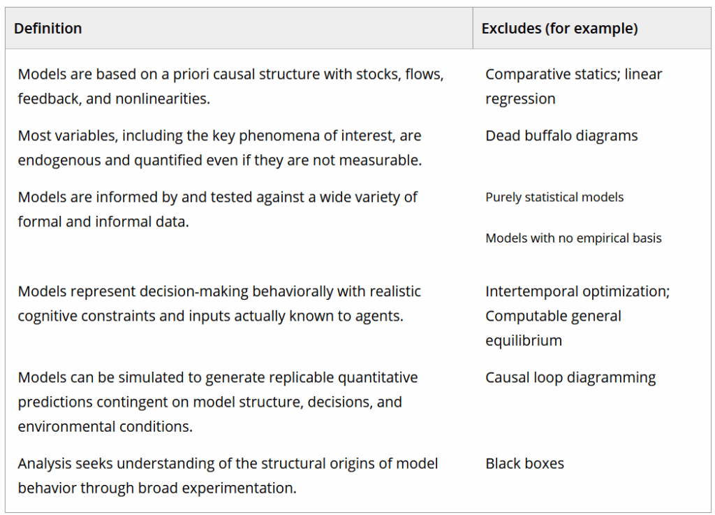
Since SD models are essentially code, I think it’s largely applicable to models built with AI assistance. Per the article, there are a lot of unsettled areas.
Regarding #3, that AI may contaminate your model with copyleft-licensed material, is maybe less of a threat given that generic structures from another model are seldom used unaltered. This differs from other code, where an algorithm or data structure is likely to be copied exactly. As long as you’ve customized the content to a situation (#1) this may not be a big concern. If you’re building models without human input, you’re probably either reproducing common memes (population, supply chain, predator-prey, SIR) or building crappy models.
I think a bigger problem might be copyright and copyleft together. LLMs have clearly ingested and memorized vast amounts of copyrighted material. A colleague, for example, coaxed Claude into confessing that, while it didn’t know how it knew, it pretty much had Sterman’s Business Dynamics memorized and could quote chapter and verse. Similarly,
Clearly Copilot knows exactly what’s in the book, but coyly declines to quote verbatim to stay out of trouble.
EFF argues that this is transformative fair use, but I’m not so sure that view will be durable. There could be a legal revolt against the idea that AI companies can scrape all human knowledge (including this blog, CC license btw) irrespective of ownership, and then sell it back to us without any credit. Maybe more likely, this will cease to be practically enforceable, as open source models are commoditized in the ultimate expression of “information wants to be free“. This makes it difficult to figure out what is a sustainable business model for IP owners and maybe even the AI companies themselves.
In that context, the Copyright Office’s finding, that nonhuman creations are not copyrightable, is perhaps an appropriate response: you don’t get ownership of mere copies of the human knowledge corpus unless you add some value.
If you’re not using AI, you’re not necessarily out of the woods – see https://metasd.com/2010/07/models-and-copyrights/ or friends don’t let friends work for hire.