Steady State Growth in SIR & SEIR Models

Beware of the interpretation of R0, and models that plug an R0 estimated in one context into a delay structure from another.

This started out as a techy post about infection models for SD practitioners interested in epidemiology. However, it has turned into something more important for coronavirus policy.

It began with a puzzle: I re-implemented my conceptual coronavirus model for multiple regions, tuning it for Italy and Switzerland. The goal was to use it to explore border closure policies. But calibration revealed a problem: using mainstream parameters for the incubation time, recovery time, and R0 yielded lukewarm growth in infections. Retuning to fit the data yields R0=5, which is outside the range of most estimates. It also makes control extremely difficult, because you have to reduce transmission by 1-1/R0 = 80% to stop the spread.

To understand why, I decided to solve the model analytically for the steady-state growth rate in the early infection period, when there are plenty of susceptible people, so the infection rate is unconstrained by availability of victims. That analysis is reproduced in the subsequent sections. It’s of general interest as a way of thinking about growth in SD models, not only for epidemics, but also in marketing (the Bass Diffusion model is essentially an epidemic model) and in growing economies and supply chains.

First, though, I’ll skip to the punch line.

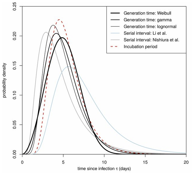
The puzzle exists because R0 is not a complete description of the structure of an epidemic. It tells you some important things about how it will unfold, like how much you have to reduce transmission to stop it, but critically, not how fast it will go. That’s because the growth rate is entangled with the incubation and recovery times, or more generally the distribution of the generation time (the time between primary and secondary infections).

This means that an R0 value estimated with one set of assumptions about generation times (e.g., using the R package R0) can’t be plugged into an SEIR model with different delay structure assumptions, without changing the trajectory of the epidemic. Specifically, the growth rate is likely to be different. The growth rate is, unfortunately, pretty important, because it influences the time at which critical thresholds like ventilator capacity will be breached.

The mathematics of this are laid out clearly by Wallinga & Lipsitch. They approach the problem from generating functions, which give up simple closed-form solutions a little more readily than my steady-state growth calculations below. For example, for the SEIR model,

R0 = (1 + r/b1)(1 + r/b2)           (Eqn. 3.2)

Where r is the growth rate, b1 is the inverse of the incubation time, and b2 is the inverse of the recovery time. If you plug in r = 0.3/day, b1 = 1/(5 days), b2 = 1/(10 days), R0 = 10, which is not plausible for COVID-19. Similarly, if you plug in the frequently-seen R0=2.4 with the time constants above, you get growth at 8%/day, not the observed 30%/day.

There are actually more ways to get into trouble by using R0 as a shorthand for rich assumptions in models. Stochastic dynamics and network topology matter, for example. In The Failure of R0, Li Blakely & Smith write,

However, in almost every aspect that matters, R 0 is flawed. Diseases can persist with R 0 < 1, while diseases with R 0 > 1 can die out. We show that the same model of malaria gives many different values of R 0, depending on the method used, with the sole common property that they have a threshold at 1. We also survey estimated values of R 0 for a variety of diseases, and examine some of the alternatives that have been proposed. If R 0 is to be used, it must be accompanied by caveats about the method of calculation, underlying model assumptions and evidence that it is actually a threshold. Otherwise, the concept is meaningless.

Is this merely a theoretical problem? I don’t think so. Here’s how things stand in some online SEIR-type simulators:

Model R0 (dmnl) Incubation (days) Infectious (days) Growth Rate (%/day)
My original 3.3  5  7  17
Homer US 3.5  5.4  11  18
covidsim.eu 4  4 & 1  10  17
Epidemic Calculator 2.2  5.2  2.9  30*
Imperial College 2.4 5.1 ~3** 20***

*Observed in simulator; doesn’t match steady state calculation, so some feature is unknown.

**Est. from 6.5 day mean generation time, distributed around incubation time.

***Not reported; doubling time appears to be about 6 days.

I think this is certainly a Tower of Babel situation. It seems likely that the low-order age structure in the SEIR model is problematic for accurate representation of the dynamics. But it also seems like piecemeal parameter selection understates the true uncertainty in these values. We need to know the joint distribution of R0 and the generation time distribution in order to properly represent what is going on.

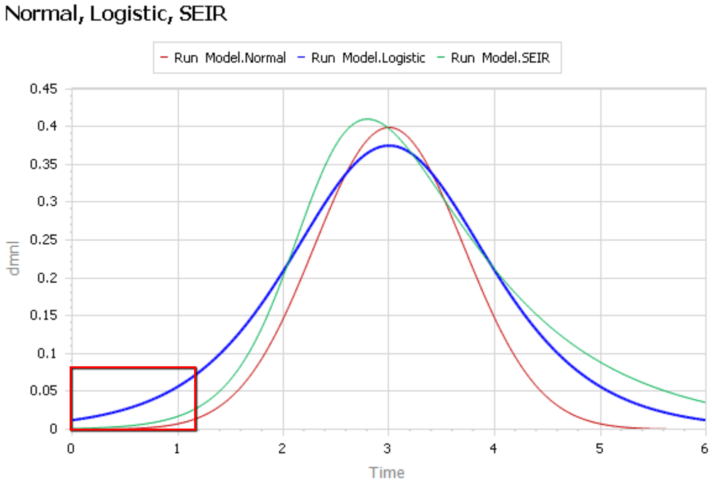
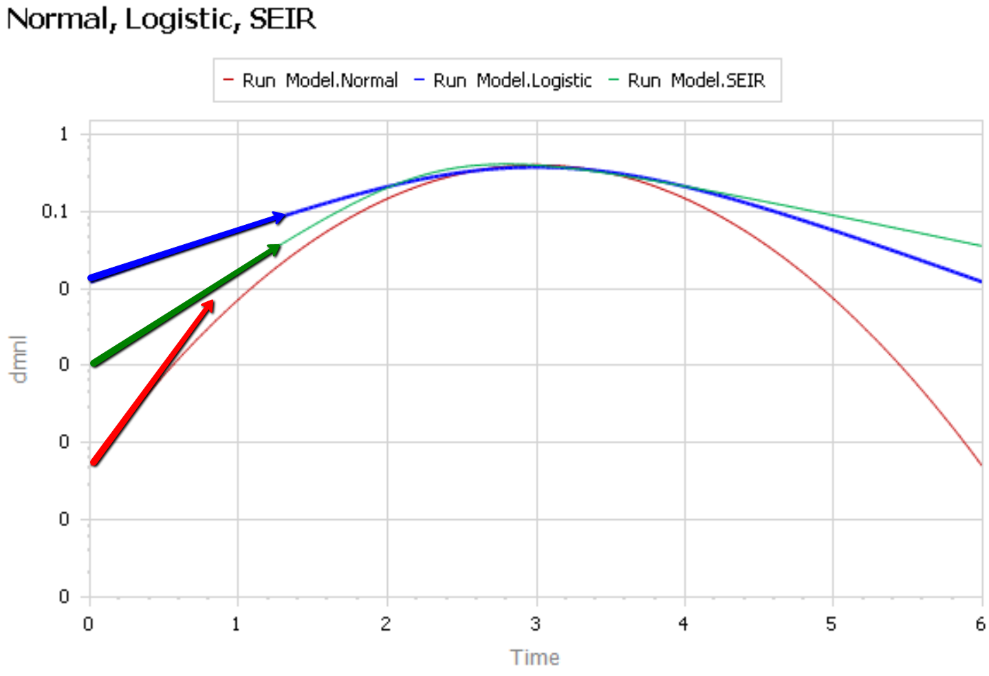
Steady State Growth – SIR

Continue reading “Steady State Growth in SIR & SEIR Models”
A model of COVID-19 in the US with endogenous testing, containment measures, and social distancing

Here’s another COVID-19 model. This one’s from Jack Homer of Homer Consulting. Jack is a very creative modeler, the author of some SD classics like the worker burnout model, an SD blogger, and plays a central role in important projects like Rethink Health.

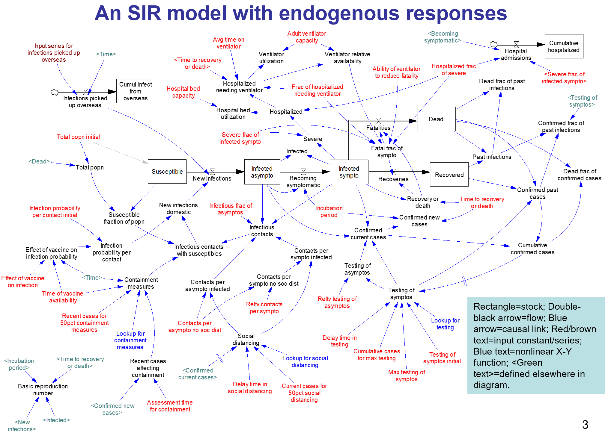
The core of the model is an SEIR chain, similar to my model. This adds some nice features, including endogenous testing and a feedback decision rule for control measures. It’s parameterized for the US.

I haven’t spent significant time with the model yet, so I can’t really comment. An alarming feature of this disease is that doublings occur on the same time scale as thinking through an iteration of a model, especially if coronavirus is not your day job. I hope to add some further thoughts when I’ve thinned my backlog a bit.

From the slide deck:

Conclusions

  • The results here come from a model with several key numerical assumptions, especially around behavioral responses. As the 4 runs illustrate, if the assumptions are modified, the overall results change over some range of possibility.
  • My assumptions about the behavioral responses were informed by what we been seeing recently in the US: a good response, even in regions not yet hard-hit. The message is out, and it is having an effect.
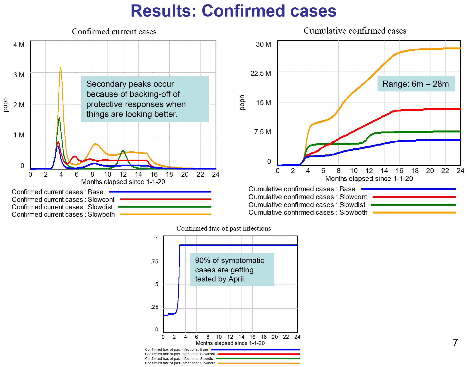
  • Because of the responses, and despite the absence of a vaccine, I conclude this epidemic will not infect a third or half of the population as some have predicted. Rather, we are likely to see 6m-28m cases in the US in total, resulting in 100k-500k deaths. This projection assumes a vaccine available by next April.
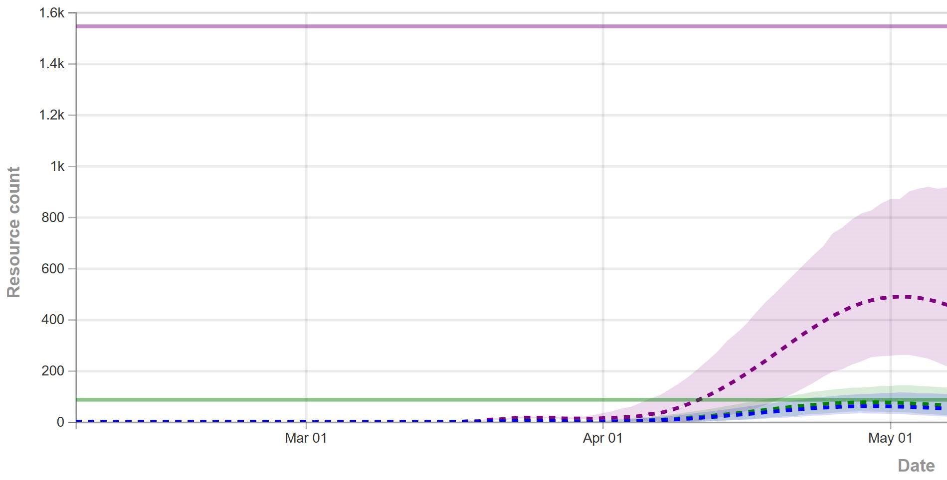
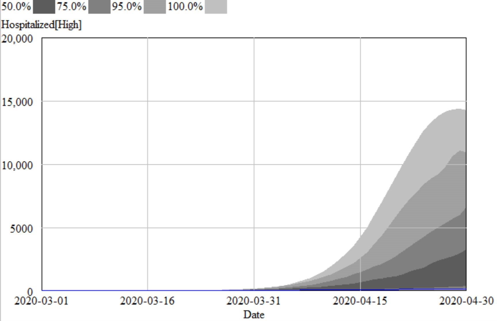
  • I also conclude that our hospital system overall has enough bed capacity to handle the peak load late April/early May; and enough ventilator capacity except during those 3 weeks in the more pessimistic Slowboth scenario. We would need 180k ventilators (rather than the assumed 120k) to avoid this shortage in the pessimistic scenario.
  • I have not addressed here the impact of containment measures and social distancing on the economy, including the supply of food and other necessities. This supply is important, affecting our ability to maintain strong containment and distancing.

This archive contains the Vensim model in mdl and vpmx format, a custom graph set (already loaded in the model), and some runs:

homerCOVID19v2.zip

A nice slide deck documenting the results:

Covid19US model jh v2.pdf

This uses data via GET XLS so it won’t work with PLE; the Model Reader will work.

Update, 3/24/2020: This version refines the model. I’ve added a copy with the data variables deleted, that should work with PLE.

Covid19US-model-jh-v2c.zip

Update, 4/27/2020:

homer v8.zip

The Chartjunk Pandemic

So much junk, so little time.

The ‘net is awash with questionable coronavirus memes. The most egregiously flawed offender I’ve seen is this one from visualcapitalist:

It’s interesting data, but the visualization really fails to put COVID19 in a proper perspective.


Exponential Growth

The biggest problem is obvious: the bottom of the curve is nothing like the peak for a quantity that grows exponentially.

Comparing the current death toll from COVID19, a few months old, to the final values from other epidemics over years to decades, is just spectacularly misleading. It beggars belief that anyone could produce such a comparison.

Perspective

Speaking of perspective, charts like this are rarely a good idea. This one gives the impression that 5M < 3M:

Reliance on our brains to map 2D to 3D is even more problematic when you consider the next problem.

2D or 3D?

Measuring the fur-blob sizes shows that the mapping of the data to the blobs is two-dimensional: the area of the blob on the page represents the magnitude. But the blobs are clearly rendered in 3D. That means the visual impression of the relationship between the Black Death (200M) and Japanese Smallpox (1M) is off by a factor of 15. The distortion is even more spectacular for COVID19.

You either have to go all the way with 3D, in which case COVID19 looks bigger, even with the other distortions unaddressed, or you need to make a less-sexy but more-informative flat 2D chart.

Stocks vs. Flows

The fourth problem here is that the chart neglects time. The disruption from an epidemic is not simply a matter of its cumulative death toll. The time distribution also matters: a large impact concentrated in a brief time frame has much greater ripple effects, as we are now experiencing.

Open Letter on Coronavirus

For all friends in the Bozone … this is letter I sent to a community list earlier today:

I appreciate the timely information from Chris Mehl. I’d like to emphasize a few points. I’m largely drawing on my thinking from an epidemic model that I posted here a few days ago, https://youtu.be/mxUsBI0Wr2M

It’s unfortunate that we now have our first confirmed COVID19 case, but we knew it was coming. One case likely means several more exposed asymptomatic are already here. Things could develop quickly: Italy went from 3 cases to 3858 in two weeks, although some of that is illusory due to the expansion of testing. However, that is not necessarily our fate – we may be luckier, and we definitely can change some things.

Two key points about this disease:
– The Covid-19 virus is transmissible before people become symptomatic. We therefore cannot wait to take action until there are confirmed or presumptive cases, or even people who have potentially been exposed, in our social networks, faith groups, communities, workplace, towns, or cities.
– This is not just about us individually. The disease disproportionately attacks older people, and people with compromised immune systems. The life you save through personal behavior may be your grandmother’s.

The response has a lot of moving parts.
1. The end of the line is treatment for the severely ill. The flu peak is typically 5-6% of ER admissions in Montana, so something just as widespread and 10x more serious is an obvious threat. It’s critical to avoid overwhelming (and infecting) our precious and limited health care workers, because if we don’t, fatality rates go up, as happened in Italy and Wuhan.
2. We can reduce contacts with the infected through monitoring, quarantine and isolation. This is the public health bailiwick, but I would expect that a large caseload could overwhelm them as well. I hope they’ll reach out to the community for help if needed. Independent of that, perhaps we can make it easy on people who are self-isolating, by organizing delivery of essential services? For employers, I hope that generous sick leave is a matter of enlightened self-interest: do you want 1 employee out for a week, or all of them out two weeks later?
We have two options that scale up well:
3. We can reduce the risk of each social contact by avoiding proximity and touching (elbow bumps instead of handshakes) and cleaning everything – handwashing, hard surfaces, etc. Lots of good info out there on this. (Sadly, hoarding sanitizers doesn’t contribute.)
4. Finally, we can reduce the number of contacts per person, aka social distancing. Cancelling nonessential group events, or moving them online, is very influential. One Biogen company meeting spawned 100 infections in Boston. The Atlantic has a nice discussion of the nuances: https://www.theatlantic.com/…/coronavirus-what-does…/607927/
If half the infected are isolated, and we have half as many contacts, and those contacts are made 50% safer, then we’ve reduced the transmission of infection by 87.5%. That’s enough to slow the infection rate to less than the recovery rate, so the disease will die out.

If we do that, we’re not quite out of the woods. Social distancing is going to be hard to sustain. But if you stop to soon, the disease comes back. So we’ll need a plan for transitioning from more disruptive social distancing measures to things we can sustain.

When we have to close schools, which I think is likely, we will need to find ways to provide good nutrition and safe spaces for kids, without risk of infection. We can help.

Social distancing is also disruptive to the economy. Our tourism industry and performing arts, and surely other sectors I haven’t thought of, are going to have a rough time. We need to mitigate that.

It’s hard on our social fabric, so things like the Renewal Network’s recent links are important. We need to figure out how to support, comfort and play interact with each other … six feet apart, like the Italians singing from their balconies in the darkness of locked-down Siena.

Fortunately, some bad outcomes are very unlikely. There’s no reason for the food system to break down, for example. Inventories are large and the working-age population won’t have high mortality. So keeping a decent stock of food in case you’re sick is prudent, but panic buying of massive quantities is unproductive. This is not the zombie apocalypse.

There is a Cassandra’s curse here. If we succeed, the worst-case scenarios won’t come true, and some will accuse us of overreacting. That takes courage.

Finally, a personal note. David Brooks had a gloomy piece in the New York Times a day or two back, detailing social breakdown during historic plagues. I think that is not our fate. We have new tools at our disposal, i.e. the internet, that did not exist in previous pandemics. Incredibly, I know – by just one hop on social media – people involved in several of the defining events of this epidemic, including the Siena singers. W now have a powerful and non-infectious way for us to stay coordinated; we just have to be sure that we find ways to reach out to people who are not so digitally connected.

There’s a huge trove of digital resources here:
https://coronavirustechhandbook.com/

Tom Continue reading “Open Letter on Coronavirus”

Vensim SIR modeling primer

I’ve added an SIR modeling primer video to the Vensim coronavirus page, where you can download the models and the software.

This illustrates most of the foundations of the community coronavirus model. Feel free to adapt any of these tools for education or other purposes (but please respect the free Vensim PLE educational license and buy a paid copy if you’re doing commercial work).


Is coronavirus different in the UK and Italy?

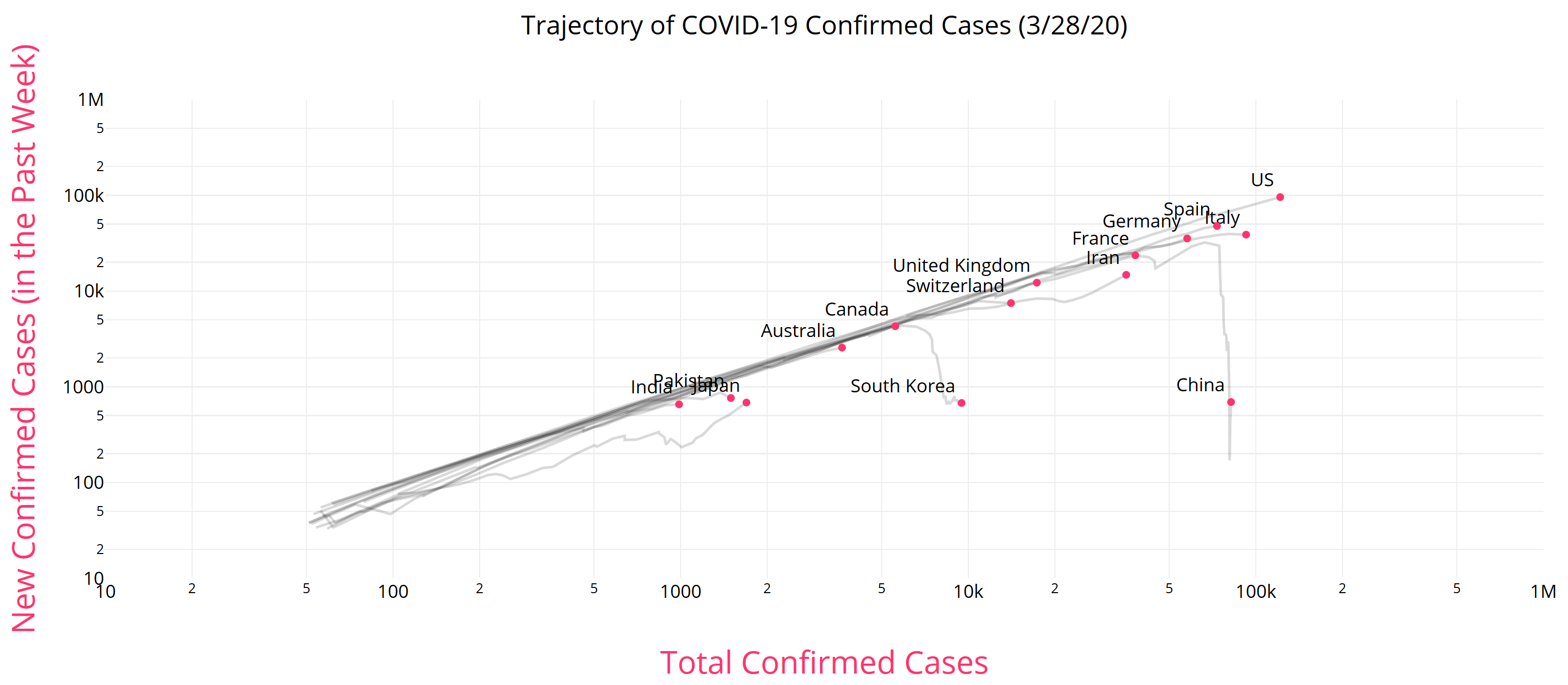
BBC UK writes, Coronavirus: Three reasons why the UK might not look like Italy. They point to three observations about the epidemic so far:

  1. Different early transmission – the UK lags the epidemic in Italy
  2. Italy’s epidemic is more concentrated
  3. More of Italy’s confirmed cases are fatal

I think these speculations are misguided, and give a potentially-disastrous impression that the UK might somehow dodge a bullet without really trying. That’s only slightly mitigated by the warning at the end,

Don’t relax quite yet

Even though our epidemic may not follow Italy’s exactly, that doesn’t mean the UK will escape serious changes to its way of life.

Epidemiologist Adam Kucharski warns against simple comparisons of case numbers and that “without efforts to control the virus we could still see a situation evolve like that in Italy”, even if not necessarily in the next four weeks.

… which should be in red 72-point text right at the top.

Will the epidemic play out differently in the UK? Surely. But it really look qualitatively different? I doubt it, unless the reaction is different.

The fundamental problem is that the structure of a system determines its behavior. A slinky will bounce if you jiggle it, but more fundamentally it bounces because it’s a spring. You can jiggle a brick all you want, but you won’t get much bouncing.

The system of a virus spreading through a population is the same. The structure of the system says that, as long as the virus can infect people faster than they recover, it grows exponentially. It’s inevitable; it’s what a virus does. The only way to change that is to change the structure of the system by slowing the reproduction. That happens when there’s no one left to infect, or when we artificially reduce the infection rate though social distancing, sterilization and quarantine.

A change to the initial timing or distribution of the epidemic doesn’t change the structure at all. The slinky is still a slinky, and the epidemic will still unfold exponentially. Our job, therefore, is to make ourselves into bricks.

The third point, that fatality rates are lower, may also be a consequence of the UK starting from a different state today. In Italy, infections have grown high enough to overwhelm the health care system, which increases the fatality rate. The UK may not be there yet. However, a few doublings of the number of infected will quickly close the gap. This may also be an artifact of incomplete testing and lags in reporting.

Here’s a more detailed explanation:

More Interactive Coronavirus Models

Jeroen Struben has a nice interactive web simulation running online at Forio. It’s multiregion, with diffusion of infection across borders, and includes some of the interesting structures I excluded from my simple model, including explicit quarantine and vaccination, and testing and reporting lags.

The NYT has a very simple interactive simulation embedded in:

How Much Worse the
Coronavirus Could Get, in Charts

As always, I’m eager to know of more – please comment!

Dynamics of Hoarding

“I’m not hoarding, I’m just stocking up before the hoarders get here.”
Behavioral causes of phantom ordering in supply chains
John D. Sterman
Gokhan Dogan

When suppliers are unable to fill orders, delivery delays increase and customers receive less than they desire. Customers often respond by seeking larger safety stocks (hoarding) and by ordering more than they need to meet demand (phantom ordering). Such actions cause still longer delivery times, creating positive feedbacks that intensify scarcity and destabilize supply chains. Hoarding and phantom ordering can be rational when customers compete for limited supply in the presence of uncertainty or capacity constraints. But they may also be behavioral and emotional responses to scarcity. To address this question we extend Croson et al.’s (2014) experimental study with the Beer Distribution Game. Hoarding and phantom ordering are never rational in the experiment because there is no horizontal competition, randomness, or capacity constraint; further, customer demand is constant and participants have common knowledge of that fact. Nevertheless 22% of participants place orders more than 25 times greater than the known, constant demand. We generalize the ordering heuristic used in prior research to include the possibility of endogenous hoarding and phantom ordering. Estimation results strongly support the hypothesis, with hoarding and phantom ordering particularly strong for the outliers who placed extremely large orders. We discuss psychiatric and neuroanatomical evidence showing that environmental stressors can trigger the impulse to hoard, overwhelming rational decision‐making. We speculate that stressors such as large orders, backlogs or late deliveries trigger hoarding and phantom ordering for some participants even though these behaviors are irrational. We discuss implications for supply chain design and behavioral operations research.