Prediction, in context

I’m increasingly running into machine learning approaches to prediction in health care. A common application is identification of risks for (expensive) infections or readmission. The basic idea is to treat patients like a function approximation problem.

The hospital compiles a big dataset on patient demographics, health status, exposure to procedures, and infection outcomes. A vendor slurps this up and turns some algorithm loose on the data, seeking the risk factors associated with the infection. It might look like this:

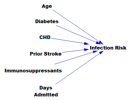
… except that there might be 200 predictors, not six – more than you can handle by eyeballing scatter plots or control charts. Once you have a risk model, you know which patients to target for mitigation, and maybe also which associated factors to pursue further.

However, this is only half the battle. Systems thinkers will recognize this model as a dead buffalo: a laundry list with unidirectional causality. The real situation is rich in feedback, including a lot of things that probably don’t get measured, and therefore don’t end up in the data for consideration by the algorithm. For example:

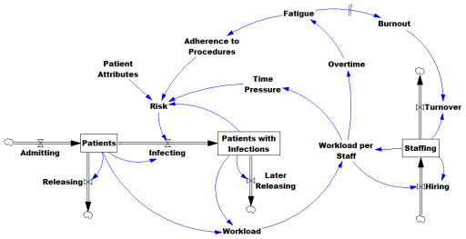
Infections aren’t just a random event for the patient; they happen for reasons that are larger than the patient. Even worse, there are positive feedbacks that can make prevention of infections, and errors more generally, hard to manage. For example, as the number of patients with infections rises, workload goes up, which creates time pressure and fatigue. That induces shortcuts and errors that create risk for patients, leading to more infections. Infections spread to other patients. Fatigued staff burn out and turn over faster, which dilutes the staff experience that might otherwise mitigate risk. (Experience, like many other dynamics, is not shown above.)

An algorithm that predicts risk in this context is certainly useful, because anything that reduces risk helps to diminish the gain of the vicious cycles. But it’s no longer so clear what to do with the patient assessments. Time spent on staff education and action for risk mitigation has to come from somewhere, and therefore might have unintended consequences that aren’t assessed by the algorithm. The algorithm is actually blind in two ways: it can’t respond to any input (like staff fatigue or skill) that isn’t in the data, and it probably  isn’t statistically smart enough to deal with the separation of cause and effect in time and space that arises in a feedback system.

Deep learning systems like Alpha Go Zero might learn to deal with dynamics. But so far, high performance requires very large numbers of exemplars for reinforcement learning, and that’s never going to happen in a community hospital dataset. Then again, we humans aren’t too good at managing dynamic complexity either. But until the machines take over, we can build dynamic models to sort these problems out. By taking an endogenous point of view, we can put machine learning in context, refine our understanding of leverage points, and redesign systems for greater performance.

Footing the bill for Iraq

Back in 2002, when invasion of Iraq was on the table and many Democrats were rushing patriotically to the President’s side rather than thinking for themselves, William Nordhaus (staunchest critic of Limits) went out on a limb a bit to attempt a realistic estimate of the potential cost.

All the dangers that lead to ignoring or underestimating the costs of war can be reduced by a thoughtful public discussion. Yet neither the Bush administration nor the Congress – neither the proponents nor the critics of war – has presented a serious estimate of the costs of a war in Iraq. Neither citizens nor policymakers are able to make informed judgments about the realistic costs and benefits of a potential conflict when no estimate is given.

His worst case: about $755 billion direct (military, peacekeeping and reconstruction) plus indirect effects totaling almost $2 trillion for a decade of conflict and its aftermath.

NordhausIraqNordhaus’ worst case is pretty close to actual direct spending in Iraq to date. But with another trillion for Afghanistan and 2 to 4 in the pipeline from future obligations related to the war, the grand total is looking like a lowball estimate. Other pre-invasion estimates, in the low billions, look downright ludicrous.

Recent news makes Nordhaus’ parting thought even more prescient:

Particularly worrisome are the casual promises of postwar democratization, reconstruction, and nation-building in Iraq. The cost of war may turn out to be low, but the cost of a successful peace looks very steep. If American taxpayers decline to pay the bills for ensuring the long-term health of Iraq, America would leave behind mountains of rubble and mobs of angry people. As the world learned from the Carthaginian peace that settled World War I, the cost of a botched peace may be even higher than the price of a bloody war

Self-generated seasonal cycles

This time of year, systems thinkers should eschew sugar plum fairies and instead dream of Industrial Dynamics, Appendix N:

Self-generated Seasonal Cycles

Industrial policies adopted in recognition of seasonal sales patterns may often accentuate the very seasonality from which they arise. A seasonal forecast can lead to action that may cause fulfillment of the forecast. In closed-loop systems this is a likely possibility. The analysis of sales data in search of seasonality is fraught with many dangers. As discussed in Appendix F, random-noise disturbances contain a broad band of component frequencies. This means that any effort toward statistical isolation of a seasonal sales component will find some seasonality in the random disturbances. Should the seasonality so located lead to decisions that create actual seasonality, the process can become self-regenerative.

Self-induced seasonality appears to occur many places in American industry. Sometimes it is obvious and clearly recognized, and perhaps little can be done about it. An example of the obvious is the strong seasonality in items such as cameras sold in the Christmas trade. By bringing out new models and by advertising and other sales promotion in anticipation of Christmas purchases, the industry tends to concentrate its sales at this particular time of year.

Other kinds of seasonality are much less clear. Almost always when seasonality is expected, explanations can be found to justify whatever one believes to be true. A tradition can be established that a particular item sells better at a certain time of year. As this “fact” becomes more and more widely believed, it may tend to concentrate sales effort at the time when the customers are believed to wish to buy. This in turn still further heightens the sales at that particular time.

Retailer sales & e-commerce sales, from FRED


Facebook Reloaded 2013

Facebook has climbed out of its 2012 doldrums to a market cap of $115 billion today. So, I’ve updated my user tracking and valuation model, just for kicks.

As in my last update, user growth continues to modestly exceed the original estimates. The user “carrying capacity” now is about 1.35 billion users, vs. .95 originally (K950 on graph) and 1.07 in 2012 – within the range of scenarios I originally ran, but well above the “best guess”. My guess is that the model will continue to underpredict for a while, because this is an inevitable pitfall of using a single diffusion process to represent what is surely the aggregate of several processes – stationary vs. mobile, different regions and demographics, etc. Of course, in the long run, users could also go down, which the basic logistic model can’t represent.

You can see what’s going on if you plot growth against users -the right tail doesn’t go to 0 as fast as the logistic assumes:

User growth probably isn’t a huge component of valuation, because these are modest differences on a percentage basis. Marginal users may be less valuable as well.

With revenue per user at a constant $7/user/year, and 30% margins, and the current best-guess model, FB is now worth $35 billion. What does it take to get to the ballpark of current market capitalization? Here’s one way:

  • The carrying capacity ceiling for users continues to grow to 2 billion, and
  • revenue per user rises to $25/user/year

This preserves some optimistic base case assumptions,

  • The risk-free interest rate takes 5 more years to rise substantially above 0 to a (still low) long term rate of 3%
  • Margins stay at 30% as in 2009-2011 (vs. 18% y.t.d.)

Think it’ll happen?

facebook 3 update 2.vpm

Real estate appraisal – learning the wrong lesson from failure

I just had my house appraised for a refinance. The appraisal came in at least 20% below my worst-case expectation of market value. The basis of the judgment was comps, about which the best one could say is that they’re in the same county.

I could be wrong. But I think it more likely that the appraisal was rubbish. Why did this happen? I think it’s because real estate appraisal uses unscientific methods that would not pass muster in any decent journal, enabling selection bias and fudge factors to dominate any given appraisal.

When the real estate bubble was on the way up, the fudge factors all provided biased confirmation of unrealistically high prices. In the bust, appraisers got burned. They didn’t learn that their methods were flawed; rather they concluded that the fudge factors should point down, rather than up.

Here’s how appraisals work:

A lender commissions an appraisal. Often the appraiser knows the loan amount or prospective sale price (experimenters used to double-blind trials should be cringing in horror).

The appraiser eyeballs the subject property, and then looks for comparable sales of similar properties within a certain neighborhood in space and time (the “market window”). There are typically 4 to 6 of these, because that’s all that will fit on the standard appraisal form.

The appraiser then adjusts each comp for structure and lot size differences, condition, and other amenities. The scale of adjustments is based on nothing more than gut feeling. There are generally no adjustments for location or timing of sales, because that’s supposed to be handled by the neighborhood and market window criteria.

There’s enormous opportunity for bias, both in the selection of the comp sample and in the adjustments. By cherry-picking the comps and fiddling with adjustments, you can get almost any answer you want. There’s also substantial variance in the answer, but a single point estimate is all that’s ever reported.

Here’s how they should work:

The lender commissions an appraisal. The appraiser never knows the price or loan amount (though in practice this may be difficult to enforce).

The appraiser fires up a database that selects lots of comps from a wide neighborhood in time and space. Software automatically corrects for timing and location by computing spatial and temporal gradients. It also automatically computes adjustments for lot size, sq ft, bathrooms, etc. by hedonic regression against attributes coded in the database. It connects to utility and city information to determine operating costs – energy and taxes – to adjust for those.

The appraiser reviews the comps, but only to weed out obvious coding errors or properties that are obviously non-comparable for reasons that can’t be adjusted automatically, and visits the property to be sure it’s still there.

The answer that pops out has confidence bounds and other measures of statistical quality attached. As a reality check, the process is repeated for the rental market, to establish whether rent/price ratios indicate an asset bubble.

If those tests look OK, and the answer passes the sniff test, the appraiser reports a plausible range of values. Only if the process fails to converge does some additional judgment come into play.

There are several patents on such a process, but no widespread implementation. Most of the time, it would probably be cheaper to do things this way, because less appraiser time would be needed for ultimately futile judgment calls. Perhaps it would exceed the skillset of the existing population of appraisers though.

It’s bizarre that lenders don’t expect something better from the appraisal industry. They lose money from current practices on both ends of market cycles. In booms, they (later) suffer excess defaults. In busts, they unnecessarily forgo viable business.

To be fair, fully automatic mass appraisal like Zillow and Trulia doesn’t do very well in my area. I think that’s mostly lack of data access, because they seem to cover only a small subset of the market. Perhaps some human intervention is still needed, but that human intervention would be a lot more effective if it were informed by even the slightest whiff of statistical reasoning and leveraged with some data and computing power.

Update: on appeal, the appraiser raised our valuation 27.5%. Case closed.

A small victory for scientific gobbledygook, arithmetic and Nate Silver

Nate Silver of 538 deserves praise for calling the election in all 50 states, using a fairly simple statistical model and lots of due diligence on the polling data. When the dust settles, I’ll be interested to see a more detailed objective evaluation of the forecast (e.g., some measure of skill, like likelihoods).

Many have noted that his approach stands in stark contrast to big-ego punditry:

Another impressive model-based forecasting performance occurred just days before the election, with successful prediction of Hurricane Sandy’s turn to landfall on the East Coast, almost a week in advance.

On October 22, you blogged that there was a possibility it could hit the East Coast. How did you know that?

There are a few rather reliable global models. They’re models that run all the time, all year long, so they don’t focus on any one storm. They run for the entire globe, not just for North America. There are two types of runs these models can be configured to do. One is called a deterministic run and that’s where you get one forecast scenario. Then the other mode, and I think this is much more useful, especially at longer ranges where things become much more uncertain, is ensemble—where 20 or 40 or 50 runs can be done. They are not run at as high of a resolution as the deterministic run, otherwise it would take forever, but it’s still incredibly helpful to look at 20 runs.

Because you have variation? Do the ensemble runs include different winds, currents, and temperatures?

You can tweak all sorts of things to initialize the various ensemble members: the initial conditions, the inner-workings of the model itself, etc. The idea is to account for observational error, model error, and other sources of uncertainty. So you come up with 20-plus different ways to initialize the model and then let it run out in time. And then, given the very realistic spread of options, 15 of those ensemble members all recurve the storm back to the west when it reaches the East coast, and only five of them take it northeast. That certainly has some information content. And then, one run after the next, you can watch those. If all of the ensemble members start taking the same track, it doesn’t necessarily make them right, but it does mean it’s more likely to be right. You have much more confidence forecasting a track if the model guidance is in in good agreement. If it’s a 50/50 split, that’s a tough call.

– Outside

On October 22, you blogged that there was a possibility it could hit the East Coast. How did you know that?
There are a few rather reliable global models. They’re models that run all the time, all year long, so they don’t focus on any one storm. They run for the entire globe, not just for North America. There are two types of runs these models can be configured to do. One is called a deterministic run and that’s where you get one forecast scenario. Then the other mode, and I think this is much more useful, especially at longer ranges where things become much more uncertain, is ensemble—where 20 or 40 or 50 runs can be done. They are not run at as high of a resolution as the deterministic run, otherwise it would take forever, but it’s still incredibly helpful to look at 20 runs.

Because you have variation? Do the ensemble runs include different winds, currents, and temperatures?
You can tweak all sorts of things to initialize the various ensemble members: the initial conditions, the inner-workings of the model itself, etc. The idea is to account for observational error, model error, and other sources of uncertainty. So you come up with 20-plus different ways to initialize the model and then let it run out in time. And then, given the very realistic spread of options, 15 of those ensemble members all recurve the storm back to the west when it reaches the East coast, and only five of them take it northeast. That certainly has some information content. And then, one run after the next, you can watch those. If all of the ensemble members start taking the same track, it doesn’t necessarily make them right, but it does mean it’s more likely to be right. You have much more confidence forecasting a track if the model guidance is in in good agreement. If it’s a 50/50 split, that’s a tough call.

On October 22, you blogged that there was a possibility it could hit the East Coast. How did you know that?

There are a few rather reliable global models. They’re models that run all the time, all year long, so they don’t focus on any one storm. They run for the entire globe, not just for North America. There are two types of runs these models can be configured to do. One is called a deterministic run and that’s where you get one forecast scenario. Then the other mode, and I think this is much more useful, especially at longer ranges where things become much more uncertain, is ensemble—where 20 or 40 or 50 runs can be done. They are not run at as high of a resolution as the deterministic run, otherwise it would take forever, but it’s still incredibly helpful to look at 20 runs.


Because you have variation? Do the ensemble runs include different winds, currents, and temperatures?

You can tweak all sorts of things to initialize the various ensemble members: the initial conditions, the inner-workings of the model itself, etc. The idea is to account for observational error, model error, and other sources of uncertainty. So you come up with 20-plus different ways to initialize the model and then let it run out in time. And then, given the very realistic spread of options, 15 of those ensemble members all recurve the storm back to the west when it reaches the East coast, and only five of them take it northeast. That certainly has some information content. And then, one run after the next, you can watch those. If all of the ensemble members start taking the same track, it doesn’t necessarily make them right, but it does mean it’s more likely to be right. You have much more confidence forecasting a track if the model guidance is in in good agreement. If it’s a 50/50 split, that’s a tough call.

The Capen Quiz at the System Dynamics Conference

I ran my updated Capen quiz at the beginning of my Vensim mini-course on optimization and uncertainty at the System Dynamics conference. The results were pretty typical – people expressed confidence bounds that were too narrow compared to their actual knowledge of the questions. Thus their effective confidence was at the 40% level rather than the 80% level desired. Here’s the distribution of actual scores from about 30 people, compared to a Binomial (10,.8) distribution:

(I’m going from memory here on the actual distribution, because I forgot to grab the flipchart of results. Did anyone take a picture? I won’t trouble you with my confidence bounds on the the confidence bounds.)

My take on this is that it’s simply very hard to be well-calibrated intuitively, unless you dedicate time for explicit contemplation of uncertainty. But it is a learnable skill – my kids, who had taken the original Capen quiz, managed to score 7 out of 10.

Even if you can get calibrated on a set of independent questions, real-world problems where dimensions covary are really tough to handle intuitively. This is yet another example of why you need a model.

Calibrate your confidence bounds: an updated Capen Quiz

Forecasters are notoriously overconfident. This applies to nearly everyone who predicts anything, not just stock analysts. A few fields, like meteorology, have gotten a handle on the uncertainty in their forecasts, but this remains the exception rather than the rule.

Having no good quantitative idea of uncertainty, there is an almost universal tendency for people to understate it. Thus, they overestimate the precision of their own knowledge and contribute to decisions that later become subject to unwelcome surprises.

A solution to this problem involves some better understanding of how to treat uncertainties and a realization that our desire for preciseness in such an unpredictable world may be leading us astray.

E.C. Capen illustrated the problem in 1976 with a quiz that asks takers to state 90% confidence intervals for a variety of things – the length of the Golden Gate bridge, the number of cars in California, etc. A winning score is 9 out of 10 right. 10 out of 10 indicates that the taker was underconfident, choosing ranges that are too wide.

Ventana colleague Bill Arthur has been giving the quiz to clients for years. In fact, it turns out that the vast majority of takers are overconfident in their knowledge – they choose ranges that are too narrow, and get only a three or four questions right. CEOs are the worst – if you score zero out of 10, you’re c-suite material.

My kids and I took the test last year. Using what we learned, we expanded the variance on our guesses of the weight of a giant pumpkin at the local coop – and as a result, brought the monster home.

Now that I’ve taken the test a few times, it spoils the fun, so last time I was in a room for the event, I doodled an updated quiz. Here’s your chance to calibrate your confidence intervals:


For each question, specify a range (minimum and maximum value) within which you are 80% certain that the true answer lies. In other words, in an ideal set of responses, 8 out of 10 answers will contain the truth within your range.

Example*:

The question is, “what was the winning time in the first Tour de France bicycle race, in 1903?”

Your answer is, “between 1 hour and 1 day.”

Your answer is wrong, because the truth (94 hours, 33 minutes, 14 seconds) does not lie within your range.

Note that it doesn’t help to know a lot about the subject matter – precise knowledge merely requires you to narrow your intervals in order to be correct 80% of the time.

Now the questions:

  1. What is the wingspan of an Airbus A380-800 superjumbo jet?
  2. What is the mean distance from the earth to the moon?
  3. In what year did the Russians launch Sputnik?
  4. In what year did Alaric lead the Visigoths in the Sack of Rome?
  5. How many career home runs did baseball giant Babe Ruth hit?
  6. How many iPhones did Apple sell in FY 2007, its year of introduction?
  7. How many transistors were on a 1993 Intel Pentium CPU chip?
  8. How many sheep were in New Zealand on 30 June 2006?
  9. What is the USGA-regulated minimum diameter of a golf ball?
  10. How tall is Victoria Falls on the Zambezi River?

Be sure to write down your answers (otherwise it’s too easy to rationalize ex post). No googling!

Answers at the end of next week.

*Update: edited slightly for greater clarity.

EIA projections – peak oil or snake oil?

Econbrowser has a nice post from Steven Kopits, documenting big changes in EIA oil forecasts. This graphic summarizes what’s happened:

kopits_eia_forecasts_jun_10
Click through for the original article.

As recently as 2007, the EIA saw a rosy future of oil supplies increasing with demand. It predicted oil consumption would rise by 15 mbpd to 2020, an ample amount to cover most eventualities. By 2030, the oil supply would reach nearly 118 mbpd, or 23 mbpd more than in 2006. But over time, this optimism has faded, with each succeeding year forecast lower than the year before. For 2030, the oil supply forecast has declined by 14 mbpd in only the last three years. This drop is as much as the combined output of Saudi Arabia and China.

In its forecast, the EIA, normally the cheerleader for production growth, has become amongst the most pessimistic forecasters around. For example, its forecasts to 2020 are 2-3 mbpd lower than that of traditionally dour Total, the French oil major. And they are below our own forecasts at Douglas-Westwood through 2020. As we are normally considered to be in the peak oil camp, the EIA’s forecast is nothing short of remarkable, and grim.

Is it right? In the last decade or so, the EIA’s forecast has inevitably proved too rosy by a margin. While SEC-approved prospectuses still routinely cite the EIA, those who deal with oil forecasts on a daily basis have come to discount the EIA as simply unreliable and inappropriate as a basis for investments or decision-making. But the EIA appears to have drawn a line in the sand with its new IEO and placed its fortunes firmly with the peak oil crowd. At least to 2020.

Since production is still rising, I think you’d have to call this “inflection point oil,” but as a commenter points out, it does imply peak conventional oil:

It’s also worth note that most of the liquids production increase from now to 2020 is projected to be unconventional in the IEO. Most of this is biofuels and oil sands. They REALLY ARE projecting flat oil production.

Since I’d looked at earlier AEO projections in the past, I wondered what early IEO projections looked like. Unfortunately I don’t have time to replicate the chart above and overlay the earlier projections, but here’s the 1995 projection:

Oil - IEO 1995

The 1995 projections put 2010 oil consumption at 87 to 95 million barrels per day. That’s a bit high, but not terribly inconsistent with reality and the new predictions (especially if the financial bubble hadn’t burst). Consumption growth is 1.5%/year.

And here’s 2002:

Oil - IEO 2002

In the 2002 projection, consumption is at 96 million barrels in 2010 and 119 million barrels in 2020 (waaay above reality and the 2007-2010 projections), a 2.2%/year growth rate.

I haven’t looked at all the interim versions, but somewhere along the way a lot of optimism crept in (and recently, crept out). In 2002 the IEO oil trajectory was generated by a model called WEPS, so I downloaded WEPS2002 to take a look. Unfortunately, it’s a typical open-loop spreadsheet horror show. My enthusiasm for a detailed audit is low, but it looks like oil demand is purely a function of GDP extrapolation and GDP-energy relationships, with no hint of supply-side dynamics (not even prices, unless they emerge from other models in a sneakernet portfolio approach). There’s no evidence of resources, not even synchronized drilling. No wonder users came to “discount the EIA as simply unreliable and inappropriate as a basis for investments or decision-making.”

Newer projections come from a new version, WEPS+. Hopefully it’s more internally consistent than the 2002 spreadsheet, and it does capture stock/flow dynamics and even includes resources. EIA appears to be getting better. But it appears that there’s still a fundamental problem with the paradigm: too much detail. There just isn’t any point in producing projections for dozens of countries, sectors and commodities two decades out, when uncertainty about basic dynamics renders the detail meaningless. It would be far better to work with simple models, capable of exploring the implications of structural uncertainty, in particular relaxing assumptions of equilibrium and idealized behavior.

Update: Michael Levi at the CFR blog points out that much of the difference in recent forecasts can be attributed to changes in GDP projections. Perhaps so. But I think this reinforces my point about detail, uncertainty, and transparency. If the model structure is basically consumption = f(GDP, price, elasticity) and those inputs have high variance, what’s the point of all that detail? It seems to me that the detail merely obscures the fundamentals of what’s going on, which is why there’s no simple discussion of reasons for the change in forecast.