This is a great talk by Nate Osgood on the intersection of systems and complexity with data science and machine learning:
Category: health
6 more reasons to apply SD to medical research
@SDWisdom Ken Cooper lists 6 good reasons to apply System Dynamics to medical research. I think there are more if you broaden the definition of ‘medical’ :
7. Dose titration can be dynamically complex and subject to misperceptions of feedback; models make it easy.
8. Chronic autoimmune and mental health problems are embedded in a nest of feedback between the disease and the person’s environment.
9. ERs, hospitals and other delivery systems are loaded with delays, feedback and nonlinearity.
10. Smoking, diet, exercise, and other big health drivers are social phenomena.
11. Diet and exercise are entangled with other systems, like urban design and energy efficiency.
12. The health insurance system, especially in the US where it has evolved into a mess, can’t be redesigned without a systemic perspective.
4 Faces of Medical Modeling
I enjoyed the biomedical modeling plenary at #ISDC2019 more than most. I was struck by the continuum of behavior involved in the system:
- True biomedical modeling is a bit funny, because it’s not typical System Dynamics, in the sense that it’s nonlinear dynamic simulation, but it’s not behavioral, so it’s missing one of the cornerstones of SD. Nevertheless, I think the way we think about complex systems is a useful complement to other approaches coming more from biology and mathematics (nonlinear dynamics).
- Behavior enters one level “up”, in problems like Jim Rogers & Ed Gallaher’s work on dose titration in anemia. This is a classic case of smart people having trouble managing a system with fairly simple dynamics – essentially a single pipeline delay in the case of anemia. There may be many similar cases, where large performance improvements are available from simple models (but complicated people management).
- Next, there are problems that combine behavioral dynamics and misperceptions of feedback with an underlying system that is also quite complex. Gizem Aktas’ work on stress and hormonal regulation is an example, as are diabetes and mental health models.
- At the far end of the scale, there are health system models, like ReThink Health, which abstract away from the biomedical details of any particular disease. In its place, there’s an extremely complex network of human resources, incentives and decisions.
I think the opportunities are large in all of these areas. Once challenge for the field is that each requires a different interface to other researchers, health practitioners and managers. That’s a lot for relatively few modelers to manage. How can we team up to be more effective?
Biological Dynamics of Stress: the Outer Loops
A while back I reviewed an interesting model of hormone interactions triggered by stress. The bottom line:
I think there might be a lot of interesting policy implications lurking in this model, waiting for an intrepid explorer with more subject matter expertise than I have. I think the crucial point here is that the structure identifies a mechanism by which patient outcomes can be strongly path dependent, where positive feedback preserves a bad state long after harmful stimuli are removed. Among other things, this might explain why it’s so hard to treat such patients. That in turn could be a basis for something I’ve observed in the health system – that a lot of doctors find autoimmune diseases mysterious and frustrating, and respond with a variation on the fundamental attribution error – attributing bad outcomes to patient motivation when delayed, nonlinear feedback is responsible.
Since then, I’ve been reflecting on the fact that the internal positive feedbacks that give the hormonal system a tipping point, allowing people to get stuck in a bad state, are complemented and amplified by a set of external loops that do the same thing. I’ve reorganized my version of the model to show how this works:
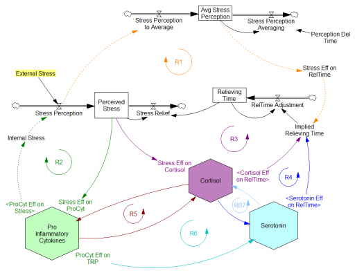
Stress-Hormone Interactions (See also Fig. 1 in the original paper.)
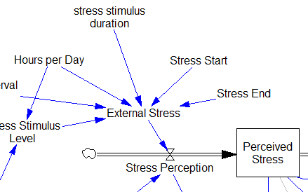
The trigger for the system is External Stress (highlighted in yellow). A high average rate of stress perception lengthens the relieving time for stress. This creates a reinforcing loop, R1. This is analogous to the persistent pollution loop in World3, where a high level of pollution poisons the mechanisms that alleviate pollution.
I’ve constructed R1 with dashed arrows, because the effects are transient – when stress perception stops, eventually the stress effect on the relieving time returns to normal. (If I were reworking the model, I think I would simplify this effect, so that the stock of Perceived Stress affected the relieving time directly, rather than including a separate smooth, but this would not change the transience of the effect.)
A second effect of stress, mediated by Pro-inflammatory Cytokines, produces another reinforcing loop, R2. That loop does create Internal Stress, which makes it potentially self-sustaining. (Presumably that would be something like stress -> cytokines -> inflammation -> pain -> stress.) However, in simulations I’ve explored, a self-sustaining effect does not occur – evidently the Pro-inflammatory Cytokines sector does not contain a state that is permanently affected, absent an external stress trigger.
Still more effects of stress are mediated by the Cortisol and Serotonin sectors, and Cortisol-Pro-inflammatory Cytokines interactions. These create still more reinforcing loops, R3, R4, R5 and R6. Cortisol-serotonin affects appear to have multiple signs, making the net effect (RB67) ambiguous in polarity (at least without further digging into the details). Like R1 (the stress self-effect), R3, R4 and R6 operate by extending the time over which stress is relieved, which tends to increase the stock of stress. Even with long relief times, stress still drains away eventually, so these do not create permanent effects on stress.
However, within the Cortisol sector, there are persistent states that are affected by stress and inflammation. These are related to glucocorticoid receptor function, and they can be durably altered, making the effects of stress long term.
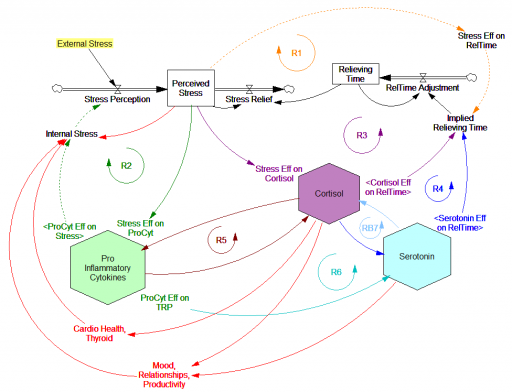
These dynamics alone make the system hard to understand and manage. However, I think the real situation is still more complex. Consider the following red links, which produce stress endogenously:
One possibility, discussed in the original paper but out of scope for the model, is that cognitive processing of stress has its own effects. For example, if stress produces stress, e.g., through worrying about stress, it could become self-sustaining. There are plenty of other possible mechanisms. The cortisol system affects cardiovascular health and thyroid function, which could lead to additional symptoms provoking stress. Similarly, mood affects family relationships and job productivity, which may contribute to stress.
These effects can be direct, for example if elevated cortisol causes stressful cardiovascular symptoms. But they could also be indirect, via other subsystems in one’s life. If you incur large health expenses or miss a lot of work, you’re likely to suffer financial stress. Presumably diet and exercise are also tightly coupled to this system.
All of these loops create abundant opportunity for tipping points that can lock you into good health or bad. I think they’re a key mechanism in poverty traps. Certainly they provide a clear mechanism that explains why mental health is not all in your head. Lack of appreciation for the complexity of this system may also explain why traditional medicine is not very successful in treating its symptoms.
If you’re on the bad side of a tipping point, all is not lost however. Positive loops that preserve a stressful state, acting as vicious cycles, can also operate in reverse as virtuous cycles, if a small improvement can be initiated. Even if it’s hard to influence physiology, there are other leverage points here that might be useful: changing your own approach to stress, engaging your relationships in the solution, and looking for ways to lower external stresses that keep the internal causes activated may all help.
I think I’m just scratching the surface here, so I’m interested in your thoughts.
An application of model critique
This long post walks through a real-world critique of an interesting model – this year’s Dana Meadows Award winner.
Testing is the key to making a good model even better.
Therefore, in the interest of continuous improvement, I’ll take a hard look at a very interesting model. To get in the spirit, you might want to take a look at How to Critique a Model and my video critique of World Dynamics. I’m taking this model apart not because it’s bad, but because it’s interesting and worth investigating. (Taking apart bad models is sometimes fun too, but the supply of them is overwhelming.)
Before digging in, let me point out that I have no particular expertise in this area, so my critique is purely technical.
Inspection
The model (originally in STELLA, translated to Vensim here) passed my initial sniff test – no strange formulations, ugly spaghetti, cryptic variable names, or unit errors in the original.
However, it turns out that STELLA’s unit checking is not very strict. For example, it permits:
LOG10(Free Cortisol)/LOG10(Ref Free Cortisol)
with cortisol in units of nmol. This is a conceptual error – logarithms are fundamentally dimensionless. Fortunately, it’s without consequence for model behavior – it just scales the input to a lookup.
Here, a better normalization would be:
LOG10(Free Cortisol/Ref Free Cortisol)
In my translation, I didn’t fix these issues; I suppressed them with a “DMNL LOG10” macro that hides the warning.
STELLA also permits unnormalized lookups without issuing a warning (maybe this is a buried preference somewhere). This is not necessarily an error, but it’s not best practice. It may conceal errors, and makes analysis difficult (more on this below).
One reviewer pointed out that a number of physical processes in the model are represented by goal seeking structures – essentially SMOOTHs. Here, the number of glucocorticoid receptors adjusts toward a level indicated by cortisol levels:
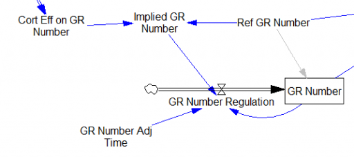
This is basically a shorthand for a real physical process that must involve inflows and outflows, something like this:
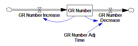
The physical representation is potentially better because it’s more operational. It invites more thinking along the lines of “where do these receptors come from?” It exposes one important possibility: asymmetry. The process that increases GR numbers might have a different time constant from the process that decreases GR numbers. However, absent detailed information about GR regulation, I have no idea how to implement such a thing. Maybe no one does: my experience with biological models is that there are always many layers of complexity surrounding the system of interest, and the literature often just scratches the surface.
TIME STEP & PULSE
The first thing I test in most models is to vary TIME STEP to check stability. The usual trick is to halve TIME STEP and see if you get the same answer, but this model already runs for 92,160 time steps (128 steps per hour for 720 hours). I don’t see any delays that are small enough to require that, but you can’t always see implicit time constants in a model. Still, I wonder, could you get away with a coarser step?
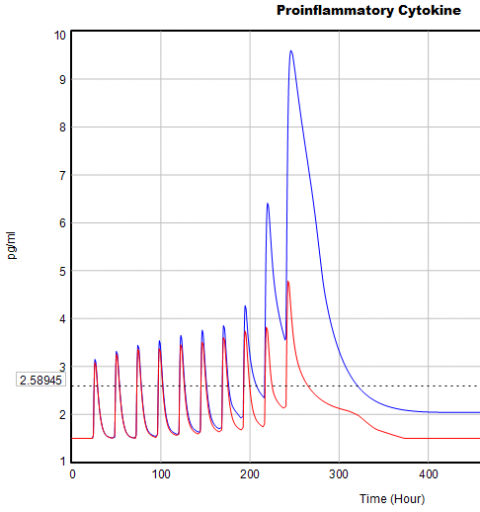
If you double the TIME STEP, you immediately see differences:
This suggests that TIME STEP needs to be small (perhaps even smaller than its already-tiny value). But where does this come from? It turns out to be due to the test input. In the original, the external stress consists of a series of IF THEN ELSE statements, like:
IF((TIME>1) AND (TIME<1+Stress_Stimulus_Duration)) THEN (1) ELSE(0) + ...
I implemented this in the Vensim version via the PULSE TRAIN function. But there’s a small problem here: if the stress stimulus duration is not a power of 2, the effective width of the pulse will vary a little bit as you change the TIME STEP (assuming that it is a power of 2, as is usual to minimize roundoff error). That in turn means that the area under the curve of the stress perception inflow to the model varies slightly with the duration of the pulse.
Often, that won’t matter, but because this model has a numerically sensitive threshold, it matters a lot.
It turns out that if you renormalize the external stress input to deliver constant area under the curve (see the updated model for details), you can get away with a TIME STEP of .03125 – 4x bigger. I think one might carry this idea even further, and switch to RK4 Auto integration and make the test input smooth, but I haven’t tried that. Fortunately, all of this concerns the test input to the model alone; the dynamics are nearly unaffected.
Lookup Bounds
Next, I check runtime warnings. This model generates quite a few, all concerning lookups that are out of bounds, like:
WARNING: Lookup out of bounds at 24.125 In -#ProCyt Eff on TRP#- computing -ProCyt Eff on TRP-.
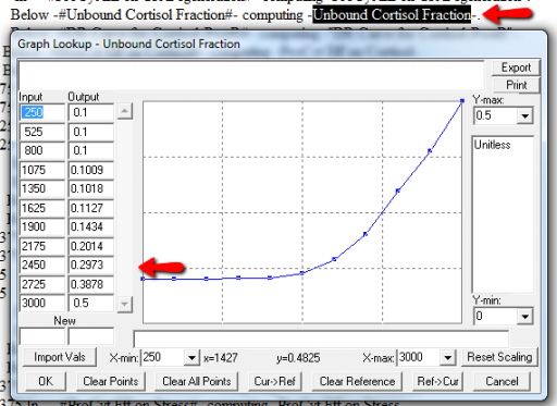
It might be OK to run off the ends of a lookup table, if the slope at the endpoints is zero. But I prefer to suppress these warnings by adding points to the ends of the lookup so that the needed domain is explicitly covered. Most of these turn out to be OK, but I modified them anyway to suppress the warnings:
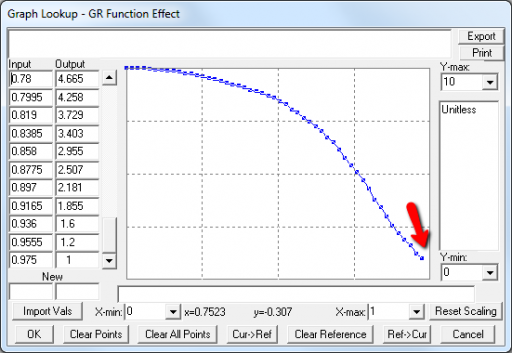
A few cases are hard to reconcile without more knowledge than I have. For example:
Above, the GR function effect has a small discontinuity. Its input (GR function) seems to be bounded at one, but adding (1,1) to the lookup would cause a break in the slope. I prefer to leave such warnings in place for later review.
Extreme Conditions
My next probe of a model is generally random Synthesim overrides of key stocks and flows, to see whether the model is robust to extreme disturbances. Generally, I’d say that this model is unusually robust, in that it’s hard to get stocks to go negative or produce other undesirable behavior. That’s good. Part of the reason for this may be that many of the relationships in the model are sigmoids, and therefore bounded above and below.
Here’s one example of a test: I replicate the “probable depression” scenario from the paper, and increase the size of the one-time external stress to 100 (2x). Then I look at every stock in the model to see what happens (the stocks are the state of the system, so if you look at those, you know everything). This is easy in Vensim if you create an instance of the Strip Graph that shows all levels:
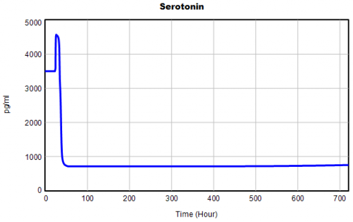
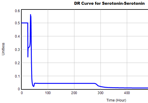
One thing jumps out at me: the initial response of serotonin is opposite the long term response:
This is not unusual, and it’s mentioned in the paper. However, I got curious about its origins, so I started causal tracing to identify the source of the behavior. The answer is … it’s complicated. But along the way, I do notice some fairly extreme nonlinear behaviors, like this:
Is this realistic, or is it a consequence of lookup table clipping and log(x)/log(y) normalizations? I can’t say for sure, but this tests the limits of what I perceive as reasonable behavior. But then, if systems don’t occasionally surprise you with weird (but real) behavior, you’re not paying attention. This is something I’d flag for further investigation.
Sensitivity
Ultimately, what we want out of this model is to identify interventions that can help people with immune/hormone/mood problems. The obvious way to get that advice out of the model is to do a lot of sensitivity analysis to test alternatives. Generically, we’re interested in two things:
- Can you change the system state directly in some beneficial way, e.g. by administering a drug that supplies a hormone, or lowering stress?
- Can you restructure the system, by changing parameters that govern the strength of feedback loops or adding/deleting links?
In a sense, these are all the same thing – a parameter is just a constant state that isn’t in the model (yet), and adding a link is like giving an implicit 0 parameter a nonzero value.
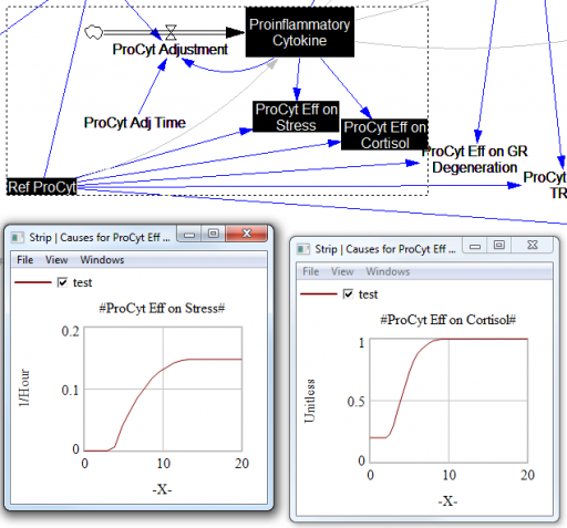
For the answers to make sense, you need a way to (a) influence each state, and (b) change the gain of each loop, preferably independently. In this model, that’s a bit tricky. Consider the effects of ProInflammatory Cytokines:
There are effects on stress, cortisol, and other things. Each has its own sigmoid-shaped lookup table transforming the input to the output. All the inputs are normalized to the same constant, Ref ProCyt. The normalization is good practice, but insufficient for testing purposes, because there’s no independent way to vary the gain on these loops by varying the shapes of the lookups. Yes, it’s possible to simply edit the curves, but that’s impractical for comprehensive, automated experimentation. Two approaches might be helpful:
1. Replace the lookups with parametric curves. Then the parameters can be varied to shift and stretch the functions. This is attractive because you get smooth behavior and a lot of flexibility. However, it’s a lot of work to implement. The functional forms may be arcane, and you can’t easily visualize them until you run the model. Here are a few sigmoid options I’ve collected over the years:
:MACRO: SSHAPE3(x,slope,lowlim,uplim,x0)
SSHAPE3 = lowlim+(uplim-lowlim)*(1/(1+exp(-4*slope*xe))) ~ Dmnl ~ defaults: lowlim= 0; uplim = 1; slope = 1; x0=1 this gives a symmetric \ S-shape from lowlim to uplim through with 1 being the inflection point and \ derivative =  at this point = slope*(uplim-lowlim) |
xe = MAX(-ZIDZ(25,4*ABS(slope)),MIN(x-x0,ZIDZ(25,4*ABS(slope)))) ~ Dmnl ~ Clip to avoid floating point errors at extreme positive / negative values \ of x |
:END OF MACRO:

:MACRO: SSHAPE2(input)
SSHAPE2 = exp(MAX(-50,MIN(50,input)))/(1+exp(MAX(-50,MIN(50,input)))) ~ Dmnl ~ Exponential s-shaped curve; -infinity -> 0, 0 -> .5, infinity -> 1 |
:END OF MACRO:

:MACRO: SSHAPE(xin,profile)
SSHAPE = IF THEN ELSE( input>0.5, 1-(1-input)^profile*0.5/0.5^profile, input^profile*\ 0.5/0.5^profile) ~ Dmnl ~ S-shaped response, from 0-1 for input from 0-1. Profile should normally be >=1 \ (1=linear; 2=quadratic) Always passes through (0.5, 0.5) |
input = MIN(1,MAX(0,xin)) ~ xin ~ |
:END OF MACRO:
2. Apply scaling parameters around the lookups. For example, if you’re starting with:
output = lookup( input/reference input )
you can add:
output = reference output*lookup( input/reference input )^scale
or
output = reference output*( 1-scale + scale*lookup( input/reference input ))
These don’t give you full control over the upper and lower bounds, slopes and asymptotes of the table, and they might not work when the lookup doesn’t pass through some obvious point like (1,1) or (0,0). So, in some cases you may need to be cleverer, or to choose approach #1 instead.
STELLA lookups, and Vensim’s WITH LOOKUP function, don’t really lend themselves to this treatment – you have to add an additional variable to transform the output downstream of the lookup. That’s why I tend to prefer the original Vensim lookup syntax. However it’s implemented, I think some level of parametric control over lookup usage is essential.
After some noodling, I settled on the following policy:
- For dimensionless parameters with (apparent) 0-1 bounds, or centered around 1, apply a scaling exponent, so y = y0*lookup(x/x0)^s
- For parameters bounded below at 0, apply a scaling multiplier, so y = s*lookup(x/x0)
- For parameters with log inputs, apply a shift of the input, so y = lookup(x/x0+s)
- Where I couldn’t figure out what do do, or a loop already contains other independent scaling parameters, skip the item
With scaling parameters in place, I ran an all-constants sensitivity analysis on the model, testing the effect of 10% variations in each parameter against the integrated serotonin level over the simulation. I started from 2 cases: the “daily stress” scenario (repeated small events), and the “probable depression” scenario (one large stress event). I then sorted the results by rank of influence on serotonin:
These are interesting in several ways:
- The model is only moderately sloppy – many parameters have a strong effect, especially in the Daily Stress scenario.
- There are big differences in sensitivity between the two scenarios, even though they differ only in the test input. This suggests that policies might have to be tailored to the stressor, among other things.
- Some of the scale parameters on lookups are near the top of the list, confirming that testing lookup tables matters.
From a policy standpoint, you have to know a little more to make sense of these. What matters is not so much the response to a 10% change, but the response to an X% change, where X is the amount you could plausibly move a parameter. For example, preventing degradation of glucocorticoid receptors is clearly important (Ref GR Deg Fraction, top of list). However, the corresponding Permanent Degeneration Time is at the bottom of the list, presumably because a 10% change from 10 hours has only a tiny effect on the time horizon of the simulation. One would have to be more ambitious than that, but it might still be important.
Bottom Line
While there are a few features that could be reexamined, this model stands up to hard use well. It would also have to pass the face validity test with people who actually know something about the system, but given the paper’s citation list, I would anticipate some success on that front.
I think there might be a lot of interesting policy implications lurking in this model, waiting for an intrepid explorer with more subject matter expertise than I have. I think the crucial point here is that the structure identifies a mechanism by which patient outcomes can be strongly path dependent, where positive feedback preserves a bad state long after harmful stimuli are removed. Among other things, this might explain why it’s so hard to treat such patients. That in turn could be a basis for something I’ve observed in the health system – that a lot of doctors find autoimmune diseases mysterious and frustrating, and respond with a variation on the fundamental attribution error – attributing bad outcomes to patient motivation when delayed, nonlinear feedback is responsible.
Big Data Gone Bad
An integrated market model is a hungry beast. It wants data from a variety of areas of a firm’s business, often from a variety of sources. As I said in my previous post, typically these data streams have never been considered together before, and therefore they’re full of contradictions and quality issues. Here’s a real world example, from the pharma business. The details are proprietary, and I’ve stylized the data, but the story is pretty simple.
Suppose you have a product with two different indications. One is short term (for injuries, a 4 month treatment), and one is long term (for a chronic condition, over 24 months). It’s of obvious interest to understand the two markets individually, to enable allocation of resources to distinct marketing efforts for each set of doctors and patients.
Here’s the structure of the market:
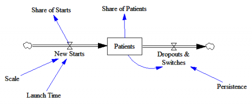
New patients are started on therapy. They remain in the stock of Patients for some time, before they drop out of therapy or switch to another drug. Initially, just the short term indication is approved; the long term indication gets approved a year into the simulation:
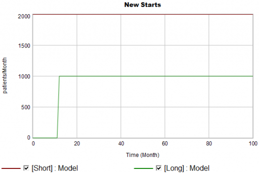
There are twice as many short term starts, but the long term patients stick around 6 times as long, so ultimately there are a lot more of them:
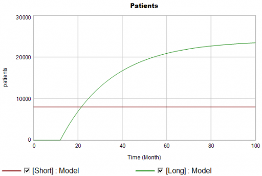
Notice that this is simple first-order goal seeking behavior. The long term patient population is rising toward an equilibrium of (1000 patients/month)x(24 months persistence)=24,000 patients, over a time scale of 24 months.
Puzzle #1
Suppose the data for the long term patients is doing something different (note that the colors now refer to model and data):
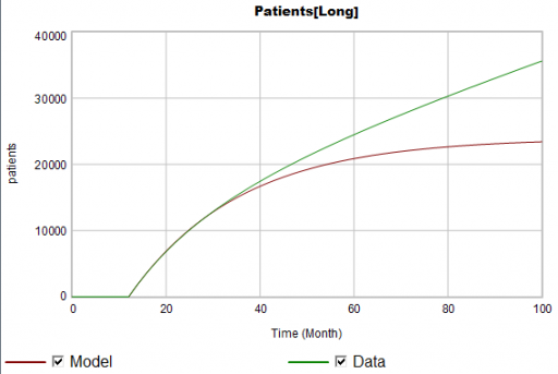
The model is goal-seeking, but the patient population data keeps rising. Bathtub dynamics says that it’s impossible for the step in the inflow of starts to integrate to this pattern when the outflow of dropouts is first order. You’d have to conclude that the model can’t fit the data, without invoking some additional assumptions. For example, the persistence of the long term patients might be increasing as doctors gain experience or the composition of the patient population changes.
But what if I told you that the driving data, new starts, isn’t a “real” measurement? First, new prescriptions aren’t easy to distinguish from refills, and there’s a certain amount of overcounting when patients switch pharmacies or otherwise drop out of the data, then reappear. Second, the short term and long term patients take the same drug, and prescription records don’t say why. So, the data vendor infers the split from dosages, prescriber specialties, and the phase of the moon. The inference happens in an undocumented black box algorithm and there’s no way to establish the ground truth of its performance.
Now, do you trust the algorithm, or doctors who say they know the duration of treatment – but might be missing something too?
Puzzle #2
Even in the presence of algorithmic uncertainty, you’d expect certain dynamic reality checks to pass. Consider the share of long term patients in the market. For new starts, it’s a step function, rising from 0 to 1/3 at launch in month 12:
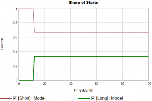
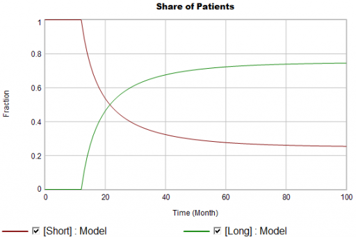
Again, from the bathtub, we know that the patient population can’t instantly mimic the step in starts. If the system is first order with constant persistence, the long term share of patients should rise gradually to 3/4 (1000*24/(1000*24+2000*4)). If persistence is increasing, per puzzle #1, it might go higher on a longer time scale, but it can’t go faster.
Now, suppose the data does something unexpected:
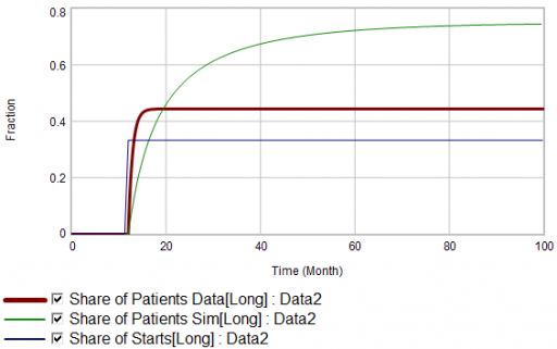
Here, the patient population share data mimics the share of new starts with a time constant that’s very short compared to the persistence of therapy. This should be dynamically impossible in a simple system. But, as always, you could start invoking time varying inputs or parameters to explain what the data shows. (And remember that the real data is noisy, making it harder to be sure about anything.)
But I think there’s another, simpler explanation. The data vendor could be using the same or similar algorithms to classify new starts and existing patients. It could be wrong about the inflow split, or wrong about the stocks, or both. And, it could be reclassifying existing patients from short to long and back with a time constant much faster than the persistence of therapy permits.
Conclusion
It turns out that, in spite of having lots of data about this system, we don’t actually know much. This is a problem for model calibration, because we don’t know which source to trust. Uncertainty in the calibration propagates into decision making. It’s awkward for people in the firm to revise the stories they’ve used to justify past actions. It ought to be awkward for the data vendor to provide flaky information, but luckily they have a near-monopoly.
But we still have options:
- Track down the data issues. This is the most attractive idea in principle, but it might be slow and expensive to find someone at the data vendor who knows what’s going on, and even then the answer might be unsatisfactory.
- Model the data. If some details of the data collection process are known, it’s often possible to reverse engineer the “real” data from flawed measurements.
- Split the difference. Calibrate as best you can to all available information, including gut feel and known “physics” of the situation, not just the numerical data.
- Embrace the uncertainty. If no theory fits the data, look for policies that are robust to alternative futures, and convey the irreducible uncertainty of the situation to decision makers.
A real challenge for modelers is that model consumers typically have science tastes on a propaganda budget. People are used to seeing data that looks precise, full of enticing detail, with conclusions that sound plausible, but are little more than superstition. It’s cheap to make nice graphics and long figure-rich Powerpoint decks.
Really sorting out what’s going on in situations like this is hard, but it can have great strategic value. For example, in this case, if persistence is increasing, it’s more critical than ever to win the long term patients. If market shares could differ dramatically from what measurements report, competitive threats and opportunities could go unnoticed. Anyone who can use models to discover the fog of data and see through it will have a real competitive edge.
Thyroid Dynamics
Quite a while back, I posted about the dynamics of the thyroid and its interactions with other systems.
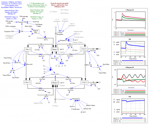
That was a conceptual model; this is a mathematical model. This is a Vensim replication of:
Marisa Eisenberg, Mary Samuels, and Joseph J. DiStefano III
Extensions, Validation, and Clinical Applications of a Feedback Control System Simulator of the Hypothalamo-Pituitary-Thyroid Axis
Background:We upgraded our recent feedback control system (FBCS) simulation model of human thyroid hormone (TH) regulation to include explicit representation of hypothalamic and pituitary dynamics, and up-dated TH distribution and elimination (D&E) parameters. This new model greatly expands the range of clinical and basic science scenarios explorable by computer simulation.
Methods: We quantified the model from pharmacokinetic (PK) and physiological human data and validated it comparatively against several independent clinical data sets. We then explored three contemporary clinical issues with the new model: …
… These results highlight how highly nonlinear feedback in the hypothalamic-pituitary-thyroid axis acts to maintain normal hormone levels, even with severely reduced TSH secretion.
THYROID
Volume 18, Number 10, 2008
DOI: 10.1089=thy.2007.0388
This version is a superset of the authors’ earlier 2006 model, and closely reproduces that with a few parameter changes.
L-T4 Bioequivalence and Hormone Replacement Studies via Feedback Control Simulations
THYROID
Volume 16, Number 12, 2006
The model is used in:
TSH-Based Protocol, Tablet Instability, and Absorption Effects on L-T4 Bioequivalence
THYROID
Volume 19, Number 2, 2009
DOI: 10.1089=thy.2008.0148
This works with any Vensim version:
Prediction, in context
I’m increasingly running into machine learning approaches to prediction in health care. A common application is identification of risks for (expensive) infections or readmission. The basic idea is to treat patients like a function approximation problem.
The hospital compiles a big dataset on patient demographics, health status, exposure to procedures, and infection outcomes. A vendor slurps this up and turns some algorithm loose on the data, seeking the risk factors associated with the infection. It might look like this:
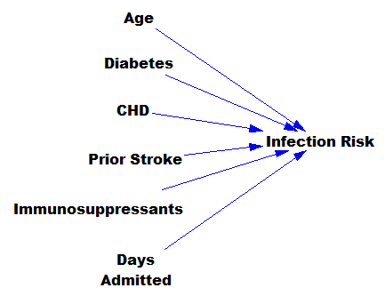
… except that there might be 200 predictors, not six – more than you can handle by eyeballing scatter plots or control charts. Once you have a risk model, you know which patients to target for mitigation, and maybe also which associated factors to pursue further.
However, this is only half the battle. Systems thinkers will recognize this model as a dead buffalo: a laundry list with unidirectional causality. The real situation is rich in feedback, including a lot of things that probably don’t get measured, and therefore don’t end up in the data for consideration by the algorithm. For example:
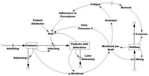
Infections aren’t just a random event for the patient; they happen for reasons that are larger than the patient. Even worse, there are positive feedbacks that can make prevention of infections, and errors more generally, hard to manage. For example, as the number of patients with infections rises, workload goes up, which creates time pressure and fatigue. That induces shortcuts and errors that create risk for patients, leading to more infections. Infections spread to other patients. Fatigued staff burn out and turn over faster, which dilutes the staff experience that might otherwise mitigate risk. (Experience, like many other dynamics, is not shown above.)
An algorithm that predicts risk in this context is certainly useful, because anything that reduces risk helps to diminish the gain of the vicious cycles. But it’s no longer so clear what to do with the patient assessments. Time spent on staff education and action for risk mitigation has to come from somewhere, and therefore might have unintended consequences that aren’t assessed by the algorithm. The algorithm is actually blind in two ways: it can’t respond to any input (like staff fatigue or skill) that isn’t in the data, and it probably isn’t statistically smart enough to deal with the separation of cause and effect in time and space that arises in a feedback system.
Deep learning systems like Alpha Go Zero might learn to deal with dynamics. But so far, high performance requires very large numbers of exemplars for reinforcement learning, and that’s never going to happen in a community hospital dataset. Then again, we humans aren’t too good at managing dynamic complexity either. But until the machines take over, we can build dynamic models to sort these problems out. By taking an endogenous point of view, we can put machine learning in context, refine our understanding of leverage points, and redesign systems for greater performance.
Exponential Epi Pens
Mylan Pharmaceuticals is in the news for taking the price of EpiPens, which contain about $1 of active ingredient, to stratospheric levels. I think Bloomberg broke the story, and the NY Times has the latest.
Here’s the price trajectory:
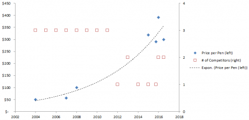
The rate of increase is not that far from the health care inflation rate in general, except that in this case, there’s no obvious underlying cost driver, hence the allegations of gouging.
Here’s a first cut at the structure of the problem:
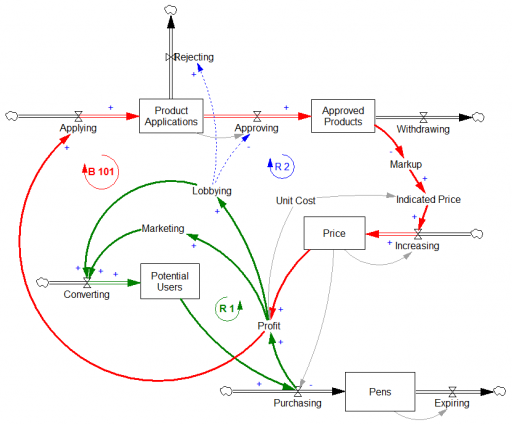
Econ 101 says that high profits should attract competition, putting downward pressure on prices (loop B 101). However, that’s not happening, because the FDA is the gatekeeper on product approval. It’s not clear to me whether the FDA just makes the approval delay systematically long and uncertain, or that it’s actually captive to Mylan lobbyists and holding new entrants to higher standards, as some hint (that would be a reinforcing loop, R2). Either way, the only loop that’s functioning is Mylan’s reinvestment in marketing and lobbying to create demand (R 1).
This reminds me of California’s electricity market deregulation debacle, which created a wholesale power market without corresponding retail price elasticity. Utilities were stranded between hammer (floating generation prices) and anvil (fixed demand). The resulting mess was worse than might have occurred in either a more or less deregulated market.
Similarly, to bring this market under control, you’d either have to get the FDA out of the way, restoring the balancing loop, or regulate the price side of the market, constraining the reinforcing loop. In this case, it may be the court of public opinion that puts the brakes on, adding a balancing loop of bad press that has so far cost Mylan dearly in investor confidence, if nothing else.
Mylan responds to gouging allegations rather unconvincingly, I think. Their CEO argues that the problem is multiple markups in the supply chain, subsidization of Europe, and R&D. It’s hard to square those external-cause arguments with Mylan’s financials.
Blood pressure regulation
The Tech Review Arxiv blog has a neat summary of new research on high blood pressure. It turns out that the culprit may be a feedback mechanism that can’t adequately respond to stiffening of the arteries with age:
The human body has a well understood mechanism for monitoring blood pressure changes, consisting of sensors embedded in the major arterial walls that monitor changes in pressure and then trigger other changes in the body to increase or reduce the pressure as necessary, such as the regulation of the volume of fluid in the blood vessels. This is known as the baroreceptor reflex.
So an interesting question is why this system does not respond appropriately as the body ages. Why, for example, does this system not reduce the volume of fluid in the blood to decrease the pressure when it senses a high systolic pressure in an elderly person?
The theory that Pettersen and co have tested is that the sensors in the arterial walls do not directly measure pressure but instead measure strain, that is the deformation of the arterial walls.
As these walls stiffen due to the natural ageing process, the sensors become less able to monitors changes in pressure and therefore less able to compensate.
